I've encountered a problem with applying blur to the background of absolute/fixed elements, as it does not seem to blur the main content of the page, only the content of the absolute element itself. I currently have the styling for my alert as following:
.alert-wrap {
    position: fixed;
    z-index: 10;
    right: 0;
    bottom: 0;
}

.alert-wrap .alert {
    display: block;
    background-color: rgba(215, 44, 44, 0.5);
    margin: 0 15px 15px 0;
    position: relative;
}

.alert-wrap .alert:before {
    content: "";

    position: absolute;
    height: 100%;
    width: 100%;
    top: 0;
    bottom: 0;
    left: 0;
    right: 0;

    -webkit-filter: blur(10px);
    -moz-filter: blur(10px);
    -o-filter: blur(10px);
    -ms-filter: blur(10px);
    filter: blur(10px);

}
I'm looking to have this blur the background of the alert element, making the main content behind it seem blurred (applying more focus on the element itself), but have not managed to find anything even confirming this issue exists at all.
HTML document flow is as follows:
<html>
    <head>
        <!-- Header Stuff Deleted -->
    </head>

    <body>
        <div class='alert-wrap'>
            <div class='alert'>
                <div class='head'>
                    Notifications
                </div>
                <div class='body'>
                    Alert content here
                </div>
            </div>
        </div>

        <?php
            //constructing navbar
        ?>

        <div class='content'>
            Some content here
        </div>

        <?php
            //constructing footer
        ?>
    </body>
</html>
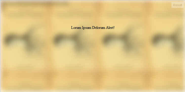
Image example:
