1

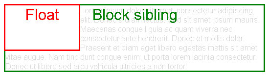
In this snippet, you can find a h2 header with a decoration underline which is implemented with the :after pseudoelement. All is working well until we have a floated image which should appear on the left of the h2 previously mentioned: the h2 will float correctly, however the pseudoelement will not and this breaks the desired effect. (The small orange line should be below the last line of the h2.)

Is there any way around this?

div.post-img-wrap img.thumbnail {
  float: left;
  max-width: 200px;
  padding-right: 20px;
  padding-bottom: 10px;
  margin-top: 25px;
}
article h2:after {
  content: "";
  display: block;
  z-index: 1;
  margin: 0;
  width: 10%;
  height: 2px;
  margin-top: 10px;
  left: 0;
  background: #E96656 none repeat scroll 0% 0%;
}
<body>
  <article>
    <header>
      <div class="post-img-wrap">
        <a href="#">
          <img class="thumbnail" src="http://ima.gs/transparent/200x200.png" height="200" width="200" />
        </a>

      </div>
      <h2><a href="#">This is a very long title with a lot of text in here, so long, so long, so veeeery long</a></h2>

    </header>
    <div class="entry-content">
      <p>Lorem ipsum dolor sit amet, consectetur adipiscing elit. Proin sed velit a sapien varius tristique. Pellentesque habitant morbi tristique senectus et netus et malesuada fames ac turpis egestas. Praesent mattis eros mi. Donec imperdiet fermentum
        lorem. Donec felis nibh, vehicula vel maximus a, aliquet ac ex. Donec euismod magna in pulvinar lobortis. Cras ut orci sollicitudin, rutrum odio nec, vulputate purus. Class aptent taciti sociosqu ad litora torquent per conubia nostra, per inceptos
        himenaeos. Curabitur tristique nibh ac aliquam sollicitudin. Praesent ullamcorper tristique tortor, sit amet mattis diam imperdiet a. Vivamus sagittis id diam sed facilisis. Ut auctor orci et felis accumsan, vel sollicitudin quam eleifend. Nam
        sollicitudin turpis augue, molestie pharetra elit vulputate vitae. Quisque nulla ante, vehicula eget dolor non, dapibus congue neque. Vestibulum convallis eros sed sem volutpat auctor.</p>
    </div>
  </article>
</body>
Scorchio
  • 2,763
  • 2
  • 20
  • 28

2 Answers2

1

The problem is that floating elements are out-of-flow:

An element is called out of flow if it is floated, absolutely positioned, or is the root element.

Therefore, they don't impact surrounding elements as an in-flow element would.

This is explained in 9.5 Floats:

Since a float is not in the flow, non-positioned block boxes created before and after the float box flow vertically as if the float did not exist. However, the current and subsequent line boxes created next to the float are shortened as necessary to make room for the margin box of the float.

enter image description here

However, block elements that establish a Block Formatting Context (are a BFC roots) are the exception, as explained in 9.5 Floats:

The border box of a table, a block-level replaced element, or an element in the normal flow that establishes a new block formatting context […] must not overlap the margin box of any floats in the same block formatting context as the element itself.

enter image description here

A common way of establishing a BFC is setting overflow to anything but visible, e.g.

article h2:after {
  overflow: hidden;
}

div.post-img-wrap img.thumbnail {
  float: left;
  max-width: 200px;
  padding-right: 20px;
  padding-bottom: 10px;
  margin-top: 25px;
}
article h2:after {
  content: "";
  display: block;
  z-index: 1;
  margin: 0;
  width: 10%;
  height: 2px;
  margin-top: 10px;
  left: 0;
  background: #E96656 none repeat scroll 0% 0%;
  overflow: hidden;
}
<article>
  <header>
    <div class="post-img-wrap">
      <a href="#">
        <img class="thumbnail" src="http://ima.gs/transparent/200x200.png" height="200" width="200" />
      </a>

    </div>
    <h2><a href="#">This is a very long title with a lot of text in here, so long, so long, so veeeery long</a></h2>
  </header>
  <div class="entry-content">
    <p>Lorem ipsum dolor sit amet, consectetur adipiscing elit. Proin sed velit a sapien varius tristique. Pellentesque habitant morbi tristique senectus et netus et malesuada fames ac turpis egestas. Praesent mattis eros mi. Donec imperdiet fermentum
      lorem. Donec felis nibh, vehicula vel maximus a, aliquet ac ex. Donec euismod magna in pulvinar lobortis. Cras ut orci sollicitudin, rutrum odio nec, vulputate purus. Class aptent taciti sociosqu ad litora torquent per conubia nostra, per inceptos
      himenaeos. Curabitur tristique nibh ac aliquam sollicitudin. Praesent ullamcorper tristique tortor, sit amet mattis diam imperdiet a. Vivamus sagittis id diam sed facilisis. Ut auctor orci et felis accumsan, vel sollicitudin quam eleifend. Nam
      sollicitudin turpis augue, molestie pharetra elit vulputate vitae. Quisque nulla ante, vehicula eget dolor non, dapibus congue neque. Vestibulum convallis eros sed sem volutpat auctor.</p>
  </div>
</article>
Oriol
  • 274,082
  • 63
  • 437
  • 513
  • This is a summary of [this other answer of mine](http://stackoverflow.com/a/32301823/1529630) – Oriol Oct 26 '15 at 18:44
0

You can use this code. I added pseudo element (:after) to the anchor (not h2). I also added position: relative to the a tag and position: absolute to the pseudo element.

div.post-img-wrap img.thumbnail {
  float: left;
  max-width: 200px;
  padding-right: 20px;
  padding-bottom: 10px;
  margin-top: 25px;
}
article h2 > a {
  position: relative;
}
article h2 > a:after {
  position: absolute;
  content: "";
  z-index: 1;
  width: 10%;
  height: 2px;
  bottom: -10px;
  left: 0;
  background: #E96655;
}
<body>
  <article>
    <header>
      <div class="post-img-wrap">
        <a href="#">
          <img class="thumbnail" src="http://ima.gs/transparent/200x200.png" height="200" width="200" />
        </a>

      </div>
      <h2><a href="#">This is a very long title with a lot of text in here, so long, so long, so veeeery long</a></h2>

    </header>
    <div class="entry-content">
      <p>Lorem ipsum dolor sit amet, consectetur adipiscing elit. Proin sed velit a sapien varius tristique. Pellentesque habitant morbi tristique senectus et netus et malesuada fames ac turpis egestas. Praesent mattis eros mi. Donec imperdiet fermentum
        lorem. Donec felis nibh, vehicula vel maximus a, aliquet ac ex. Donec euismod magna in pulvinar lobortis. Cras ut orci sollicitudin, rutrum odio nec, vulputate purus. Class aptent taciti sociosqu ad litora torquent per conubia nostra, per inceptos
        himenaeos. Curabitur tristique nibh ac aliquam sollicitudin. Praesent ullamcorper tristique tortor, sit amet mattis diam imperdiet a. Vivamus sagittis id diam sed facilisis. Ut auctor orci et felis accumsan, vel sollicitudin quam eleifend. Nam
        sollicitudin turpis augue, molestie pharetra elit vulputate vitae. Quisque nulla ante, vehicula eget dolor non, dapibus congue neque. Vestibulum convallis eros sed sem volutpat auctor.</p>
    </div>
  </article>
</body>
max
  • 8,632
  • 3
  • 21
  • 55
  • I've tried this sample with Chrome (47.0.2526.27 beta) and Firefox (41.0.2). For Chrome, this works fine, but in Firefox the positioning of the decoration line is off: it seems the position gets calculated based on the first row's bottom, not the last one's. – Scorchio Oct 27 '15 at 09:44