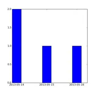
I've got list of tuples with timestamps and usernames and I'm trying to make a plot of the frequency of the timestamps.
That means the x-axis will be from the earliest timestamp to the latest, y-axis will show the frequency within a time period. I'm also looking for way to mark the plots of username the timestamp is connected to (with different colors etc.).
I've been googling for hours, but can't find any examples that does what I'm looking for. Could anyone here point me in the right direction?
The timestamp is epoch time. Example:
lst= [('john', '1446302675'), ('elvis', '1446300605'),('peter','1446300622'), ...]
Thanks
