21

I'm attempting to build the "Holy Grail" layout using Flexbox.

  • Fixed Header
  • Fixed, Collapsible, Scrollable Left Nav
  • Flexible Content Area
  • Fixed, Collapsible, Scrollable Right Nav
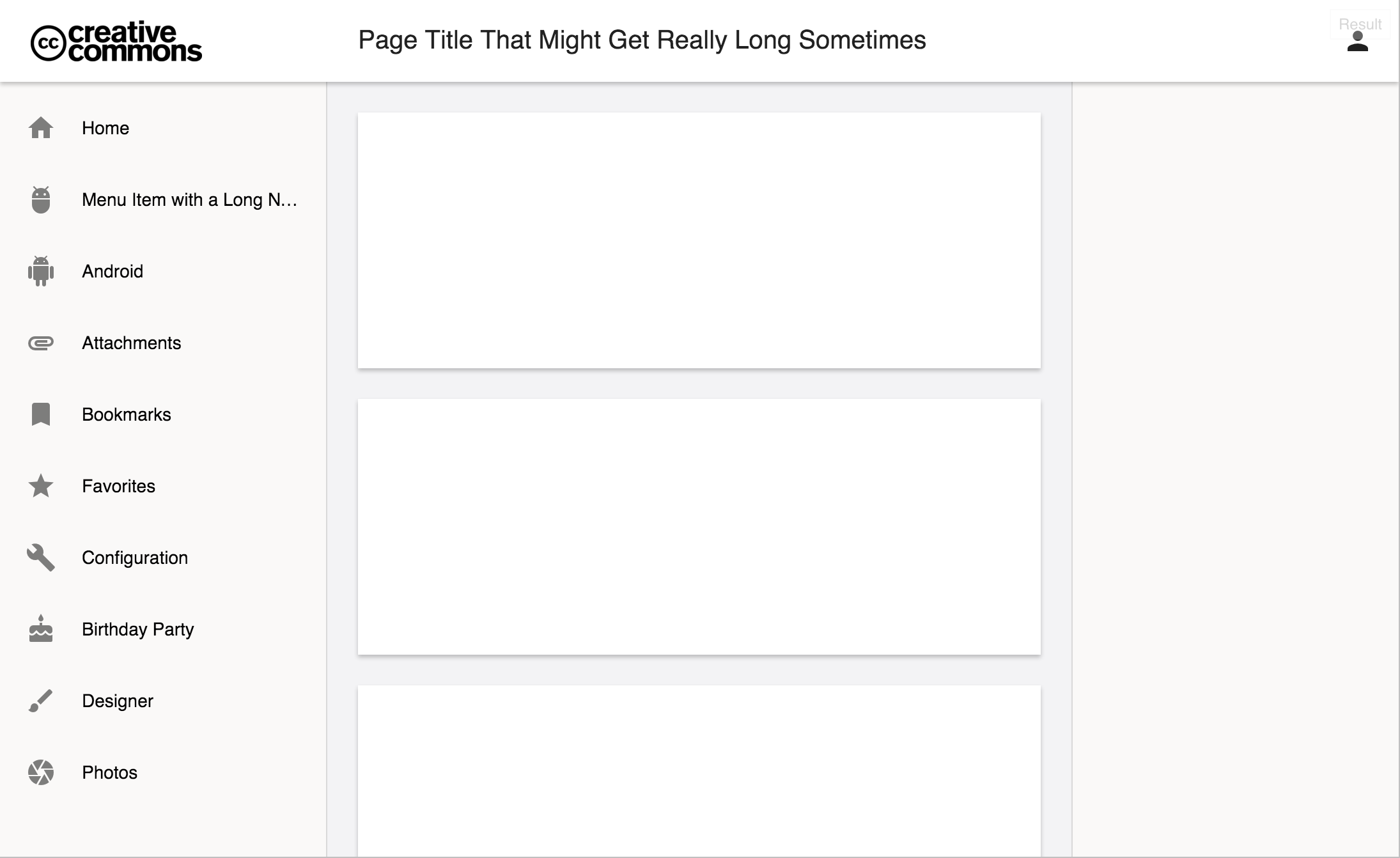
See below:

enter image description here

I have everything working, except for the height of the "app" area underneath the header. Right now it's 100vh (100% of the viewport height), but this includes the 64px header.

I attempted calc(100vh - 64px), but that doesn't jive well with flex.

Here's my basic HTML structure:

<main>
    <header></header>
    <app>
        <nav>Left Nav</nav>
        <article>Content</article>
        <aside>Right Nav</aside>
    </app>
</main>

And the supporting CSS:

main {
    display: flex;
    flex-direction: column;
}

header { 
    z-index: 0;
    flex: 0 0 64px;
    display: flex;
}

app {
    flex: 1 1 100vh;
    display: flex;
}

nav {
    flex: 0 0 256px;
    order: 0;
}

article {
    flex: 1 1 100px;
    order: 1;
}

aside {
    flex: 0 0 256px;
    order: 2;
}

- - - Full jsFiddle Here - - -

- - - Simplified jsFiddle Here - - -

Brian
  • 3,850
  • 3
  • 21
  • 37
Jon
  • 3,154
  • 13
  • 53
  • 96
  • FYI, the `flex` tag is used for Apache Flex. The `flexbox` tag refers to CSS flex layouts. – Brian Nov 04 '15 at 16:04

1 Answers1

19

There were some CSS conflicts with <main> and <body>, and all I had to do was remove the <main> wrapper, then add the flex definitions directly to the page body.

- - - Here's the full working jdFiddle - - -

- - - Here's the simplified jdFiddle - - -

html,
body {
  margin: 0;
  height: 100%;
  min-height: 100%;
}

body {
  margin: 0;
  display: flex;
  flex-direction: column;
}

header {
  z-index: 0;
  flex: 0 64px;
  display: flex;
}

app {
  flex: 1;
  display: flex;
}

nav {
  flex: 0 0 256px;
  order: 0;
}

article {
  flex: 1;
  order: 1;
  overflow: auto;
}

aside {
  flex: 0 0 256px;
  order: 2;
}
<header></header>
<app>
  <nav>Left Nav</nav>
  <article></article>
  <aside>Right Nav</aside>
</app>
Quentin
  • 914,110
  • 126
  • 1,211
  • 1,335
Jon
  • 3,154
  • 13
  • 53
  • 96
  • 2
    This answer, while it works well in current Chrome (47) and Safari (9), doesn't seem to work properly in Firefox (44). This seems to be a recurring issue I see with layouts like this coded in flexbox on FF - it doesn't seem to respect the ability of a single panel (the nav and/or article panels in your example) to have a flex-calculated height and overflow-y setting. Instead, the entire page scrolls. I can't seem to get it to work properly in FF - maybe some prefixes are missing? – J. Ky Marsh Jan 26 '16 at 22:33
  • Thanks for sharing. Is using the HTML tag `` semantically correct? Or should one really use `div id="app">` instead? Or are you using a framework such as AngularJs? – ᴍᴀᴛᴛ ʙᴀᴋᴇʀ Mar 14 '16 at 14:28
  • 2
    @J.KyMarsh Just add `overflow: auto;` to `app` selector and fixed header will work in FF too. – Jan Peša Mar 22 '16 at 15:28
  • `` has been removed from HTML5, because it was a precursor to ``. It has no business in a modern web page. – SeverityOne Aug 02 '21 at 09:50