0

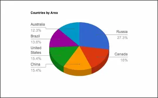
I built a pie chart using ggplot2 package but because some of the slices are very small the group labels overlap one another, and the value labels as well. Im looking for a way to get the labels furthere away from the slices and linking the slice and the label with a line. Im using this data:

a<-c(0.5,0.01,2,50,40,7)
data<-data.frame(a)
data$b<-c("A","B","C","D","E","F")

and I used the following code:

p<- ggplot(data,aes(x=1,y=a,fill=b))
p<- p + geom_bar(stat = "identity",color="black")
p<- p+coord_polar("y")
br<-cumsum(data$a) - data$a/2
p<-p+theme(legend.position = "none",axis.text.x=element_text(color='black',size = 15))+
    scale_y_continuous(breaks=br,labels=data$b)+
    geom_text(aes(y = a/3 + c(0, cumsum(a)[-length(a)]),
                  label=a),size=6)

and the resaulted plot is: this one

and im looking for somthing similar to that one (that I found online):

plort

Aviv
  • 1
  • 1
  • 4
  • 3
    Please see advice on software-specific questions in the Help Center. Asking for code in particular software is off-topic here. (I'd say that a horizontal bar chart would be enormously better than the garishly coloured display with a meaningless third dimension that you want to emulate; that's partly a matter of taste, but there are rational arguments too. The merits and limitations of such displays are not your question.... but would be entirely on-topic here.) – Nick Cox Nov 04 '15 at 10:44
  • Don't use piecharts? Sorry, high horse. Piecharts are notoriously hard to interpret. Would you consider using a (stacked) barplot? This Q might have some inspiration: http://stackoverflow.com/questions/32382235/trying-to-fill-large-gap-in-pie-chart-using-ggplot2/32382525#32382525 – Heroka Nov 04 '15 at 13:48

0 Answers0