I have a webapp with which I'm using flexbox for layout.
I'm trying to both fill the screen (it's an app, not a document), and as far as possible to not specify any fixed widths or heights as the content could be all sorts of things (Full fluid layout! The dream!)
So I need fluid height, full width headers and footers, and then a main panel in the middle filling the remaining vertical space, divided into columns, each of which scrolls when too high, and where the width of each non-primary column should shrink to fit its content, and a primary column which uses up the remaining space.
I am so close, but have had to resort to explicitly sizing the non-main columns - I believe that flex-basis: content; is supposed to do this but isn't supported by browsers yet.
Here's a minimal demo showing fixed size columns:
var list = document.querySelector('ul')

for (var i = 0; i < 100; i++) {
  var li = document.createElement('li')
  li.textContent = i
  list.appendChild(li)
}
html,
body {
height: 100%;
width: 100%;
margin: 0;
}
body {
display: flex;
flex-direction: column;
}
main {
display: flex;
flex-direction: row;
overflow: hidden;
}
main > section {
overflow-y: auto;
flex-basis: 10em;
/* Would be better if it were fluid width/shrink to fit, unsupported: */
/* flex-basis: content; */
}
main > section:last-child {
display: flex;
flex: auto;
flex-direction: column;
}
main > section:last-child > textarea {
flex: auto;
}<header>
<h1>Heading</h1>
</header>
<main>
<section>
<h1>One</h1>
<ul>
</ul>
</section>
<section>
<h1>Two</h1>
</section>
<section>
<header>
<h1>Three</h1>
</header>
<textarea></textarea>
<footer>
<p>Footer</p>
</footer>
</section>
</main>
<footer>
<p>Footer</p>
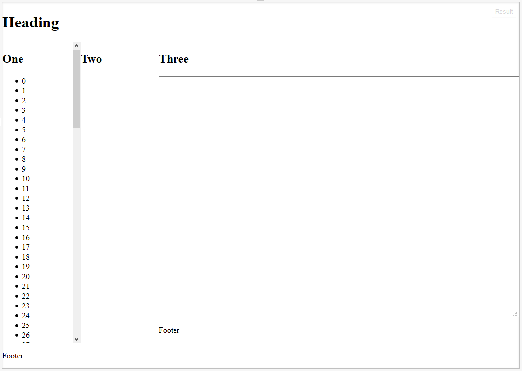
</footer>Which looks like this - I want columns One and Two to shrink/grow to fit rather than being fixed:
My question is, is there a CSS-only workaround for flex-basis: content, or an alternative way to realise this goal?
I can possibly live with fixing the column sizes as above, or using javascript, but I HAVE A DREAM DAMN IT.