I'm playing a little bit with Material-UI. Are there any options for creating a grid layout (like in Bootstrap)?
If not, what is the way to add this functionality?
There is a GridList component but I guess it has some different purpose.
I'm playing a little bit with Material-UI. Are there any options for creating a grid layout (like in Bootstrap)?
If not, what is the way to add this functionality?
There is a GridList component but I guess it has some different purpose.
Material UI have implemented their own Flexbox layout via the Grid component.
It appears they initially wanted to keep themselves as purely a 'components' library. But one of the core developers decided it was too important not to have their own. It has now been merged into the core code and was released with v1.0.0.
You can install it via:
npm install @material-ui/core
It is now in the official documentation with code examples.
From the description of material design specs:
Grid Lists are an alternative to standard list views. Grid lists are distinct from grids used for layouts and other visual presentations.
If you are looking for a much lightweight Grid component library, I'm using React-Flexbox-Grid, the implementation of flexboxgrid.css in React.
On top of that, React-Flexbox-Grid played nicely with both material-ui, and react-toolbox (the alternative material design implementation).
I looked around for an answer to this and the best way I found was to use Flex and inline styling on different components.
For example, to make two paper components divide my full screen in 2 vertical components (in ration of 1:4), the following code works fine.
const styles = {
  div:{
    display: 'flex',
    flexDirection: 'row wrap',
    padding: 20,
    width: '100%'
  },
  paperLeft:{
    flex: 1,
    height: '100%',
    margin: 10,
    textAlign: 'center',
    padding: 10
  },
  paperRight:{
    height: 600,
    flex: 4,
    margin: 10,
    textAlign: 'center',
  }
};

class ExampleComponent extends React.Component {
  render() {
    return (
      <div>
        <div style={styles.div}>
          <Paper zDepth={3} style={styles.paperLeft}>
            <h4>First Vertical component</h4>
          </Paper>
          <Paper zDepth={3} style={styles.paperRight}>
              <h4>Second Vertical component</h4>
          </Paper>
        </div>
      </div>
    )
  }
}
Now, with some more calculations, you can easily divide your components on a page.
I hope this is not too late to give a response.
I was also looking for a simple, robust, flexible and highly customizable bootstrap like react grid system to use in my projects.
The best I know of is react-pure-grid https://www.npmjs.com/package/react-pure-grid
react-pure-grid gives you the power to customize every aspect of your grid system, while at the same time it has built in defaults which probably suits any project
Usage
npm install react-pure-grid --save
-
import {Container, Row, Col} from 'react-pure-grid';

const App = () => (
      <Container>
        <Row>
          <Col xs={6} md={4} lg={3}>Hello, world!</Col>
        </Row>
        <Row>
            <Col xsOffset={5} xs={7}>Welcome!</Col>
        </Row>
      </Container>
);
The way I do is go to http://getbootstrap.com/customize/ and only check "grid system" to download. There are bootstrap-theme.css and bootstrap.css in downloaded files, and I only need the latter.
In this way, I can use the grid system of Bootstrap, with everything else from Material UI.
Below is made by purely MUI Grid system,
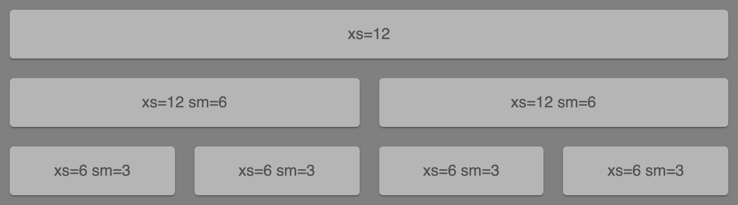
With the code below,
// MuiGrid.js

import React from "react";
import { makeStyles } from "@material-ui/core/styles";
import Paper from "@material-ui/core/Paper";
import Grid from "@material-ui/core/Grid";

const useStyles = makeStyles(theme => ({
  root: {
    flexGrow: 1
  },
  paper: {
    padding: theme.spacing(2),
    textAlign: "center",
    color: theme.palette.text.secondary,
    backgroundColor: "#b5b5b5",
    margin: "10px"
  }
}));

export default function FullWidthGrid() {
  const classes = useStyles();

  return (
    <div className={classes.root}>
      <Grid container spacing={0}>
        <Grid item xs={12}>
          <Paper className={classes.paper}>xs=12</Paper>
        </Grid>
        <Grid item xs={12} sm={6}>
          <Paper className={classes.paper}>xs=12 sm=6</Paper>
        </Grid>
        <Grid item xs={12} sm={6}>
          <Paper className={classes.paper}>xs=12 sm=6</Paper>
        </Grid>
        <Grid item xs={6} sm={3}>
          <Paper className={classes.paper}>xs=6 sm=3</Paper>
        </Grid>
        <Grid item xs={6} sm={3}>
          <Paper className={classes.paper}>xs=6 sm=3</Paper>
        </Grid>
        <Grid item xs={6} sm={3}>
          <Paper className={classes.paper}>xs=6 sm=3</Paper>
        </Grid>
        <Grid item xs={6} sm={3}>
          <Paper className={classes.paper}>xs=6 sm=3</Paper>
        </Grid>
      </Grid>
    </div>
  );
}
↓ CodeSandbox ↓

Here is example of grid system with material-ui which is similar to bootstrap:
<Grid container>
    <Grid item xs={12} sm={4} md={4} lg={4}>
    </Grid>
    <Grid item xs={12} sm={4} md={4} lg={4}>
    </Grid>
 </Grid>