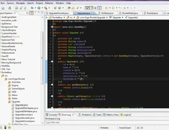
font-size controls the height of characters, not the width: letters in proportional fonts each have a different width, appropriate for the letter (usual example is "W" and "i"). If you want each character to take up the same width, use a monospaced font instead. These are generally less comfortable to read when used for a lot of text (they're fine for words).
Depending on what font renderer is used by a given browser, even fonts rendered at a particular pixel size may look slightly different on different browsers (or different operating systems running the same browser). This applies to monospaced fonts, too.
I'd strongly advise against relying on exact pixel-size measurements for any kind of UI, unless you generate bitmaps instead of using fonts so you know exactly what size to expect. (Consider what happens to the UI when a user tries to change the font size to make the text more readable. A given font size may not fit all readers. Another example is words of varying length: if you autofit words to the UI, short words will be big, long words will be tiny.)
If you work with actual text (rather than pregenerated images), I'd design the UI as much as possible to be flexible and able to deal with most variations in pixel size / screen resolution / zoom / etc.
For more details, read this article.
