EDIT: My example was to complicated. So I made a simpler one.
http://codepen.io/knobo/pen/gaZVoN
.top grows beyond the available size of the html element. I don't want any content outside the current viewport which is 100vh, but I don't know the height of .bottom which can vary.
This line: max-height: calc(100vh - 60px); Makes it look like this works. But it does not, because I don't know the height of .bottom, which I just estimated to 60px;
<div class="page">
  <div class="top">
    <div class="left">Some text</div>
    <div class="right">
      <img src="http://placehold.it/350x1800">
    </div>
  </div>
  <div class="bottom">
    <button>Click</button>
    <button>Click</button>
    <button>Could be several lines</button>
  </div>
</div>

html, body {
  max-height: 100vh;
}
Css
.page {
  display: flex;
  flex-direction: column;
  height: 100%;
}

.top {
  flex: 1 1 auto;
  display: flex;
  overflow: hidden;
  max-height: calc(100vh - 60px);
  /*
  I don't know the height of .bottom
  It can change when browser is resized too..
  How do I solve this.
  */
}
.left {
  flex: 1 1 auto;
}
.bottom {
  padding: 10px;
  flex: 1 1 auto;
  background-color: teal;
}
EDIT2: (included the original links from the first version) http://codepen.io/knobo/pen/epboBv (css version. Does not work) http://codepen.io/knobo/pen/wKRNjr/ (js version. Works. But I want to know how to do it with css.)
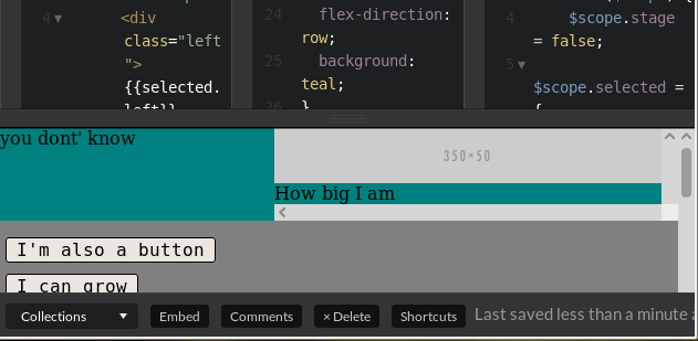
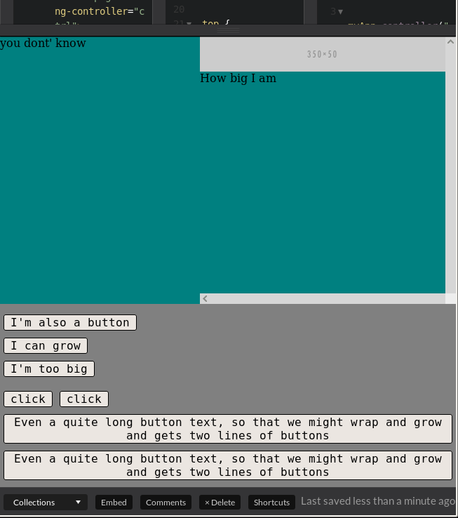
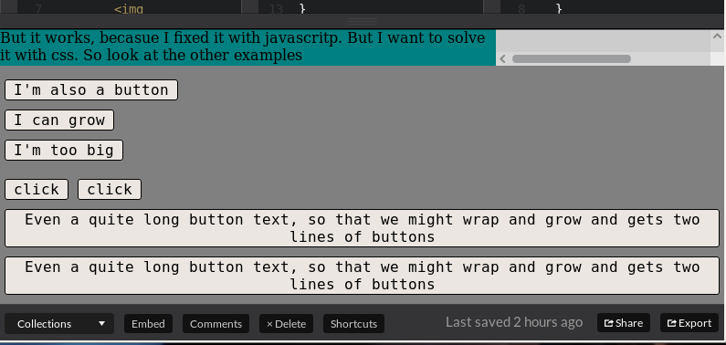
EDIT3 Screenshots:
When browser window is small, the bottom row disappears, when div.right is too big.
When browser window is large everything shows up (corectly)
This is how it should be: div.top is scaled down, and bottom row is stil visible. I was able to do it with javascript. I guess it should be possible with css too.