18

I know what you're thinking, there's at least a million questions like this, asking about waves in borders, or waves at the edges of elements. However, I have a different question. What I need is a combination between a zigzag-edge (I have no idea how to call it, I'm not English) and a wave-edge.

More specific: I need to create this:

enter image description here

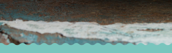
The top part of the blue element has to be a wavy kind of border, where the top part is transparent so the underlying image shows 'through the element', so to say.

Is this do-able with CSS? I'd rather not use images, simply because there will be multiple elements like these, with different colours (that means different edge colours per element).

Community
  • 1
  • 1
Sean
  • 343
  • 1
  • 2
  • 13
  • Related to http://stackoverflow.com/questions/25895895/creating-a-droplet-like-border-effect-in-css/25903879#25903879. You can't exactly produce such a wave border effect with CSS (with a repeating pattern, unless you use a lot of elements). The closest is the thread I linked prior. – Harry Nov 17 '15 at 14:14
  • Thanks, I'll look into that. Could the people giving me downvotes please tell me what the reason is for their downvote? I've did my research, I've come to a dead end, so far there's just one question that's related to mine (the one Harry linked), and I didn't find it in the search. What should I improve next time before I ask a question? – Sean Nov 17 '15 at 15:02
  • Shocking that they never answered the question above. Why is the SO community so toxic?! –  Feb 17 '18 at 12:42

2 Answers2

71

It's relatively easy to draw a border like that with a couple of pseudo-elements.

First we draw the bottom of the wave:

.wave{
  background:
    linear-gradient(to right, sandybrown, chocolate);
  height: 50px;
  position: relative;
}
.wave::before{
  content: "";
  position: absolute;
  left: 0;
  bottom: 0;
  right: 0;
  background-repeat: repeat;
  height: 10px;
  background-size: 20px 20px;
  background-image:
    radial-gradient(circle at 10px -5px, transparent 12px, maroon 13px);
}
<div class='wave'></div>

We then fill every other ditch with the background of another pseudo-element. This background is twice as wide so we only fill the odd ditches.

.wave{
  background:
    linear-gradient(to right, sandybrown, chocolate);
  height: 50px;
  position: relative;
}
.wave::after{
  content: "";
  position: absolute;
  left: 0;
  bottom: 0;
  right: 0;
  background-repeat: repeat;
  height: 15px;
  background-size: 40px 20px;
  background-image:
    radial-gradient(circle at 10px 15px, crimson 12px, transparent 13px);
}
<div class='wave'></div>

Combining the two gives us the desired effect:

.wave{
  background:
    linear-gradient(to right, sandybrown, chocolate);
  height: 50px;
  position: relative;
}
.wave::before{
  content: "";
  position: absolute;
  left: 0;
  bottom: 0;
  right: 0;
  background-repeat: repeat;
  height: 10px;
  background-size: 20px 20px;
  background-image:
    radial-gradient(circle at 10px -5px, transparent 12px, aquamarine 13px);
}
.wave::after{
  content: "";
  position: absolute;
  left: 0;
  bottom: 0;
  right: 0;
  background-repeat: repeat;
  height: 15px;
  background-size: 40px 20px;
  background-image:
    radial-gradient(circle at 10px 15px, aquamarine 12px, transparent 13px);
}
<div class='wave'></div>

Updated with a flatter wave.

.wave{
  background:
    linear-gradient(to right, sandybrown, chocolate);
  height: 50px;
  position: relative;  
}
.wave::before, .wave::after{
  border-bottom: 5px solid yellow;
}
.wave::before{
  content: "";
  position: absolute;
  left: 0;
  right: 0;
  bottom: 0;
  height: 10px;
  background-size: 20px 40px;
  background-image:
    radial-gradient(circle at 10px -15px, transparent 20px, yellow 21px);
}
.wave::after{
  content: "";
  position: absolute;
  left: 0;
  right: 0;
  bottom: 0;
  height: 15px;
  background-size: 40px 40px;
  background-image:
    radial-gradient(circle at 10px 26px, yellow 20px, transparent 21px);
}
<div class='wave'></div>
woestijnrog
  • 1,549
  • 12
  • 9
-1

Try-

#wave {
    position: relative;
    height: 70px;
    width: 54px;
    background:#79C5BD none repeat scroll 0% 0%;float:left;margin-top:20px
}
#wave::after {
    content: "";
    display: block;
    position: absolute;
    border-radius: 100% 100%;
    height: 70px;
    background-color: #79C5BD;
    left: 0px;
    bottom: 27px;
    width: 60px;
}
<div id="wave"></div>
<div id="wave"></div><div id="wave"></div>
Shantanu Verma
  • 260
  • 2
  • 12
  • That is more of a droplet than a wave. When you compare with the image provided in question you'd notice that the bottom part is not curving. – Harry Nov 17 '15 at 14:48
  • What Harry said, yeah. I really need the wave, that's what the client wants. Besides, my Lead Dev won't like it if I use countless div's, just for aesthetic purposes.. EDIT: using thesame ID multiple times kinda goes against the purpose of an ID. – Sean Nov 17 '15 at 14:58