4

I'm referring to the answer at https://stackoverflow.com/a/24475228/72437

The proposed answer is using drawable from Android : ?android:attr/selectableItemBackground

enter image description here

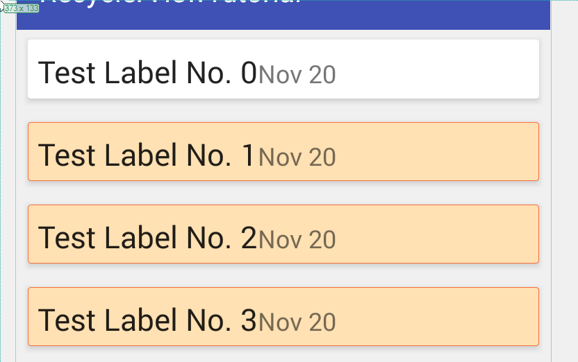
This is what happen when I tap on the card item. Note that, by using drawable from Android, android:state_selected="true" (when setSelected(true)) will not have any color change effect.

Hence, I would like to use my own defined drawable so that

  1. It looks nicer.
  2. Able to handle android:state_selected="true".

Here's my code


statelist_item_background.xml

<?xml version="1.0" encoding="utf-8"?>
<selector xmlns:android="http://schemas.android.com/apk/res/android">

    <item android:state_pressed="true" android:drawable="@drawable/selected_background" />
    <item android:state_selected="true" android:drawable="@drawable/selected_background" />
    <item android:drawable="@android:color/transparent" />

</selector>

selected_background.xml

<shape android:shape="rectangle" xmlns:android="http://schemas.android.com/apk/res/android">
    <solid android:color="#ffffe1b3" />
    <stroke
        android:width="1px"
        android:color="#fff76d3c" />
</shape>

card_row.xml

<!-- A CardView that contains a TextView -->
<android.support.v7.widget.CardView xmlns:android="http://schemas.android.com/apk/res/android"
    xmlns:tools="http://schemas.android.com/tools"
    xmlns:card_view="http://schemas.android.com/apk/res-auto"
    android:id="@+id/card_view"
    android:layout_marginLeft="5dp"
    android:layout_marginRight="5dp"
    android:layout_marginTop="5dp"
    android:layout_marginBottom="5dp"
    android:clickable="true"
    android:foreground="@drawable/statelist_item_background"
    android:layout_width="match_parent"
    android:layout_height="match_parent">

    <LinearLayout
        android:padding="5dp"
        android:layout_width="match_parent"
        android:layout_height="match_parent">
        <TextView
            android:id="@+id/txt_label_item"
            android:layout_width="wrap_content"
            android:layout_height="wrap_content"
            android:textAppearance="?android:attr/textAppearanceLarge"
            tools:text="Item Number One" />

        <TextView
            android:id="@+id/txt_date_time"
            android:layout_width="wrap_content"
            android:layout_height="wrap_content"
            android:textAppearance="?android:attr/textAppearanceMedium"
            tools:text="Item Number One" />
    </LinearLayout>
</android.support.v7.widget.CardView>

When I long press on the card item and perform childView.setSelected(true);, here's my outcome.

enter image description here

All my card content (TextViews) are blocked. How can I avoid such?

Some notes regarding using android:background

Note, when you use android:background="@drawable/statelist_item_background" with CardView itself, nothing will happen.

However, if you use android:background="@drawable/statelist_item_background" with CardView's LinearLayout, you will get the following imperfect outcome.

enter image description here

The highlighted color doesn't cover the entire card.

Update

Seem like this is limitation of CardView - https://code.google.com/p/android/issues/detail?id=78198 Using "foreground" as workaround is not an option as it covers card content.

Community
  • 1
  • 1
Cheok Yan Cheng
  • 47,586
  • 132
  • 466
  • 875

6 Answers6

4

After experimenting for quite some time, I can pretty much conclude that this is limitation of current CardView - https://code.google.com/p/android/issues/detail?id=78198

Don't use CardView's foreground workaround. Although it is widely being proposed, it just don't work!

My suggestion is, avoid using CardView if you need a customized selector. Replace it LayerDrawable. Here's what I had done.

card.xml

<layer-list xmlns:android="http://schemas.android.com/apk/res/android">
    <item>
        <shape>
            <padding android:top="1dp" android:right="1dp" android:bottom="1dp" android:left="1dp" />
            <solid android:color="@android:color/transparent" />
            <stroke
                android:width="1dp"
                android:color="#ffededed" />
            <corners android:radius="2dp" />
        </shape>
    </item>

    <item>
        <shape>
            <padding android:top="1dp" android:right="1dp" android:bottom="1dp" android:left="1dp" />
            <stroke
                android:width="1dp"
                android:color="#ffe8e8e8" />
            <corners android:radius="2dp" />
        </shape>
    </item>

    <item>
        <shape>
            <padding android:top="0dp" android:right="1dp" android:bottom="1dp" android:left="1dp" />
            <stroke
                android:width="1dp"
                android:color="#ffe1e1e1" />
            <corners android:radius="2dp" />
        </shape>
    </item>

    <item>
        <shape>
            <padding android:top="0dp" android:right="0dp" android:bottom="1dp" android:left="0dp" />
            <stroke
                android:width="1dp"
                android:color="#ffdbdbdb" />
            <corners android:radius="2dp" />
        </shape>
    </item>

    <item>
        <shape>
            <padding android:top="0dp" android:right="0dp" android:bottom="1dp" android:left="0dp" />
            <stroke
                android:width="1dp"
                android:color="#ffd5d5d5" />
            <corners android:radius="2dp" />
        </shape>
    </item>

    <!--
    <item>
        <shape>
            <padding android:top="0dp" android:right="0dp" android:bottom="1dp" android:left="0dp" />
            <stroke
                android:width="1dp"
                android:color="#ffcfcfcf" />
            <corners android:radius="2dp" />
        </shape>
    </item>
    -->

    <item>
        <shape >
            <solid android:color="#ffffffff" />
            <corners android:radius="2dp" />
        </shape>
    </item>
</layer-list>

card_selected.xml

<layer-list xmlns:android="http://schemas.android.com/apk/res/android">
    <item>
        <shape>
            <padding android:top="1dp" android:right="1dp" android:bottom="1dp" android:left="1dp" />
            <stroke
                android:width="1dp"
                android:color="#ffededed" />
            <corners android:radius="2dp" />
        </shape>
    </item>

    <item>
        <shape>
            <padding android:top="1dp" android:right="1dp" android:bottom="1dp" android:left="1dp" />
            <stroke
                android:width="1dp"
                android:color="#ffe8e8e8" />
            <corners android:radius="2dp" />
        </shape>
    </item>

    <item>
        <shape>
            <padding android:top="0dp" android:right="1dp" android:bottom="1dp" android:left="1dp" />
            <stroke
                android:width="1dp"
                android:color="#ffe1e1e1" />
            <corners android:radius="2dp" />
        </shape>
    </item>

    <item>
        <shape>
            <padding android:top="0dp" android:right="0dp" android:bottom="1dp" android:left="0dp" />
            <stroke
                android:width="1dp"
                android:color="#ffdbdbdb" />
            <corners android:radius="2dp" />
        </shape>
    </item>

    <item>
        <shape>
            <padding android:top="0dp" android:right="0dp" android:bottom="1dp" android:left="0dp" />
            <stroke
                android:width="1dp"
                android:color="#ffd5d5d5" />
            <corners android:radius="2dp" />
        </shape>
    </item>

    <!--
    <item>
        <shape>
            <padding android:top="0dp" android:right="0dp" android:bottom="1dp" android:left="0dp" />
            <stroke
                android:width="1dp"
                android:color="#ffcfcfcf" />
            <corners android:radius="2dp" />
        </shape>
    </item>
    -->

    <item>
        <shape>
            <solid android:color="#ffffe1b3" />
            <stroke
                android:width="1px"
                android:color="#fff76d3c" />
            <corners android:radius="2dp" />
        </shape>
    </item>
</layer-list>

statelist_item_background.xml

<?xml version="1.0" encoding="utf-8"?>
<selector xmlns:android="http://schemas.android.com/apk/res/android"
    android:exitFadeDuration="@android:integer/config_mediumAnimTime">

    <item android:state_pressed="true" android:drawable="@drawable/card_selected" />     <!-- pressed -->
    <item android:state_selected="true" android:drawable="@drawable/card_selected" />     <!-- pressed -->

    <item android:drawable="@drawable/card" />

</selector>

layout.xml

<!-- A CardView that contains a TextView -->

<LinearLayout xmlns:android="http://schemas.android.com/apk/res/android"
    xmlns:tools="http://schemas.android.com/tools"
    android:padding="10dp"
    android:layout_marginLeft="5dp"
    android:layout_marginRight="5dp"
    android:layout_marginTop="5dp"
    android:layout_marginBottom="5dp"
    android:background="@drawable/statelist_item_background"
    android:layout_width="match_parent"
    android:layout_height="match_parent"
    android:clickable="true" >

    <TextView
        android:id="@+id/txt_label_item"
        android:layout_width="wrap_content"
        android:layout_height="wrap_content"
        android:textAppearance="?android:attr/textAppearanceLarge"
        tools:text="Item Number One" />

    <TextView
        android:id="@+id/txt_date_time"
        android:layout_width="wrap_content"
        android:layout_height="wrap_content"
        android:textAppearance="?android:attr/textAppearanceMedium"
        tools:text="Item Number One" />
</LinearLayout>

You will get the pretty nice outcome.

enter image description here

Cheok Yan Cheng
  • 47,586
  • 132
  • 466
  • 875
1

I've just tried MaterialCardView and this works:

<com.google.android.material.card.MaterialCardView
    android:id="@+id/material_card_view"
    android:layout_width="match_parent"
    android:layout_height="wrap_content"
    android:layout_margin="@dimen/activity_vertical_margin"
    app:cardCornerRadius="4dp"
    app:cardBackgroundColor="@color/selector_background_color"
    app:strokeWidth="2dp">

selector_background_color.xml

<?xml version="1.0" encoding="utf-8"?>
<selector xmlns:android="http://schemas.android.com/apk/res/android">
<item android:color="@android:color/white" android:state_activated="true"/>
<item android:color="@android:color/darker_gray" android:state_activated="false"/>

In the Activity/Fragment:

material_card_view.setOnClickListener {
        it.isActivated = !it.isActivated
}

For the strokeColor though, you can't use a selector. You will have to do it programmatically if you want the stroke color to change as per selector state.

Example for state_activated:

val colorStateList: ColorStateList = 
ResourcesCompat.getColorStateList(resources, 
R.color.selector_stroke_color, null)!!
val colorForState =colorStateList.getColorForState(intArrayOf(android.R.attr.state_activated), colorStateList.defaultColor)
material_card_view.strokeColor = colorForState
ExpensiveBelly
  • 444
  • 5
  • 8
0

All my card content (TextViews) are blocked. How can I avoid such?

Your blocked issue can easily be solved with some color theory knowledge. Instead of using the given peach color, you could use a variant of the peach shade with a higher transparency.

Color Code scheme in Android xxyyyyyy

xx is your transparency level, and y's are your color.

xx max value is : ff // this is fully visible

xx min value is : 00 // this is full invisible

So by playing around on the color wheel, you can get the right effect with the right amount of transparency needed for your view.

aman shivhare
  • 334
  • 2
  • 13
  • Using alpha value won't help. If you use non zero alpha value, the text view seems to block by a "blur" layer. If you use zero alpha value (full transparent), there is no color at all. – Cheok Yan Cheng Nov 18 '15 at 03:07
0

for the background not covering the entire card issue, it is due to the cornerRadius drawing limitation. There are two solutions for this:

  1. Disable round corner for your card will resolve the problem. app:cardCornerRadius="0dp"

  2. You can retain cardCornerRadius but you need to set app:cardPreventCornerOverlap="false"

You Qi
  • 8,353
  • 8
  • 50
  • 68
0

MaterialCardView has ripple effect and doesn't need a custom background drawable as opposed to CardView. That handled the android:state_selected and android:state_pressed for my use case.

omersem
  • 564
  • 7
  • 21
-1

I believe you are misunderstanding the question you referred to. The question is how to get the ripple effect:

enter link description here

Where I think you are just looking for click feedback? If so, try setting the background drawable:

  android:background="@drawable/statelist_item_background"

EDIT:

On you background color xml, you need to give it an alpha. It is being drawn in the front, so give it an alpha of .1f and see how that looks and go from there. Try using color 50F76D3C Then use is it in the foreground like you were originally.

Chad Bingham
  • 32,650
  • 19
  • 86
  • 115
  • Using `android:background` won't help much. I update my finding in question regarding using `android:background` – Cheok Yan Cheng Nov 17 '15 at 17:59
  • Using alpha value won't help. If you use non zero alpha value, the text view seems to block by a "blur" layer. If you use zero alpha value (full transparent), there is no color at all. – Cheok Yan Cheng Nov 18 '15 at 03:17