3

I would like to have two images as a background that are diagonally separated. I think the best bet is by using SVG shapes as clipping masks, but I'm not sure.

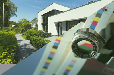
The below image shows what I would like to achieve. As you can see those two images are perfectly diagonally split.

enter image description here

The issue that's been troubling me is that I cannot find a way to create such split while not stretching these images and keep it full screen at all time (thus responsive).

My question/goal: How do I make a page that consists of two diagonally separated images that, together, make a fullscreen view of which the images are not stretched and the split is at both corners.


Edit: With help of this topic you can easily create the two diagonals. It's a matter of having images as backgrounds of those polygons. However, the images should be fullscreen and therefor should scale, instead of stretch.

Copied the answer below

Your best bet may be to use a simple SVG

<svg viewBox="0 0 25 25" preserveAspectRatio="none">
    <polyline points="0,0  25,0  0,25" fill="#FF0000" id="top"/>
    <polyline points="25,0  25,25  0,25" fill="#00FF00" id="bottom"/>
</svg>
You can use CSS to style the elements on hover:

#top:hover {
    fill: #880000;
}

Demo here: http://codepen.io/Godwin/pen/mIqlA
Community
  • 1
  • 1
Sander Schaeffer
  • 2,757
  • 7
  • 28
  • 58
  • maybe this other answer will help...seems similar: http://stackoverflow.com/a/14889564/1028949 – jeffjenx Nov 30 '15 at 23:08
  • @Quantastical Hi! Thanks for your input. As I yet haven't found a full screen responsive way my idea was to create exactly as the answer you linked to. However, full screen and responsive is my final goal, so It's not a (great) answer yet. Still thanks, it will be helpful for sure! – Sander Schaeffer Nov 30 '15 at 23:09

1 Answers1

3

You can do this with clip-path

Result - https://jsfiddle.net/11kn8mjn/4/

How It's Done

Two fullscreen divs with responsive background images are positioned on top of each other.

Clip mask is used to show a responsive triangle of each div.

Code

Two divs positioned on top of each other:

div {
  position: absolute;
  width: 100vw;
  height: 100vh;
}

With a responsive background image:

.div-one { background: url('http://i.imgur.com/8LgIL7B.jpg') center / cover no-repeat; }

.div-two { background: url('http://i.imgur.com/fBL4WC1.jpg') center / cover no-repeat; }

Clip path shows a triangle of each div. The triangle is made responsive using vh and vw values:

.div-one { clip-path: polygon(0 0, 100vh 0, 100vw 0); }

.div-two { clip-path: polygon(100vw 0, 0% 100vh, 100vw 100vh); }

Browser Support

Support for clip-path isn't great - http://caniuse.com/#feat=css-clip-path

Edward
  • 5,148
  • 2
  • 29
  • 42
  • Because of lack of browser support (IE) i've chosen to go with the suggestion from @Quantastical in the comments. However, you've provided what I asked for. Thank you incredibly! – Sander Schaeffer Dec 03 '15 at 21:12