Without doing too many changes to your code, you can achieve that by increasing your power and/or decreasing your offsetTop in the open function.
TweenMax.to(settings, 0.35, {overwrite: true, offsetTop: 80, ease: Strong.easeOut, onUpdate: render })
TweenMax.to(settings, 1, {power: 120, ease: Elastic.easeOut, onUpdate: render })
$(function() {
var pattern = "M0,{offsetTop} C{ax1},{power},{ax2},{power},{width},{offsetTop} L{width},{height},0,{height}Z";
var $svg = $('svg#footer');
var $path = $svg.find('path');
var settings = {
width: 1200,
height: 200,
offsetTop: 200,
power: 200
}
settings.ax1 = settings.width / 3 * 1;
settings.ax2 = settings.width / 3 * 2;
function render() {
var newPath = pattern;
for (var i in settings) {
newPath = newPath.split('{' + i + '}').join(settings[i]);
}
$path.attr('d', newPath);
}
TweenMax.set($svg, {
force3D: true
})
var opened = false;
function open() {
if (opened) {
return
}
opened = true;
TweenMax.to(settings, 0.35, {
overwrite: true,
offsetTop: 80,
ease: Strong.easeOut,
onUpdate: render
})
TweenMax.to(settings, 1, {
power: 150,
ease: Elastic.easeOut,
onUpdate: render
})
}
function close() {
if (!opened) {
return
}
opened = false;
TweenMax.to(settings, 0.35, {
overwrite: true,
offsetTop: 200,
ease: Back.easeIn,
onUpdate: render
})
TweenMax.to(settings, 0.35, {
power: 200,
delay: 0.15,
ease: Back.easeOut,
onUpdate: render
})
}
$(window).on('mousedown touchstart', function(e) {
opened ? close() : open();
})
open();
})
html,
body {
  margin: 0;
  padding: 0;
  width: 100%;
  height: 100%;
}

body {
  background-image: url('http://i839.photobucket.com/albums/zz314/mrkanpuc/stuffs/1PZ1.jpg');
  background-repeat: no-repeat;
  background-size: cover;
}

svg {
  position: absolute;
  bottom: 0;
  width: 100%;
  height: 200px;
}

svg path {
  fill: rgba(0, 0, 0, 0.5);
}
<script src="https://code.jquery.com/jquery-1.11.3.min.js"></script>
<script src="https://cdnjs.cloudflare.com/ajax/libs/gsap/1.18.0/TweenMax.min.js"></script>

<svg id="footer" viewBox="0 0 1200 200" preserveAspectRatio="none"><path/></svg>
Quadratic Bézier curve
Another solution is to add a curved path (called quadratic Bézier curve) to your rectangle. The curve is built like this:
M{startWidth}, {startHeight} q {curvePeak}, {curveHeight}, {endWidth}, {endHeight}
- startWidth - x-axis positioning of
P0: x coordinate where the curve starts
- startHeight - y-axis positioning of
P0: y coordinate where the curve starts
- curvePeak - x-axis positioning of
P1: where the curve reach it's peak
- curveHeight - y-axis positioning of
P1: height of the curve
- endWidth - x-axis positioning of
P2: dimension of the curve
- endHeight - y-axis positioning of
P2: inclination of the curve
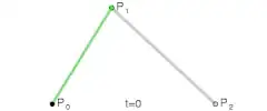
See also: Quadratic Bézier Curve: Calculate Points or click here for an interactive example of the quadratic Bézier curve.
Negative
This solution has some problems when using two different animations and duration, like in your case.
$(function() {
var pattern = "M0,{offsetTop} C{ax1},{power},{ax2},{power},{width},{offsetTop} L{width},{height},0,{height}Z q 600, 100, 1200, 0";
var $svg = $('svg#footer');
var $path = $svg.find('path');
var settings = {
width: 1200,
height: 200,
offsetTop: 200,
power: 200
}
settings.ax1 = settings.width / 3 * 1;
settings.ax2 = settings.width / 3 * 2;
function render() {
var newPath = pattern;
for (var i in settings) {
newPath = newPath.split('{' + i + '}').join(settings[i]);
}
$path.attr('d', newPath);
}
TweenMax.set($svg, {
force3D: true
})
var opened = false;
function open() {
if (opened) {
return
}
opened = true;
TweenMax.to(settings, 0.35, {
overwrite: true,
offsetTop: 80,
ease: Strong.easeOut,
onUpdate: render
})
TweenMax.to(settings, 1, {
power: 80,
ease: Elastic.easeOut,
onUpdate: render
})
}
function close() {
if (!opened) {
return
}
opened = false;
TweenMax.to(settings, 0.35, {
overwrite: true,
offsetTop: 200,
ease: Back.easeIn,
onUpdate: render
})
TweenMax.to(settings, 0.35, {
power: 200,
delay: 0.15,
ease: Back.easeOut,
onUpdate: render
})
}
$(window).on('mousedown touchstart', function(e) {
opened ? close() : open();
})
open();
})
html,
body {
  margin: 0;
  padding: 0;
  width: 100%;
  height: 100%;
}

body {
  background-image: url('http://i839.photobucket.com/albums/zz314/mrkanpuc/stuffs/1PZ1.jpg');
  background-repeat: no-repeat;
  background-size: cover;
}

svg {
  position: absolute;
  bottom: 0;
  width: 100%;
  height: 200px;
}

svg path {
  fill: rgba(0, 0, 0, 0.5);
}
<script src="https://code.jquery.com/jquery-1.11.3.min.js"></script>
<script src="https://cdnjs.cloudflare.com/ajax/libs/gsap/1.18.0/TweenMax.min.js"></script>

<svg id="footer" viewBox="0 0 1200 200" preserveAspectRatio="none"><path/></svg>
Positive
On the contrary it works great when using the same animation and duration.
Both with Elastic.easeOut : 1.00s
$(function() {
var pattern = "M0,{offsetTop} C{ax1},{power},{ax2},{power},{width},{offsetTop} L{width},{height},0,{height}Z q 600, 100, 1200, 0";
var $svg = $('svg#footer');
var $path = $svg.find('path');
var settings = {
width: 1200,
height: 200,
offsetTop: 200,
power: 200
}
settings.ax1 = settings.width / 3 * 1;
settings.ax2 = settings.width / 3 * 2;
function render() {
var newPath = pattern;
for (var i in settings) {
newPath = newPath.split('{' + i + '}').join(settings[i]);
}
$path.attr('d', newPath);
}
TweenMax.set($svg, {
force3D: true
})
var opened = false;
function open() {
if (opened) {
return
}
opened = true;
TweenMax.to(settings, 1, {
overwrite: true,
offsetTop: 80,
ease: Elastic.easeOut,
onUpdate: render
})
TweenMax.to(settings, 1, {
power: 80,
ease: Elastic.easeOut,
onUpdate: render
})
}
function close() {
if (!opened) {
return
}
opened = false;
TweenMax.to(settings, 0.35, {
overwrite: true,
offsetTop: 200,
ease: Back.easeIn,
onUpdate: render
})
TweenMax.to(settings, 0.35, {
power: 200,
ease: Back.easeIn,
onUpdate: render
})
}
$(window).on('mousedown touchstart', function(e) {
opened ? close() : open();
})
open();
})
html,
body {
  margin: 0;
  padding: 0;
  width: 100%;
  height: 100%;
}

body {
  background-image: url('http://i839.photobucket.com/albums/zz314/mrkanpuc/stuffs/1PZ1.jpg');
  background-repeat: no-repeat;
  background-size: cover;
}

svg {
  position: absolute;
  bottom: 0;
  width: 100%;
  height: 200px;
}

svg path {
  fill: rgba(0, 0, 0, 0.5);
}
<script src="https://code.jquery.com/jquery-1.11.3.min.js"></script>
<script src="https://cdnjs.cloudflare.com/ajax/libs/gsap/1.18.0/TweenMax.min.js"></script>

<svg id="footer" viewBox="0 0 1200 200" preserveAspectRatio="none"><path/></svg>
Swapping the url path/mask with rect/custom one may do the trick ! – Cristian Davide Conte Aug 07 '20 at 16:48