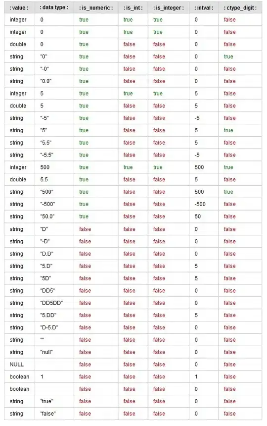
I am working on an email with two rows of three images. It works well throughout all email clients until I get to iPhone5, 6 and 6s where in iPhone5 the first two images seem to be shrunk even further then the last image. Making a white line between the first and the second row.(see the image attached). In iPhone6 and 6s it is only the first image that is causing this issue. Here is the code as well. I have tried to place all images in individual tables, add width to individual tables, TDs and image tags, I even turned PX to percentage and nothing seem to be working. Anybody has any idea?
Cheers
    <table width="600" border="0" cellpadding="0" cellspacing="0" bgcolor="ffffff" class="100plr">
                <tr>
                    <td width="11" class="hide"></td>
                    <td valign="top" align="center">
                        <table width="579" border="0" cellpadding="0" cellspacing="0" class="100p">
                            <tr>
                                <td valign="top" align="center">
<!--                                Row one-->
                                    <table width="579" border="0" cellpadding="0" cellspacing="0" class="100p">
                                        <tr>
                                            <td valign="top" align="center">
                                                <a href="##" target="_blank" style="text-decoration:none;"><img src="http://uploadlibrary.com/emosaic/martin/kuoni/html/images/img388x344.jpg" alt="" border="0" style="display:block;" class="100p" /></a>
                                            </td>
                                            <td valign="top" align="center">
                                                <a href="##" target="_blank" style="text-decoration:none;"><img src="http://uploadlibrary.com/emosaic/martin/kuoni/html/images/img388x344.jpg" alt="" border="0" style="display:block;" class="100p"/></a>
                                            </td>
                                        </tr>
                                    </table>
<!--                                End of Row one-->

<!--                                Row two-->
                                    <table width="579" border="0" cellpadding="0" cellspacing="0" class="100p">
                                        <tr>
                                            <td valign="top" align="center">
                                                <a href="##" target="_blank" style="text-decoration:none;"><img src="http://uploadlibrary.com/emosaic/martin/kuoni/html/images/img388x344.jpg" alt="" border="0" style="display:block;" class="100p" /></a>
                                            </td>
                                            <td valign="top" align="center">
                                                <a href="##" target="_blank" style="text-decoration:none;"><img src="http://uploadlibrary.com/emosaic/martin/kuoni/html/images/img388x344.jpg" alt="" border="0" style="display:block;" class="100p" /></a>
                                            </td>
                                            <td valign="top" align="center">
                                                <a href="##" target="_blank" style="text-decoration:none;"><img src="http://uploadlibrary.com/emosaic/martin/kuoni/html/images/img388x344.jpg" alt="" border="0" style="display:block;" class="100p" /></a>
                                            </td>
                                        </tr>
                                    </table>
<!--                                End of Row two-->
                                </td>
                            </tr>
                        </table>
                    </td>
                    <td width="10" class="hide"></td>
                </tr>
            </table>


   <!DOCTYPE html PUBLIC "-//W3C//DTD XHTML 1.0 Transitional//EN" "http://www.w3.org/TR/xhtml1/DTD/xhtml1-transitional.dtd">
<html xmlns="http://www.w3.org/1999/xhtml">
<head>
<meta http-equiv="Content-Type" content="text/html; charset=UTF-8"/>
<meta name="viewport" content="width=device-width, initial-scale=1.0"/>
    <title>email template</title>
    <style>


         @import url(http://fonts.googleapis.com/css?family=Roboto:300); /*Calling our web font*/

        /* Some resets and issue fixes */
        #outlook a { padding:0; }
        body{ width:100% !important; -webkit-text; size-adjust:100%; -ms-text-size-adjust:100%; margin:0; padding:0; }
        .ReadMsgBody { width: 100%; }
        .ExternalClass {width:100%;}
        .backgroundTable {margin:0 auto; padding:0; width:100%;!important;}
        table td {border-collapse: collapse;}
        .ExternalClass * {line-height: 115%;}
        a:visited{color:#dddbdc;text-decoration:none;}
/*      div, p, a, li, td { -webkit-text-size-adjust:none; }*/

        /* End reset */

        @media screen and (max-width: 630px){


            *[class="mobile-column"] {display: block;}

            *[class="mob-column"] {float: none !important;width: 100% !important;}
            *[class="hide"] {display:none !important;}

            *[class="100p"] {width:100% !important; height:auto !important;}

            *[class="condensed"] {display: block;}

            *[class="center"] {text-align:center !important; width:100% !important; height:auto !important;}

            *[class="100pad"] {width:100% !important; padding:20px;}

            *[class="100padleftright"] {width:100% !important; padding:0 20px 0 20px;}

            *[class="100padtopbottom"] {width:100% !important; padding:20px 0px 20px 0px;}

            *[class="padleft50p"] {text-align:left !important;}


            *[class="100grad"] {width:100% !important; height:1px !important;}

            *[class="cwNumbs"] {font-size:40px !important;}

        }

        @media screen and (max-width: 414px) {
            *[class="100p"] {width: 100% !important; height:auto !important;}
            *[class="100pm"] {width: 100% !important; height:auto !important;}
            *[class="100plr"] {width: 100% !important; height:auto !important; padding: 0 20px 0 20px;}
            *[class="100prl"] {width: 100% !important; height:auto !important; padding: 0 20px 0 20px;}
            *[class="100plrn"] {width: 100% !important; height:auto !important; padding: 0 70px 0 70px;}
            *[class="100pr"] {width: 100% !important; height:auto !important; padding: 0 30px 0 0;}
            *[class="100pt"] {width: 100% !important; height:auto !important; padding: 10px 0 0 0;}
            *[class="100pb"] {width: 100% !important; height:auto !important; padding: 0 0 20px 0;}
            *[class="100pbn"] {width: 100% !important; height:auto !important; padding: 0 0 30px 0;}
            *[class="100pad"] {width: 100% !important; height:auto !important; padding: 20px 20px 20px 20px;}
            *[class="hide"] {display:none !important;}
            *[class="center"] {text-align:center !important;}
            *[class="mobile"] {width: 100% !important; height:auto !important; display:block !important; max-height:none !important;}
            *[class="heading1"] {font-size: 29px !important;}
            *[class="heading2"] {font-size: 26px !important;}
            *[class="heading3"] {font-size: 15px !important;}
            *[class="heading4"] {font-size: 17px !important;}
            *[class="apptext"] {font-size: 15px !important;}
            *[class="text"] {font-size: 20px !important;}

        }
        @media screen and (max-width: 373px) {
            *[class="heading1"] {font-size: 24px !important;}
            *[class="heading2"] {font-size: 22px !important;}
            *[class="heading3"] {font-size: 15px !important;}
            *[class="heading4"] {font-size: 15px !important;}
            *[class="apptext"] {font-size: 13px !important;}
        }
    </style>


</head>