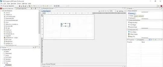
I know, it's a weird question. Imagine a list of items. Placed vertically. Is there a way to "detect" when my list has to be on multiple columns? (because of a lack of space) ?
I guess an example is more efficient: http://jsfiddle.net/KCarnaille/au8mpo9t/4/
.right{
  display: flex;
  flex-flow: column wrap;
  justify-content: flex-start; //change the option when 2 cols needed
}
I'm not talking about media queries What I want depends on items length, not screen size.
I dont think it's possible with CSS but, let's see :)
What I want :

