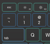
For the border glow effect, you can add a Drop Shadow Effect with a Shadow Depth of 0 and the desired color and a border brush of white for the Button.
To create the style in a separate file, you need to create a Resource Dictionary like this:
Project ► Add New Item... ► Resource Dictionary
Then name your file. In this example, I name it Styles.xaml.
Now open up your App.xaml and put this within the Application tag:
<Application.Resources>
    <ResourceDictionary>
        <ResourceDictionary.MergedDictionaries>
            <ResourceDictionary Source="Styles.xaml"/>
        </ResourceDictionary.MergedDictionaries>
        <!--Put all previous resources in the App.xaml here-->
    </ResourceDictionary>
</Application.Resources>
Now in the Styles.xaml file within the ResourceDictionary tag, put the style. I am working on a style too. Once I finish it I will post it.
To link the style, use:
<Button Style="{StaticResource Button}" .../>
It may not work since the key is "Button". If it doesn't change it to something like "ButtonStyle".
And the Drop Shadow Effect does a pretty decent job.
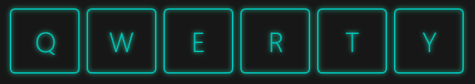
Here's an example (Zoomed at 200%):

and the XAML style:
<Style x:Key="ButtonStyle" TargetType="Button">
    <Setter Property="BorderBrush">
        <Setter.Value>
            <SolidColorBrush Color="#FF00C3BA"/>
        </Setter.Value>
    </Setter>
    <Setter Property="Template">
        <Setter.Value>
            <ControlTemplate TargetType="Button">
                <Border BorderBrush="{TemplateBinding BorderBrush}" BorderThickness="0.8" CornerRadius="3">
                    <Border.Effect>
                        <DropShadowEffect Color="#FF72FFE5" ShadowDepth="0"/>
                    </Border.Effect>
                    <TextBlock Foreground="{TemplateBinding BorderBrush}" Text="{TemplateBinding Content}" HorizontalAlignment="Center" VerticalAlignment="Center"/>
                </Border>
            </ControlTemplate>
        </Setter.Value>
    </Setter>
</Style>
used like this:
<Grid Background="#FF171717">
    <Button Content="Q" HorizontalAlignment="Left" Height="47" Margin="103,59,0,0" VerticalAlignment="Top" Width="50" FontSize="20" FontFamily="Segoe UI Light" Style="{StaticResource ButtonStyle}"/>
    <Button Content="Y" HorizontalAlignment="Left" Height="47" Margin="378,59,0,0" VerticalAlignment="Top" Width="50" FontSize="20" FontFamily="Segoe UI Light" Style="{StaticResource ButtonStyle}"/>
    <Button Content="T" HorizontalAlignment="Left" Height="47" Margin="323,59,0,0" VerticalAlignment="Top" Width="50" FontSize="20" FontFamily="Segoe UI Light" Style="{StaticResource ButtonStyle}"/>
    <Button Content="R" HorizontalAlignment="Left" Height="47" Margin="268,59,0,0" VerticalAlignment="Top" Width="50" FontSize="20" FontFamily="Segoe UI Light" Style="{StaticResource ButtonStyle}"/>
    <Button Content="E" HorizontalAlignment="Left" Height="47" Margin="213,59,0,0" VerticalAlignment="Top" Width="50" FontSize="20" FontFamily="Segoe UI Light" Style="{StaticResource ButtonStyle}"/>
    <Button Content="W" HorizontalAlignment="Left" Height="47" Margin="158,59,0,0" VerticalAlignment="Top" Width="50" FontSize="20" FontFamily="Segoe UI Light" Style="{StaticResource ButtonStyle}"/>
</Grid>