This speech bubble is used to display error messages on form validation
p.speech {
position: relative;
width: 200px;
height: 40px;
left: 100px;
top: 100px;
background-color: #FFFFFF;
-webkit-border-radius: 10px;
-moz-border-radius: 10px;
border-radius: 10px;
text-align: center;
border: 1px solid red;
}
p.speech::before {
content: ' ';
position: absolute;
width: 0;
height: 0;
left: -10px;
top: -10px;
border: 20px solid;
border-color: #FF0000 transparent transparent transparent;
-webkit-transform: rotate(25deg);
-moz-transform: rotate(25deg);
transform: rotate(25deg);
}
p.speech::after {
content: ' ';
position: absolute;
width: 0;
height: 0;
left: -9px;
top: -9px;
border: 19px solid;
border-color: #FFFFFF transparent transparent transparent;
-webkit-transform: rotate(25deg);
-moz-transform: rotate(25deg);
transform: rotate(25deg);
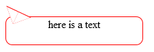
}<p class="speech">here is a text</p>creates a speech bubble, as shown below,
But the pseudo elements have some lines that does not make it transparent.
My question is,
leftandtopvalues of pseudo elements show negative values. Why pseudo elements are not positioned based onrelativeparagraph element? so that theleftandtopare given positive values?Why does the pseudo element does not become transparent with
afterpseudo element?