23

The purpose:

I am working on a code similar to this to create a component where an input field has an embedded button:

http://codepen.io/anon/pen/pgwbWG?editors=110

As you can see, the button is positioned absolutely with top and bottom set to 0, to achieve a 100% height element.

Also to note is that the border of the text-input must stay visible and also wrap the button. To achieve this I added a margin: 1px to the button so that there is (should be) space to display the surrounding text-input red border (usually when the input field content is invalid).

The problem:

is that on Firefox it is (mostly) rendered correctly, while on Chrome (and apparently on the newest Safari) it will have a 1px gap at the bottom of the button.

CSS seems ok but it appears to be a calculation/rounding problem in the rendering, where the bottom or the top margin of the button are not really 1px (can see it inspecting the element). And also the padding of the input seems to influence in that.

At different zoom-rates it will add or remove 1px of margin to the top or the bottom of the button, resulting in a 1px-gap or in a covered-border.

As I set the button margin to 0px then the bottom margin is fixed but I loose the 1px margin on the top, finishing to cover the red border of the text-input.

The examples:

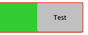
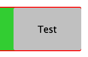
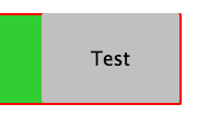
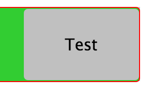
Probably I am not clear or too verbose in explaining it, so here are some screenshots of the bug, from different zooms on Chrome (note the CSS is always the same):

enter image description here enter image description here enter image description here enter image description here

The solution:

I was not able to find a cross-browser solution. How to deal with it and get a consistent component? (no Javascript please)

Community
  • 1
  • 1
Kamafeather
  • 8,663
  • 14
  • 69
  • 99
  • Would it be ok to set the border on the wrapper ? – vals Jan 12 '16 at 14:23
  • Actually not, because the styling (border and other rules) are dependant on the :valid state coming from the validation API of the browser and executed on the contained *input*. And as long as there is not the CSS4 parent-selector (```>```) I can't style the wrapper. Also I am interested in understanding how to deal with subpixel also in other cases. – Kamafeather Jan 12 '16 at 15:46
  • 1
    One way to prevent subpixel rendering woes is to make sure all css properties relative to size, margin and padding are a fixed amount of pixel that is divisible by 2. This is not applicable to all scenarios, but when it is applicable it helps. – Mahn Jan 12 '19 at 19:17
  • Yes but fixed amount of pixels then we can trash responsiveness altogether. And zooming the page would probably break those calculations. – Kamafeather Feb 23 '19 at 13:48

2 Answers2

17

As you already know, the problem arises from a different approach to subpixel calculus between browsers

In Chrome, for instance, borders can have a fractional size, but margins are handled different (as integers).

I don't have documentation about it from the Chrome team, but it's what can be seen in dev tools:

dev tools capture

AFAIK, there is not a way to change that.

Instead, you can transfer the use of the margin in the button to a border.

Since you need to get space for the 1px border of the input, do the same in the button, set a 1px border (instead of a margin), and set it transparent.

The remaining trick is to set the background-clip property to padding box, so that this transparency is not affected by the background

There is another bug in Chrome, the padding expressed in em is not reliable at this level of precision when the browser is zoomed. I changed this in the snippet.

Since we are using the border button to get the dimension ok, we can style the border using instead a inset shadow.

* {
  margin: 0; padding: 0; box-sizing: border-box;
}
button, input, wrapper {
  display: inline-block; border-radius: 3px;
}

.wrapper {
  position: relative;
  
  width: 60%;
  margin: 1em;
  background-color: #ccc;
}

input {
  border: 1px solid red;
  width: 100%;
  
  background-color: limegreen;
  line-height: 3em;
/*  padding: 0.75em; */
  padding: 10px;
}

button {
  position: absolute;
  right: 0;
  top: 0;
  bottom: 0;
  border: 1px solid transparent;
  width: 7em;
  margin: 0px;
  background-clip: padding-box;
  box-shadow:  inset 0px 0px 0px 2px  black;
}
<div class="wrapper">
  <input type="text">
  <button>Test</button>
</div>

Another example, where the button has a border. But we need a wrapper around it to get the dimensions ok.

* {
  margin: 0; padding: 0; box-sizing: border-box;
}
button, input, wrapper {
  display: inline-block; border-radius: 3px;
}

.wrapper {
  position: relative;
  
  width: 60%;
  margin: 1em;
  background-color: #ccc;
}

input {
  border: 1px solid red;
  width: 100%;
  
  background-color: limegreen;
  line-height: 3em;
/*  padding: 0.75em; */
  padding: 10px;
}

.buttonwrap {
  position: absolute;
  right: 0;
  top: 0;
  bottom: 0;
  border: 1px solid transparent;
  width: 7em;
  margin: 0px;
  background-clip: padding-box;
}
button {
  position: absolute;
  right: 0px;
  top: 0;
  bottom: 0;
  width: 100%;
  border: 2px solid blue;
  margin: 0px;
}
<div class="wrapper">
  <input type="text">
  <div class="buttonwrap">
      <button>Test</button>
  </div>
</div>
vals
  • 61,425
  • 11
  • 89
  • 138
  • Thanks for the suggestions! I was thinking about playing with the **border** property but unfortunately that is already used for styling (sorry for not making that evident in question). Anyway it's interesting to know that calculation of fractionals and integers are handled differently for **border** and **margin** (do you have some link about it?). Also, unfortunately running your snippet on Chrome 47 it still has the bottom unwanted pixel spacing. – Kamafeather Jan 18 '16 at 10:58
  • OMG ! There is another bug involved. I have modified the snippets to solve also this other (padding related). And I added 2 ways to get the button border styled. – vals Jan 18 '16 at 17:05
  • Yes I also found the padding was creating half of the problems; changing that to *px* helped a lot. Nice workaround to use the ```box-shadow```as border (even if I am inheriting the button's border style from a SASS mixin and am trying to not have to specify it; but I guess this case will have to be an exception). Btw would be wonderful if you could refer an article/link/reference with the explanation of the difference in **border** and **margin** calculation (I can't find one); mostly for the future and community reference. However thanks for the solution, and enjoy your bounty :) – Kamafeather Jan 18 '16 at 17:45
  • Thanks ! I have added a little explanation about that ... I don't have much more :-) – vals Jan 18 '16 at 19:07
  • That's fair. I just wanted to let as much detail as possible for future reference (the views on the question are raising fast!). Thanks; +50 for you! ;) – Kamafeather Jan 19 '16 at 12:12
  • Thank you! Tried so many things to fix this sub-pixel gap. All I needed in my case (no margins) actually was adding half a pixel inset shadow: box-shadow: inset 0 0 0 0.5px #000; – Ralf Apr 27 '21 at 20:34
-2

Use http://autoprefixer.github.io/ to get the cross browser support you need for display: flex;

button, input, wrapper {
  display: inline-block; <----- Remove "display: inline-block;"
  border-radius: 3px;
}

.wrapper {
  position: relative;
  display: -webkit-box;<----- Add "display: flex;"
  display: -webkit-flex;<----- Add "display: flex;"
  display: -ms-flexbox;<----- Add "display: flex;"
  display: flex;<----- Add "display: flex;"
  width: 60%;
  margin: 1em;
  background-color: #ccc;
}

Extra reading and learning material:

https://css-tricks.com/snippets/css/a-guide-to-flexbox/

http://flexbox.io/#/

https://philipwalton.github.io/solved-by-flexbox/demos/holy-grail/

http://www.sketchingwithcss.com/samplechapter/cheatsheet.html

Note: to overide a flex rule you will need to use flex shorthand rather than specific over-ride due to current browser shortfalls eg.

.item {
  flex: 0 0 300px;
}

/* overide for some reason */

.item {
  flex: 1 0 300px;
}

/* NOT */

.item {
  flex-grow: 1;
}

You MAY need to do an over-ride for ie11:

.ie11std .wrapper {
  display:table;
}

.ie11std .item {
  display:table-cell;
}

although this won't be responsive.

Carol McKay
  • 2,438
  • 1
  • 15
  • 15
  • 4
    Thank you for all the Flexbox tips! But the answer is not clear; could you provide more insight on why this would solve my rendering problem? – Kamafeather Jan 18 '16 at 10:45
  • Also, trying your changes on my snippet unfortunately doesn't seem to make the sub-pixel rendering better. Do you have a working example that fixes the unwanted spacing? – Kamafeather Jan 18 '16 at 11:03