Your HTML structure should be like that:
<div class="main">
    <div class="col-sm-12">
        <div class="col-sm-4">
            // image one
        </div>
        <div class="col-sm-4">
            // image two
        </div>
        <div class="col-sm-4">
            // image three
        </div>
    </div>
</div>
IF you are using HTML inside the loop than you can follow this:
<div class="main">
    <div class="col-sm-12">
    <?
    $i = 1;
    foreach ( yourloop ) {
    ?>
        <div class="col-sm-4">
            // image one
        </div>
       <?
       // after every third record use clear div
       if($i == 3){
       ?>
          <div style="clear:both"></div>
       <?
       $i = 1; // reassign the value
       }
    $i++;
    }
    ?>
    </div>
</div>
UPDATE 1:
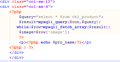
Solution with your provided code:
<div class="main">
    <div class="col-sm-12">
    <?
    while ( yourloop ... ) {
    ?>
        <div class="col-sm-4">
            // your stuff
        </div>
    <?
    }
    ?>
    </div>
</div>
What i have changed?
you need to use <div class="col-sm-4"> inside your loop and you can also follow the second example with clear:both; div.
UPDATE 2 (For Future aspects):
For new designers and developers you must need to understand Basic grid layouts:
FROM Bootstrap Examples:

You can also follow this link getting information about the difference between bootstrap classes:
FROM other answer:
- .col-xs = *Extra small devices (ie Phones) (<768px)
- .col-sm = Small devices (ie Tablets) (≥768px)
- .col-md = Medium devices (ie laptops, or small desktops) (≥992px)
- .col-lg = Large devices (ie Desktops) (≥1200px)*

