4

I am trying to make a circle and put 3 equals part around it. I saw the image below in the site, but I want three equals part and not four.

I want them (the parts) to be like a button. If someone click them they will refer to another page.

circle image

I tried a lot but without success. My goal is that each button around the circle will refer to another page. Is it possible to do it just with HTML and CSS? and if yes, how?

Harry
  • 87,580
  • 25
  • 202
  • 214
Web R
  • 565
  • 1
  • 6
  • 23
  • What would be within the parts? Is it just a shape (or) do you want to put content within the parts? – Harry Jan 16 '16 at 12:45
  • what html structure are you working on and what css have you tried so far ? it is of course possible via CSS3 or even SVG nowdays – G-Cyrillus Jan 16 '16 at 12:46
  • @Harry I want them to be like a button. If someone click them they will refer to another page. – Web R Jan 16 '16 at 12:48
  • @GCyrillus To be hoenst, I tried without success. I just did well the circle... – Web R Jan 16 '16 at 12:48
  • Ok and do you need it exactly like in the image (but with just 3 parts)? That is, an outer circle, an inner circle and only the area in between is clickable? Also, do the parts have plain color (or) gradient/image background? – Harry Jan 16 '16 at 12:52
  • 1
    Yes, harry. I can add them a color later or something. The main issue is how to do the inner circle @Harry – Web R Jan 16 '16 at 12:53
  • @WebR the inner circle, if not a link can just be a pseudo element in absolute position + z-index to bring it on top – G-Cyrillus Jan 16 '16 at 13:22

3 Answers3

4

Using CSS:

One pure CSS way to create this shape would be to use CSS skew transforms. Since you need click events on the parts, it is better to use separate elements instead of using pseudo-elements.

.outer {
  position: relative;
  height: 200px;
  width: 200px;
  border-radius: 50%;
  border: 2px solid;
  overflow: hidden;
}
.inner {
  position: absolute;
  height: 50%;
  width: 50%;
  top: calc(25% - 2px);
  left: calc(25% - 2px);
  border-radius: 50%;
  background: yellowgreen;
  border: 2px solid;
}
.part {
  position: absolute;
  height: 100%;
  width: 100%;
}
.part:nth-child(2) {
  top: -50%;
  left: calc(-50% - 2px);
  transform: skewY(-30deg);
  transform-origin: right bottom;
  background: red;
  border: 2px solid;  
}
.part:nth-child(3) {
  top: -50%;
  right: calc(-50% - 2px);
  transform: skewY(30deg);
  transform-origin: left bottom;
  background: green;
  border: 2px solid;
}
.part:nth-child(1) {
  top: 0%;
  left: 0%;
  width: 100%;
  background: yellow;
}
.part:hover {
  background: chocolate;
}
.part:nth-child(1) p{
  position: absolute;
  top: 85%;
  left: 50%;
  transform: translateX(-50%) translateY(-100%);
}
.part:nth-child(2) p{
  position: absolute;
  top: 50%;
  left: 55%;
  transform: skewY(30deg);
}
.part:nth-child(3) p{
  position: absolute;
  top: 50%;
  left: 30%;
  transform: skewY(-30deg);
}
<div class='outer'>
  <div class='part'><p>Text</p></div>
  <div class='part'><p>Text</p></div>
  <div class='part'><p>Text</p></div>
  <div class='inner'></div>
</div>

Using SVG:

I would still recommend using SVG for creating such shapes because it allows for better control over the circle and its parts. The co-ordinates for the path should be set by identifying points on the circle. The logic to identify the points on a circle is described in my answer here. It uses trigonometry.

svg {
  height: 30vw;
  width: 30vw;
}
svg circle {
  fill: transparent;
  stroke: black;
}
path {
  stroke: black;
}
#part1 {
  fill: green;
}
#part2 {
  fill: yellow;
}
#part3 {
  fill: red;
}
#inner {
  fill: yellowgreen;
}
#part1:hover,
#part2:hover,
#part3:hover {
  fill: chocolate;
}
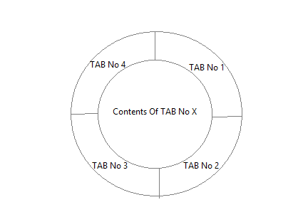
<svg viewBox='0 0 100 100'>
  <defs>
    <path d='M13.63,71 A42,42 0 0,1 50,8' id='path1' />
    <path d='M50,8 A42,42 0 0,1 86.37,71' id='path2' />
    <path d='M13.63,76 A42,42 0 0,0 86.37,76' id='path3' />
  </defs>

  <path d='M50,0 A50,50 0 0,0 7,75 L50,50z' id='part1' />  <!-- should use trignometry to calculate points - angle = 30deg -->
  <path d='M50,0 A50,50 0 0,1 93,75 L50,50z' id='part2' />  <!-- should use trignometry to calculate points - angle = 300deg -->
  <path d='M7,75 A50,50 0 0,0 93,75 L50,50z' id='part3' />  <!-- should use points calculated for previous two paths -->
  <circle cx='50' cy='50' r='40' id='inner' />
  
  <text font-family="Calibri" font-size="8" x="28">
    <textPath xlink:href="#path1">
      Tab 1 Text
    </textPath>
  </text>
  <text font-family="Calibri" font-size="8" x="28">
    <textPath xlink:href="#path2">
      Tab 2 Text
    </textPath>
  </text>  
  <text font-family="Calibri" font-size="8" x="28">
    <textPath xlink:href="#path3">
      Tab 3 Text
    </textPath>
  </text>  
</svg>
Community
  • 1
  • 1
Harry
  • 87,580
  • 25
  • 202
  • 214
  • Hi again Harry, Im sorry but I tried and I couldn't. How I can put text such as p element that containts "text" on each part? and that he will be in the center of each part? If you can do it, its will be awesome :) (With the CSS way) @Harry – Web R Jan 17 '16 at 21:41
  • @WebR: If you want to add text and stuff, I would strongly recommend using SVG because it offers a lot of options (like you can see in my snippet). With CSS, it becomes tough because we are using transforms and overflow settings to achieve the shape. It can be done with some absolute positioning and I'll add it into the answer. – Harry Jan 18 '16 at 06:29
3

okay, from a list you could use absolute + trasform: DEMO

ul,
li {
  margin: 0;
  padding: 0;
  list-style-type: none;
  display: block;
  box-sizing: border-box;
  overflow: hidden;
}

ul {
  margin: 1em auto;
  height: 300px;
  width: 300px;
  border: solid;
  border-radius: 50%;
  transform: rotate(45deg);
  background: #1D69A3;
}

li a {
  box-shadow: 0 0 5px;
  height: 100%;
  width: 100%;
  margin: -50%;
  position: absolute;
  background: tomato;
  top: 0;
  left: 0;
  transform-origin: bottom right;
  transform: rotate(0deg) skew(-15deg, -15deg);
}

li:nth-child(2) a {
  transform-origin: bottom left;
  transform: rotate(30deg) skew(15deg, 15deg);
  background: turquoise;
  top: 0;
  left: 100%;
}

li:nth-child(3) a {
  transform-origin: top right;
  top: auto;
  left: 0;
  bottom: 0;
  transform: rotate(-30deg) skew(15deg, 15deg);
  background: #7F9A12
}


/* hide center ? */

ul:before {
  content: '';
  position: absolute;
  top: 25%;
  left: 25%;
  right: 25%;
  bottom: 25%;
  background: purple;
  z-index: 1;
  border-radius: 50%;
  box-shadow: 0 0 5px, inset 15px 5px 15px 5px rgba(255, 255, 255, 0.2);
  border: solid 1px;
}
/* see some effects on hover */

a:hover {
  mix-blend-mode: multiply
}
ul:hover:before {
  mix-blend-mode:color
}
<ul>
  <li><a href="#"><b>item 1</b></a></li><!-- <b> is here if you wish to add text and style in order to show it -->
  <li><a href="#"><b>item 2</b></a></li>
  <li><a href="#"><b>item 3</b></a></li>
</ul>
G-Cyrillus
  • 101,410
  • 14
  • 105
  • 129
1

u can use border-radius, create four divs with border-radius 50% and one div with 100% border radius in center for your content

<div class="container">
<div class="around top-left">
</div>
<div class="around top-right">
</div>
<div class="around bottom-left">
</div>
<div class="around bottom-right">
</div>
<div class="content">
</div>
</div>

CSS:

.container{
  position:relative;
  width:200px;
  height:200px;
}
.content{
  width:50%;
  height:50%;
  left:50px;
  top:50px;
  position:absolute;
  background-color:white;
  z-index:1;
  border-radius:50%;
}
.around{
  background-color:red;
  width:100px;
  height:100px;
  display:inline-block;
  position:absolute;
}
.top-left{border-top-left-radius:100%; top:0; left:0; background:blue;}
.top-right{border-top-right-radius:100%; top:0; right:0;background:green;}
.bottom-left{border-bottom-left-radius:100%; bottom:0; left:0;background:orange;}
.bottom-right{border-bottom-right-radius:100%; bottom:0; right:0;background:purple;}

JSFiddle

Saeed Taran
  • 376
  • 2
  • 14