1

Here is what I am trying to achieve using Bootstrap:-

enter image description here

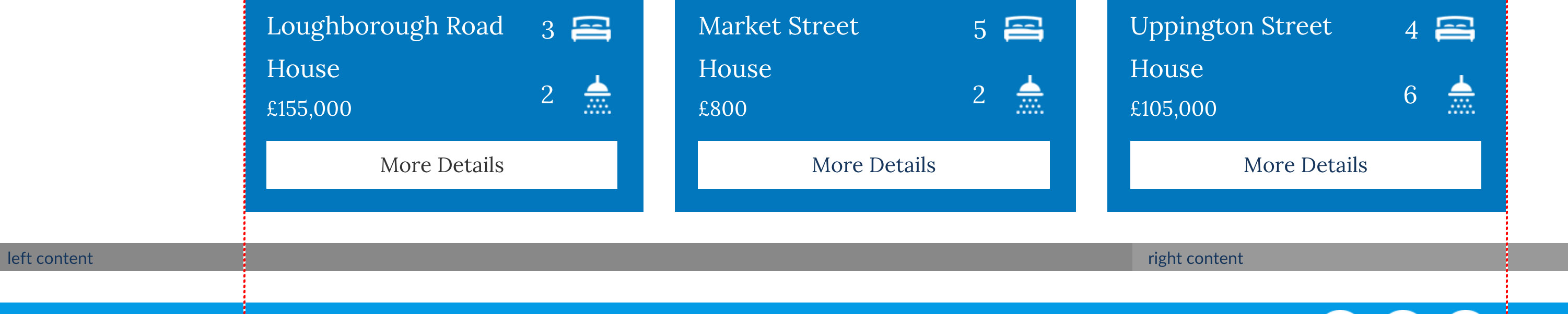
The red lines show the where container div is.

The thing I am having an issue with is the background colours. So for example if I did something as follows:-

    <div class="container-fluid">

        <div style="background: #888;" class="col-md-8">
            left content
        </div>

        <div style="background: #999;" class="col-md-4">
            right content
        </div>

    </div>

The backgrounds are how I want them to be but the 'left content' and 'right content' would then not be inside the 'container' like the rest of the sites content as shown below:-

enter image description here

How could I achieve this?

I'll explain further if this is not clear enough, thanks.


nsilva
  • 5,184
  • 16
  • 66
  • 108
  • what do you mean with "not be insode the container", they are in the container, aren't they? btw. container-fluid isn't a class in bootstrap 3 (outdated and removed) and you are missing the row... container > row > col – Dennis Heiden Jan 20 '16 at 22:01
  • @DennisHeiden `.container-fluid` most certainly is in bootstrap 3. It's the full width container whereas `.container` has a max-width. – bcr Jan 20 '16 at 22:21
  • yes you are right i have mixed that up with row-fluid, i am sorry you are still missing the row: http://getbootstrap.com/css/ – Dennis Heiden Jan 20 '16 at 22:24
  • updated the question which explains what I mean – nsilva Jan 20 '16 at 22:25
  • Possible duplicate of [CSS - how to overflow from div to full width of screen](http://stackoverflow.com/questions/28565976/css-how-to-overflow-from-div-to-full-width-of-screen) – vanburen Jan 21 '16 at 03:00

2 Answers2

1

One solution is to warp the container and add a gradient background to it. That background should only be visible when the two columns are next to each other.

CSS

@media (min-width: 992px ) {
  .wrap { background: linear-gradient(to right, #888 0%, #888 50%, #999 50%, #999 100%); }
}

HTML

<div class="wrap">
  <div class="container">
    <div class="row">
      <div class="col-md-8" style="background: #888;">
        Left content
      </div>
      <div class="col-md-4" style="background: #999;">
        Right content
      </div>
    </div>
  </div>
</div>

JSFiddle

azeós
  • 4,853
  • 4
  • 21
  • 40
0

try this

<div class="container-fluid">
<div class="row">
        <div style="background: #888;" class="col-md-8">
            left content
        </div>

        <div style="background: #999;" class="col-md-4">
            right content
        </div>
</div>
</div>
skander
  • 109
  • 1
  • 13