1

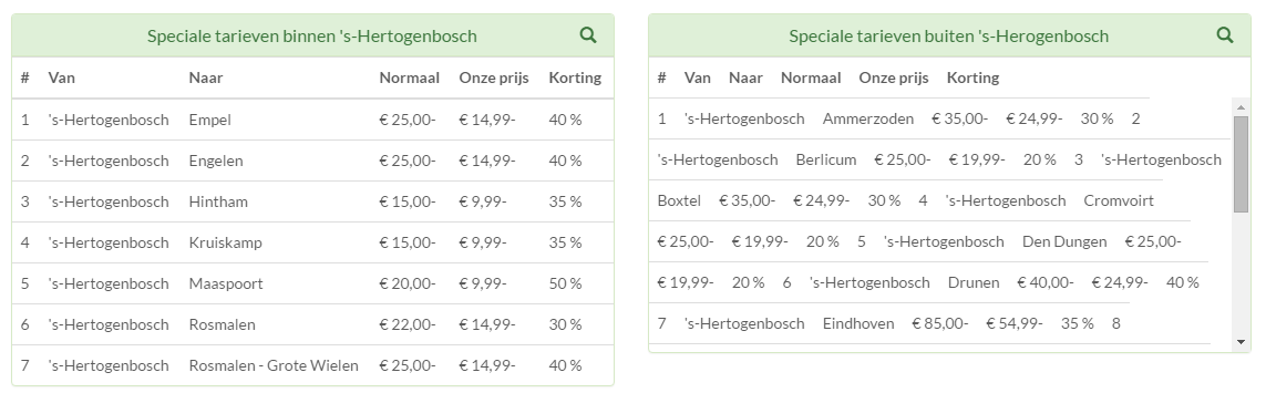
I want to create a table with a lot of data. To keep it all sorted out, I want the table to be scrollable. I use bootstrap to pimp up the table. I know this question is asked before and the solution does work for me, but my table is a mess. See the table on the right for what it looks like. I want it to look more like the table to the left.

enter image description here

So what I tried is:

<div class="panel panel-success">
    <div class="panel-heading">
        <h3 class="panel-title">Speciale tarieven buiten 's-Herogenbosch</h3>

        <div class="pull-right">
                        <span class="clickable filter" data-toggle="tooltip" title="Klik om te zoeken"
                              data-container="body">
                            <i class="glyphicon glyphicon-search"></i>
                        </span>
        </div>
    </div>
    <div class="panel-body">
        <input type="text" class="form-control" id="task-table-filter" data-action="filter"
               data-filters="#task-table" placeholder="Zoek naar een plaats.."/>
    </div>
    <table class="table table-hover table-fixed" id="task-table">
        <thead>
        <tr>
            <th >#</th>
            <th>Van</th>
            <th>Naar</th>
            <th>Normaal</th>
            <th>Onze prijs</th>
            <th>Korting</th>
        </tr>
        </thead>
        <tbody class="alignmentp">
        <tr>
            <td>1</td>
            <td>'s-Hertogenbosch</td>
            <td>Ammerzoden</td>
            <td>€ 35,00-</td>
            <td>€ 24,99-</td>
            <td>30 %</td>
        </tr>
        <tr>
            <td>2</td>
            //etc etc
        </tr>
        </tbody>
    </table>
</div>

And the CSS I use with this is:

.alignmentp{
text-align: left !important;
}

.table-fixed thead {
width: 97%;
}
.table-fixed tbody {
height: 230px;
overflow-y: auto;
width: 100%;
}
.table-fixed thead, .table-fixed tbody, .table-fixed tr, .table-fixed td,     .table-fixed th {
display: block;
}
.table-fixed tbody td, .table-fixed thead > tr> th {
float: left;
border-bottom-width: 0;
}

I can fix this table by manually correcting the width and height of each <"tr"> and <"td"> element, but there must be a better way of doing this..

Jack Bashford
  • 43,180
  • 11
  • 50
  • 79
Mirwais
  • 131
  • 1
  • 4
  • 18

3 Answers3

0

You can check this answer it was helpful for me.

In HTML you can add this:

<div class="panel panel-default">
    <div class="panel-body">
        <table id="myTable" class="table table-hover table-fixedheader table-bordered table-striped">
            <thead>
                <tr>
                    <th width="15%">Column1Column1Column1Column1</th>
                    <th width="15%">Column2</th>
                    <th width="15%">Column3</th>
                    <th width="15%">Column4</th>
                    <th width="40%">Column5</th>
                </tr>
            </thead>
            <tbody style="height:110px">
                <tr>
                    <td width="15%">aaaaaaaaaaa</td>
                    <td width="15%">bbbbbbbbbbb</td>
                    <td width="15%">ccccccccccc</td>
                    <td width="15%">ddddddddddd</td>
                    <td width="40%">eeeeeeeeeee</td>
                </tr>
            </tbody>
        </table>
    </div>
</div>

In your CSS add this link:

 table.table-fixedheader {
    width: 100%;   
}

 table.table-fixedheader, table.table-fixedheader>thead, table.table-fixedheader>tbody, table.table-fixedheader>thead>tr, table.table-fixedheader>tbody>tr, table.table-fixedheader>thead>tr>th, table.table-fixedheader>tbody>td {
    display: block;
}
table.table-fixedheader>thead>tr:after, table.table-fixedheader>tbody>tr:after {
    content:' ';
    display: block;
    visibility: hidden;
    clear: both;
}

 table.table-fixedheader>tbody {
    overflow-y: scroll;
    height: 100px;
    
}

 table.table-fixedheader>thead {
    overflow-y: scroll;    
}

 table.table-fixedheader>thead::-webkit-scrollbar {
    background-color: inherit;
}


table.table-fixedheader>thead>tr>th:after, table.table-fixedheader>tbody>tr>td:after {
    content:' ';
    display: table-cell;
    visibility: hidden;
    clear: both;
}

 table.table-fixedheader>thead tr th, table.table-fixedheader>tbody tr td {
    float: left;    
    word-wrap:break-word;     
}
Andrew
  • 307
  • 7
  • 13
moheb hawari
  • 311
  • 4
  • 9
  • This does work, but it does not support responsiveness. On full-screen the table looks good, but when I resize the window, everything gets messed up. – Mirwais Jan 26 '16 at 22:22
  • Sorry i forget to add class table-hover in the table tag ,,, add it and it will be fine :) – moheb hawari Jan 28 '16 at 10:15
  • did you use the **datatables.bootstrap.js** and **dataTables.responsive.js** ,,, if you not you can download it and include it in your project and replace the id name in the table tag to 'id="dataTables-example"' ,, this will make your table more flixable – moheb hawari Jan 28 '16 at 10:26
0

Sounds like you are having problems with your columns not lining up. What you could do is find out how wide your widest element is (<td> or <th>) and then set all <td> and <th> elements to that width.

Another possible solution is to add the table-responsive class to your table, as defined in the Bootstrap table docs, and make the width of your <td> and <th> elements be defined by how many there are in a row. If there are five <td>s in a <tr>, set the width of the <td>s to be 20%.

Hope this fixed your problem, if not, just comment below and I'll try again.

Jack Bashford
  • 43,180
  • 11
  • 50
  • 79
0
.fixHeader{
    overflow-y: auto;
}

.fixHeader th {
    position: sticky;
    top: 0;
    background-color: #b4bab4;
  }

  .fixHeader table {
    border-collapse: collapse;
    width: 100%;
  }

  .fixHeader th,
  .fixHeader td {
    padding: 8px 16px;
  }

     <div class="fixHeader" style="height:200px;">
          <table class="table card-border">
            <thead class="tableHead">
              <tr>
                <th scope="col">
                    <label class="form-check-label">xyz</label>
                </th>
                <th scope="col"> abc</th>
              </tr>
            </thead>
            <tbody>
              <tr *ngFor="let item of listData">
                <td>
                  <div class="form-check">
                    {{item.Name}}
                  </div>
                </td>
                <td>
                  <label class="form-check-label">{{ item.Value }}</label>
                </td>
              </tr>
            </tbody>
          </table>
        </div>