14

I am new to bootstrap. This is the design I am trying to make: enter image description here

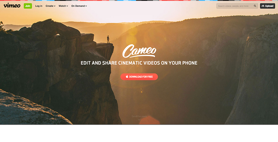
As you can see the navbar is on top op the background image. This is what I have:

 <!DOCTYPE html>
    <html lang="en">
    <head>
               <meta charset="utf-8">
<meta name="viewport" content="width=device-width, initial-scale=1">
<link rel="stylesheet" href="http://maxcdn.bootstrapcdn.com/bootstrap/3.3.4/css/bootstrap.min.css">
<script src="https://ajax.googleapis.com/ajax/libs/jquery/1.11.3/jquery.min.js"></script>
<script src="http://maxcdn.bootstrapcdn.com/bootstrap/3.3.4/js/bootstrap.min.js"></script>

<style>
        <style>
.navbar-default {
background: none;
border: none;
}

body{
    height:100%;
}
        html{
            background: url('sun.jpg') no-repeat center center fixed;
            -webkit-background-size:cover;
            -moz-background-size:cover;
            -o-background-size:cover;
            background-size:cover;
            background-position: 0 0;

        }
        </style>

    </head>
<body>

        <nav class="navbar navbar-default">
            <div class="container">
                <ul class="nav navbar-nav"> 
                    <li class="active"><a href="#">home</a></li>
                    <li><a href="#">ask a question!</a></li>
                    <li><a href="#">learn</a></li>
                    <li><a href="#">contact</a></li>
                </ul>
            </div>

        </nav>

</body>
</html>

gives:

enter image description here

I don't know how to put it on the image itself instead of above.

short sidequestion: what makes it that the picture from vimeo makes it look so much better than the image I use from the sun? on my image you can see all the pixels etc... Is this due to the fact that it might be a too small image and that it has to be stretched a lot to fit the whole page?

EDIT:

this is what I tried but didn't work

    <nav class="navbar navbar-default">
        <div class="container">
            <ul class="nav navbar-nav"> 
                <li class="active"><a href="#">home</a></li>
                <li><a href="#">ask a question!</a></li>
                <li><a href="learn.html">learn</a></li>
                <li><a href="#">contact</a></li>
            </ul>
            <style>
            .navbar{
                background:transparent;
            }
            </style>
        </div>

    </nav>
Carol Skelly
  • 351,302
  • 90
  • 710
  • 624

5 Answers5

9

Bootstrap 4

The Navbar has no background color, so it's transparent by default. Just remember to use navbar-light or navbar-dark so the link colors work with the contrast of the background image. Display of the toggler is also based on navbar-(dark or light).

https://www.codeply.com/go/FTDyj4KZlQ

<nav class="navbar navbar-expand-sm fixed-top navbar-light">
    <div class="container">
        <button class="navbar-toggler navbar-toggler-right" type="button" data-toggle="collapse" data-target="#navbar1">
            <span class="navbar-toggler-icon"></span>
        </button>
        <a class="navbar-brand" href="#">Brand</a>
        <div class="collapse navbar-collapse" id="navbar1">
            <ul class="navbar-nav">
                <li class="nav-item active">
                    <a class="nav-link" href="#">Link</a>
                </li>
            </ul>
        </div>
    </div>
</nav>

Bootstrap 3

Use navbar-fixed-top and then change the CSS to make it transparent. Here's an example of a custom transparent navbar. http://www.codeply.com/go/JNy8BtYSem

  <nav id="nav" class="navbar navbar-fixed-top" data-spy="affix">
    <div class="container">
        <div class="navbar-header">
      <a href="#" class="navbar-brand">Brand</a>
      <a class="navbar-toggle" data-toggle="collapse" data-target=".navbar-collapse">
        <i class="fa fa-bars"></i>
      </a>
      </div>
      <div class="navbar-collapse collapse">
        <ul class="nav navbar-nav">
          <li><a href="#">Link</a></li>
          <li><a href="#">Link</a></li>
        </ul>
        <ul class="nav pull-right navbar-nav">
          <li>
           <a href="#">Link</a>
          </li>
        </ul>
      </div>        
    </div>
  </nav>

This question is only to make the transparent Navbar. To change style after scrolling or at some Navbar position see: Animate/Shrink NavBar on scroll using Bootstrap 4

Carol Skelly
  • 351,302
  • 90
  • 710
  • 624
  • any idea about the side question? – LandonZeKepitelOfGreytBritn Feb 02 '16 at 13:33
  • This looks terrible. Fixed-top makes the navbar overlap text when scrolling down. – Manuel Fedele Nov 15 '19 at 11:05
  • 1
    @MilesDavis - so you think it deserves a downvote even though it specifically answers the question? it's not my fault that "This looks terrible". If you want to change the style/color after scroll see this: question/answer https://stackoverflow.com/questions/42237406/animate-shrink-navbar-on-scroll-using-bootstrap-4/42250478#42250478 – Carol Skelly Nov 15 '19 at 11:19
1

You need to remove the background from your nav-bar:

.navbar-default {
    background: none;
}

<link href="https://maxcdn.bootstrapcdn.com/bootstrap/3.3.6/css/bootstrap.min.css" rel="stylesheet"/>

<style>
html,
body {
  height: 100%;
 background: red;
}

.navbar-default {
    background: none;
   border: none;
}
</style>

<!-- Wrap all page content here -->
<div id="wrap">
  
  <!-- Fixed navbar -->
  <div class="navbar navbar-default navbar-fixed-top">
    <div class="container">
      <div class="navbar-header">
        <button type="button" class="navbar-toggle" data-toggle="collapse" data-target=".navbar-collapse">
          <span class="icon-bar"></span>
          <span class="icon-bar"></span>
          <span class="icon-bar"></span>
        </button>
        <a class="navbar-brand" href="#">Project name</a>
      </div>
      <div class="collapse navbar-collapse">
        <ul class="nav navbar-nav">
          <li class="active"><a href="#">Home</a></li>
          <li><a href="#about">About</a></li>
          <li><a href="#contact">Contact</a></li>
          <li class="dropdown">
            <a href="#" class="dropdown-toggle" data-toggle="dropdown">Dropdown <b class="caret"></b></a>
            <ul class="dropdown-menu">
              <li><a href="#">Action</a></li>
              <li><a href="#">Another action</a></li>
              <li><a href="#">Something else here</a></li>
              <li class="divider"></li>
              <li class="dropdown-header">Nav header</li>
              <li><a href="#">Separated link</a></li>
              <li><a href="#">One more separated link</a></li>
            </ul>
          </li>
        </ul>
      </div><!--/.nav-collapse -->
    </div>
  </div>
  
</div>
Turnip
  • 35,836
  • 15
  • 89
  • 111
  • I tried your solution as well, but didn't work. I edited my question(I tried non iso transparant as well), did I misunderstand anything? Ps: any idea about the side question? – LandonZeKepitelOfGreytBritn Feb 02 '16 at 13:11
  • Where in your code are you loading bootstrap.css? Your custom styles need to come _after_ you load bootstrap – Turnip Feb 02 '16 at 13:14
0
.navbar{
    background:transparent;
}

This will make your background transparent.

tiny sunlight
  • 6,231
  • 3
  • 21
  • 42
0

Just take the backgound image in Body and then use this code

             <div class="navbar navbar-inverse navbar-fixed-top">
              <div class="container">
                <div class="navbar-header">
                  <button type="button" class="navbar-toggle" data-         
                toggle="collapse" data-target=".navbar-collapse">
                    <span class="icon-bar"></span>
                    <span class="icon-bar"></span>
                    <span class="icon-bar"></span>
                  </button>
                  <a class="navbar-brand" href="#">Brand</a>
                </div>
                <div class="collapse navbar-collapse">
                  <ul class="nav navbar-nav">
                    <li class="active"><a href="#">Home</a></li>
                    <li><a href="#about">About</a></li>
                  </ul>
                  <ul class="nav navbar-nav navbar-right">
                    <li><a href="#">Username</a></li>
                  </ul>
                </div>
              </div>
            </div>

            <div class="wide">
                <div class="col-xs-5 line"><hr></div>
                <div class="col-xs-2 logo">Logo</div>
                <div class="col-xs-5 line"><hr></div>
            </div>

            <div class="container">
              <div class="text-center">
                <h1>Content</h1>
              </div>
            </div>

Also used styling style="opacity:0.6;" in Navbar div

Saad Mirza
  • 1,154
  • 14
  • 22
0

The background colour is set on the .navbar-default class so make sure your css is using that class to target turning the bar transparent. e.g.

.navbar-default{background-color: transparent;}

As Turnip states, this needs to be applied after the bootstrap styles in your <head>

If you really want to force it whilst you are getting it to work add the following attribute to your <nav> element

style="background-color: transparent;"

So your nav element looks like this:

 <nav class="navbar navbar-default" style="background-color: transparent;">

However, it obviously better to have this within a CSS file, rather than as inline HTML

elmarko
  • 813
  • 7
  • 17