RESPONSIVE DIV CONTAINING IMAGE AND CONTENT
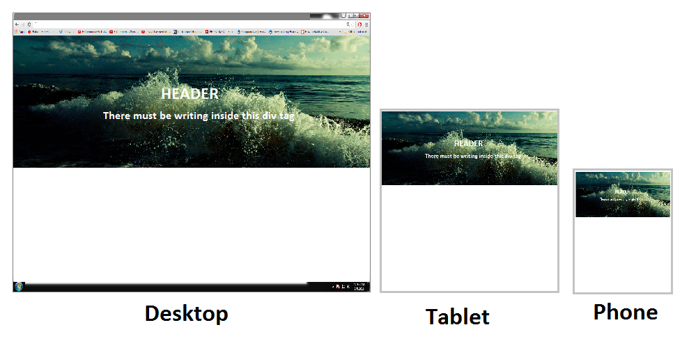
I am trying to have a div that contains a background image which has content (writing) on it as shown in the picture. The div needs to be responsive, and the image has to remain 100% and reach but not exceed the frame of the screen no matter what size the screen is.
The problem is that when I zoom out, by pressing ctrl and scroll down on the mouse, the image loses alot of it's height rather than stay the same height. How do i make it not lose its height when zooming in and out.
I've tried everything and this is the best I've got
enter code here


       <div id="container">
            <div class="content-inner">
                <h1>HELLO!!</h1>
                <hr>
                <p>I HAVE A QUESTION AND WAS WONERING IF YOU CAN HELP?</p>

            </div>
        </div>


<style>
html, body{
margin:0;
}
#container {
    position:relative;
    border:1px solid red;
    position: relative;
    width: 100%;
    min-height: auto;
    text-align: center;
    color: #fff;

    background: radial-gradient(circle, rgba(17, 5, 19, 0.94), rgba(20, 7, 35, 0.78), rgb(0, 0, 0)), url(backgrounddark.png) no-repeat;
    background-position: center;
    -webkit-background-size: cover;
    -moz-background-size: cover;
    background-size: cover;
    -o-background-size: cover;
            }

#container .content-inner {
    position: relative;
    width: 50%;
    padding: 100px 15px;
    text-align: center;
    margin:auto;
                        }

#container .content-inner .content-inner h1 {
    margin-top: 0;
    margin-bottom: 0;
    text-transform: uppercase;
    font-weight: 700;
}

#container .content-inner .content-inner hr {
    margin: 30px auto;
}

#container .content-inner .content-inner p {
    margin-bottom: 50px;
    font-size: 16px;
    font-weight: 300;
    color: rgba(255,255,255,.7);
}


</style>
Thanks