4

i want to add bootstrap row with col-lg-3class. my div contains different heights.hope to add articles with different length texts. 
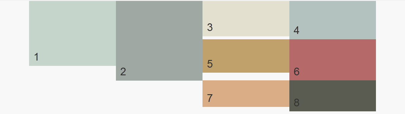
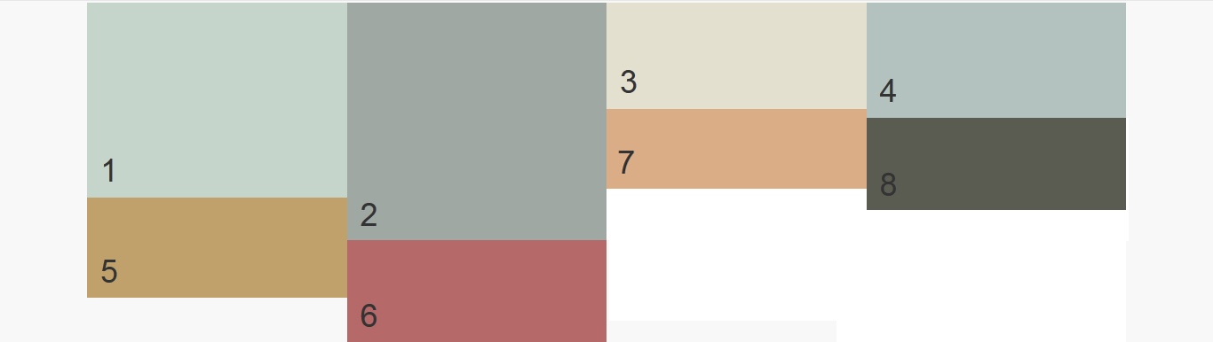
my output is but designed expected output and here. code as follows

<div class="row">
    <div class="col-lg-3" style="background-color: #c5d5cb"><p style="height: 150px">1</p></div>
    <div class="col-lg-3" style="background-color: #9fa8a3"><p style="height: 200px">2</p></div>
    <div class="col-lg-3" style="background-color: #e3e0cf"><p style="height: 50px">3</p></div>
    <div class="col-lg-3" style="background-color: #b3c2bf"><p style="height: 60px">4</p></div>  

    <div class="col-lg-3" style="background-color: #173e43"><p style="height: 44px">5</p></div>
    <div class="col-lg-3" style="background-color: #b56969"><p style="height: 70px">6</p></div>
    <div class="col-lg-3" style="background-color: #daad86"><p style="height: 20px">7</p></div>
    <div class="col-lg-3" style="background-color: #5a5c51"><p style="height: 35px">8</p></div> 
</div>

Updated values put as 1,2,3 etc comes from mysql database. so the height is equal to text row numbers. php code is follows `

    foreach ($value as $add) {
        echo "<div class='col-md-3'><p>";
        echo $add->item;
        echo "</p></div>";
    }
    ?>`
Geeth Welagedara
  • 614
  • 1
  • 8
  • 24

4 Answers4

2

Perhaps, I ruin your original code. I change everywhere. I hope this helps you.

  1. Add customized stylesheet inside tag head:

<style> .col-md-3{padding:0px;} // default: 15px -> left and right. </style>

  1. Here's the code:

<div class="container"> <div class="col-md-12"> <div class="col-md-3"> <div class="col-md-12" style="background-color: #c5d5cb;height: 150px;"> 1 </div> <div class="clearfix"></div> <div class="col-md-12" style="background-color: #173e43;height: 44px; color:white;"> 5 </div> </div> <div class="col-md-3"> <div class="col-md-12" style="background-color: #9fa8a3;height: 200px;"> 2 </div> <div class="clearfix"></div> <div class="col-md-12" style="background-color: #b56969;height: 70px;"> 6 </div> </div> <div class="col-md-3"> <div class="col-md-12" style="background-color: #e3e0cf;height: 50px;"> 3 </div> <div class="col-md-12" style="background-color: #daad86;height: 20px;"> 7 </div> </div> <div class="col-md-3"> <div class="col-md-12" style="background-color: #b3c2bf;height: 60px;"> 4 </div> <div class="col-md-12" style="background-color: #5a5c51;height: 35px;"> 8 </div> </div> </div> </div>

Because I don't know what version of your bootstrap, I use v3.1.1 for clearfix ... you can customize this based on your version.

Joe Kdw
  • 2,245
  • 1
  • 21
  • 38
  • it's work perfectly.. @herman do u have idea to put these `div` in a sql result `

    "; echo $add->item; echo "

    "; } ?> ` i mean all

    values comes from database, height is no of text rows.

    – Geeth Welagedara Feb 06 '16 at 09:46
  • Final this question first then start again with your new question since your question has no related to mysql script. Besides, future members will read this and see if the question has been solved – Joe Kdw Feb 06 '16 at 09:54
1

You are on right track. This will definitely work. You need to use col-md-3 like this :

<div class="row">
<div class="col-md-3">
    <p>1</p>
    <p>5</p>
</div>
<div class="col-md-3">
   <p>2</p>
   <p>6</p>
</div>
<div class="col-md-3">
   <p>3</p>
   <p>7</p>
</div>
<div class="col-md-3">
   <p>4</p>
   <p>8</p>
</div>
</div>
pritesh
  • 533
  • 4
  • 15
0

I think try this

<div class="row">
  <div class="col-lg-5">
   <div id="1"  ></div>
   <div id="5"  ></div>
  </div>
<div class="col-lg-5">
   <div id="2"  ></div>
   <div id="6"  ></div>
  </div>
<div class="col-lg-5">
   <div id="3"  ></div>
   <div id="7"  ></div>
  </div>
<div class="col-lg-5">
   <div id="4"  ></div>
   <div id="8"  ></div>
  </div>
</div>

Hope this will help you..

Rahul Chaudhari
  • 148
  • 1
  • 17
0

You can first use columns with col-lg-3 and then place your blocks inside each one. That way you will get your desired result.

HTML:

<div class="container">
  <div class="row">
    <div class="col-lg-3 grid-row">
      <div class="left-block" style="background-color: #c5d5cb"><p style="height: 150px">1</p></div>
      <div class="left-block" style="background-color: #173e43"><p style="height: 44px">5</p></div>
    </div>
    <div class="col-lg-3 grid-row">
      <div class="left-block" style="background-color: #9fa8a3"><p style="height: 200px">2</p></div>
      <div class="left-block" style="background-color: #b56969"><p style="height: 70px">6</p></div>
    </div>
    <div class="col-lg-3 grid-row">
      <div class="left-block" style="background-color: #e3e0cf"><p style="height: 50px">3</p></div>
      <div class="left-block" style="background-color: #daad86"><p style="height: 20px">7</p></div>
    </div>
    <div class="col-lg-3 grid-row">
      <div class="left-block" style="background-color: #b3c2bf"><p style="height: 60px">4</p></div>
      <div class="left-block" style="background-color: #5a5c51"><p style="height: 35px">8</p></div>
    </div>
  </div>
</div>

CSS:

.grid-row{
  margin-left: -15px;
  margin-right: -15px;
}
.left-block{
  float: left;
  width: 100%;
}

Jsfiddle: https://jsfiddle.net/debraj/6dufsc4u/1/

Hope that helps.

DebRaj
  • 599
  • 4
  • 16