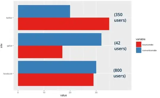
I have some data like this:
site <- c('twitter', 'facebook', 'gplus')
bouncerate <- c(35, 29, 17)
conversionrate <- c(20, 30, 32)
users <- c(350, 800, 42)
df <- data.frame(site, bouncerate, conversionrate, users) %>% melt()
I’m plotting it like so:
ggplot(subset(df, variable!='users'), aes(x=site, y=value)) +
  geom_bar(stat="identity", aes(fill=variable), position="dodge") +
  coord_flip() +
  scale_fill_brewer(palette = "Set1”)
As you can see, I’m trying to plot the “rate” variables. But I’d also like to drop the value of the “users” variable over on the right side of the bars. It’d look something like this:
So my question is, how do I get those user counts over there? I thought maybe geom_label could do this, but I can’t see how to tie the coordinates of the label to the cluster.
And, while the above example doesn’t show it, I would be thrilled if the cluster with the biggest number of users was at the top, and the rest descended from there.

