I'm having static(when scrolling on lower screens it stays on same place), fixed size first column(100px) in responsive table by Bootstrap. What i want is to have others columns same size each (of the rest space: 100%-100px) with min-width css(so when it comes lower responsive starts to works). And I don't know how much non static columns i will have so col-md/xs.. are not appropriately.
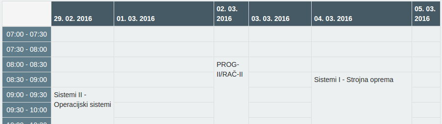
In photo there is thead with dates which should share remaining space, but only to min-width for example 80px. If lower then responsive should work. Anyway I want to make timetable.
Code source:
<div class="table-responsive">
<table class="table table-condensed table-bordered" ng-if="showTable">
    <thead>
        <tr style="background-color: #455A64; color: #FFFFFF;">
            <th style="background-color:#F5F5F5;"></th>
            <th ng-repeat="..." ng-if="..." id="{{...}}">{{ ... }}</th>
        </tr>
    </thead>
    <tbody>
        <tr ng-repeat="..." ng-if="...">
            <td style="text-align:center;background-color:#607D8B; color:#FFFFFF">{{ ... }}</td>
            <td ng-repeat="..." rowspan="{{...}}" ng-if="...">{{ ... }} </td>
        </tr>
    </tbody>
</table>
<div>
And one more thing. I don't want to text in td to go over table border. So it should adjust to size of td.