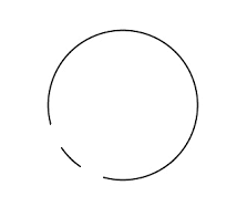
Can we create transparent circle with cut inside with css and html? I have attached the image for the clarification
.circle {
  width: 150px;
  height: 150px;
  border-radius: 50%;
  border: 1px solid black;
}
<div class="circle"></div>Can we create transparent circle with cut inside with css and html? I have attached the image for the clarification
.circle {
width: 150px;
height: 150px;
border-radius: 50%;
border: 1px solid black;
}<div class="circle"></div>
You can do this with :after pseudo-element
.circle {
  width: 150px;
  height: 150px;
  border-top: 2px solid black;
  border-left: 2px solid black;
  border-right: 2px solid black;
  border-bottom: 2px solid transparent;
  border-radius: 50%;
  position: relative;
  transform: rotate(30deg);
}

.circle:after {
  content: '';
  position: absolute;
  bottom: 0;
  border-radius: 50%;
  height: 10px;
  width: 40px;
  left: 50%;
  transform: translate(-50%, 7%);
  border-bottom: 2px solid black;
  border-top: 2px solid transparent;
  border-left: 2px solid transparent;
  border-right: 2px solid transparent;
}
<div class="circle"></div>SVG might be an option.
See this excellent Answer
svg {
  height: 100px;
  width: 100px;
}
circle {
  fill: transparent;
  stroke: green;
  stroke-width: 3;
}
.dashed {
  stroke-dasharray: 75, 10;
}
div {
  height: 100px;
  width: 100px;
  color: green;
  font-weight: bold;
  text-align: center;
  line-height: 100px;
}
<svg viewBox="0 0 120 120">
<circle cx="55" cy="55" r="50" class="dashed" />
</svg>