10

I'm fairly new to WPF but experienced in .NET (Winforms). I'm trying to manipulate the highlight style of a listbox to control the focused and unfocused color of the selected item. Every single tutorial on this that I have found uses a custom style to assign a new value to the SystemColors.HighlightBrushKey and SystemColors.ControlBrushKey. But it isn't working. After countless hours trying to get this to work, it occurred to me that maybe it was OS related. I had been trying it on a Windows 10 system. I ran the exact same code on a Windows 7 setup, and lo and behold, it worked!

So apparently the old method doesn't work in Windows 10 (at least that's what it looks like to me). Has anybody found an alternative? At the end of the day, I just want the listbox to maintain the bright highlight even when it doesn't have focus. The default grey highlight is difficult to see, and doesn't seem appropriate in some usages. I have a real world scenario where it feels very unnatural for the highlight to basically disappear when the focus moves away from the ListBox.

Below is the XAML code I used that worked on Windows 7 but not on Windows 10. (By the way, I have also tried replacing SystemColors.ControlBrushKey with SystemColors.InactiveSelectionHighlightBrushKey -- the results were the same).

    <Window x:Class="TestApp.TestWindow"
        xmlns="http://schemas.microsoft.com/winfx/2006/xaml/presentation"
        xmlns:x="http://schemas.microsoft.com/winfx/2006/xaml"
        xmlns:d="http://schemas.microsoft.com/expression/blend/2008"
        xmlns:mc="http://schemas.openxmlformats.org/markup-compatibility/2006"
        xmlns:local="clr-namespace:TestApp"
        mc:Ignorable="d"
        Title="TestWindow" Height="300" Width="300" Loaded="Window_Loaded">
    <Window.Resources>
        <Style x:Key="myListboxStyle">
            <Style.Resources>
                <!-- Background of selected item when focused -->
                <SolidColorBrush x:Key="{x:Static SystemColors.HighlightBrushKey}" Color="Red" />
                <!-- Background of selected item when not focused -->
                <SolidColorBrush x:Key="{x:Static SystemColors.ControlBrushKey}" Color="Green" />
            </Style.Resources>
        </Style>
    </Window.Resources>
    <Grid>
        <ListBox x:Name="listBox" Style="{StaticResource myListboxStyle}" HorizontalAlignment="Left" Height="100" Margin="22,18,0,0" VerticalAlignment="Top" Width="237">
            <ListBoxItem>Test 1</ListBoxItem>
            <ListBoxItem>Test 2</ListBoxItem>
            <ListBoxItem>Test 3</ListBoxItem>
        </ListBox>
            <TextBox x:Name="textBox" HorizontalAlignment="Left" Height="23" Margin="50,165,0,0" TextWrapping="Wrap" Text="TextBox" VerticalAlignment="Top" Width="120"/>

    </Grid>
</Window>
Taterhead
  • 5,763
  • 4
  • 31
  • 40
Cosmicjive
  • 185
  • 2
  • 12
  • Quote "a control requiring you to go down this road is poorly designed (including parts of the WPF stock controls)." from https://blogs.msdn.microsoft.com/wpf/2010/11/30/systemcolors-reference/ – Wouter Jan 15 '19 at 18:44
  • @Wouter quote "We don’t advise using this practice, and we are studying this problem so that we may provide a better mechanism." - and what is "a better mechanism" other than completely overriding full template to change the color of a single element? – vitidev Apr 28 '22 at 01:01

4 Answers4

19

Microsoft broke this for windows 10, but we can fix it!

Here is what the template looks like in windows 10 (just the parts i care about):

   <ControlTemplate TargetType="{x:Type ListBoxItem}">
 ...
        <Border x:Name="Bd" BorderBrush="{TemplateBinding BorderBrush}" BorderThickness="{TemplateBinding BorderThickness}" Background="{TemplateBinding Background}" Padding="{TemplateBinding Padding}" SnapsToDevicePixels="True">
            <ContentPresenter ContentTemplate="{TemplateBinding ContentTemplate}" Content="{TemplateBinding Content}" ContentStringFormat="{TemplateBinding ContentStringFormat}" HorizontalAlignment="{TemplateBinding HorizontalContentAlignment}" SnapsToDevicePixels="{TemplateBinding SnapsToDevicePixels}" VerticalAlignment="{TemplateBinding VerticalContentAlignment}"/>
        </Border>
        <ControlTemplate.Triggers>
            <MultiTrigger>
                <MultiTrigger.Conditions>
                    <Condition Property="IsMouseOver" Value="True"/>
                </MultiTrigger.Conditions>
                <Setter Property="Background" TargetName="Bd" Value="#1F26A0DA"/>
                <Setter Property="BorderBrush" TargetName="Bd" Value="#A826A0DA"/>
            </MultiTrigger>
            <MultiTrigger>
                <MultiTrigger.Conditions>
                    <Condition Property="Selector.IsSelectionActive" Value="False"/>
                    <Condition Property="IsSelected" Value="True"/>
                </MultiTrigger.Conditions>
                <Setter Property="Background" TargetName="Bd" Value="#3DDADADA"/>
                <Setter Property="BorderBrush" TargetName="Bd" Value="#FFDADADA"/>
            </MultiTrigger>
            <MultiTrigger>
                <MultiTrigger.Conditions>
                    <Condition Property="Selector.IsSelectionActive" Value="True"/>
                    <Condition Property="IsSelected" Value="True"/>
                </MultiTrigger.Conditions>
                <Setter Property="Background" TargetName="Bd" Value="#3D26A0DA"/>
                <Setter Property="BorderBrush" TargetName="Bd" Value="#FF26A0DA"/>
            </MultiTrigger>
            <Trigger Property="IsEnabled" Value="False">
                <Setter Property="TextElement.Foreground" TargetName="Bd" Value="{DynamicResource {x:Static SystemColors.GrayTextBrushKey}}"/>
            </Trigger>
        </ControlTemplate.Triggers>
    </ControlTemplate>

Notice they have hard-coded the values for the colors, like "#1F26A0DA".

In windows 7, the built-in template for ListBoxItems was:

         <ControlTemplate TargetType="{x:Type ListBoxItem}">
...
                    <Border x:Name="Bd" BorderBrush="{TemplateBinding BorderBrush}" BorderThickness="{TemplateBinding BorderThickness}" Background="{TemplateBinding Background}" Padding="{TemplateBinding Padding}" SnapsToDevicePixels="true">
                        <ContentPresenter HorizontalAlignment="{TemplateBinding HorizontalContentAlignment}" SnapsToDevicePixels="{TemplateBinding SnapsToDevicePixels}" VerticalAlignment="{TemplateBinding VerticalContentAlignment}"/>
                    </Border>
                    <ControlTemplate.Triggers>
                        <Trigger Property="IsSelected" Value="true">
                            <Setter Property="Background" TargetName="Bd" Value="{DynamicResource {x:Static SystemColors.HighlightBrushKey}}"/>
                            <Setter Property="Foreground" Value="{DynamicResource {x:Static SystemColors.HighlightTextBrushKey}}"/>
                        </Trigger>
                        <MultiTrigger>
                            <MultiTrigger.Conditions>
                                <Condition Property="IsSelected" Value="true"/>
                                <Condition Property="Selector.IsSelectionActive" Value="false"/>
                            </MultiTrigger.Conditions>
                            <Setter Property="Background" TargetName="Bd" Value="{DynamicResource {x:Static SystemColors.InactiveSelectionHighlightBrushKey}}"/>
                            <Setter Property="Foreground" Value="{DynamicResource {x:Static SystemColors.InactiveSelectionHighlightTextBrushKey}}"/>
                        </MultiTrigger>
                        <Trigger Property="IsEnabled" Value="false">
                            <Setter Property="Foreground" Value="{DynamicResource {x:Static SystemColors.GrayTextBrushKey}}"/>
                        </Trigger>
                    </ControlTemplate.Triggers>
          </ControlTemplate>

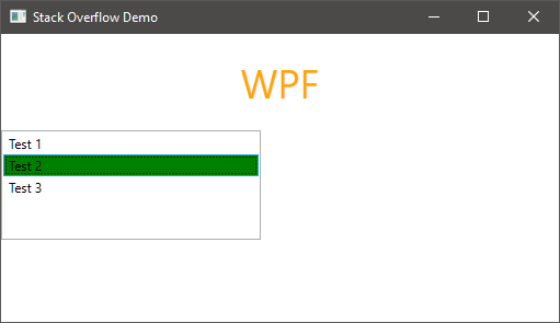
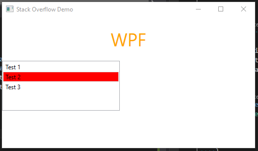
So basically Microsoft was using resources like "SystemColors.InactiveSelectionHighlightBrushKey" in windows 7. But now they made it so we can't do this without overriding the template; since they hard-coded in all the values.

So to patch this, simply override the Template for ListBoxItem in you App.Xaml file; so that everything gets the patch.

 <Style TargetType="{x:Type ListBoxItem}">
        <Style.Resources> <!-- Use your own colors here if you want, or do it per class -->    
            <SolidColorBrush x:Key="{x:Static SystemColors.HighlightBrushKey}" Color="#FFFFA500"/> 
            <SolidColorBrush x:Key="{x:Static SystemColors.InactiveSelectionHighlightBrushKey }" Color="#FFFFA500"/>
        </Style.Resources>

      <Setter Property="Template">
<!-- Revert the Template in Windows 10 to match the Windows 7 template that used "SystemColors.HighlightBrushKey" and such-->
                <Setter.Value>
                <ControlTemplate TargetType="{x:Type ListBoxItem}">
                    <Border x:Name="Bd" BorderBrush="{TemplateBinding BorderBrush}" BorderThickness="{TemplateBinding BorderThickness}" Background="{TemplateBinding Background}" Padding="{TemplateBinding Padding}" SnapsToDevicePixels="true">
                        <ContentPresenter HorizontalAlignment="{TemplateBinding HorizontalContentAlignment}" SnapsToDevicePixels="{TemplateBinding SnapsToDevicePixels}" VerticalAlignment="{TemplateBinding VerticalContentAlignment}"/>
                    </Border>
                    <ControlTemplate.Triggers>
                        <Trigger Property="IsSelected" Value="true">
                            <Setter Property="Background" TargetName="Bd" Value="{DynamicResource {x:Static SystemColors.HighlightBrushKey}}"/>
                            <Setter Property="Foreground" Value="{DynamicResource {x:Static SystemColors.HighlightTextBrushKey}}"/>
                        </Trigger>
                        <MultiTrigger>
                            <MultiTrigger.Conditions>
                                <Condition Property="IsSelected" Value="true"/>
                                <Condition Property="Selector.IsSelectionActive" Value="false"/>
                            </MultiTrigger.Conditions>
                            <Setter Property="Background" TargetName="Bd" Value="{DynamicResource {x:Static SystemColors.InactiveSelectionHighlightBrushKey}}"/>
                            <Setter Property="Foreground" Value="{DynamicResource {x:Static SystemColors.InactiveSelectionHighlightTextBrushKey}}"/>
                        </MultiTrigger>
                        <Trigger Property="IsEnabled" Value="false">
                            <Setter Property="Foreground" Value="{DynamicResource {x:Static SystemColors.GrayTextBrushKey}}"/>
                        </Trigger>
                    </ControlTemplate.Triggers>

                </ControlTemplate>
            </Setter.Value>
        </Setter>
    </Style>
00jt
  • 2,818
  • 3
  • 25
  • 29
  • 3
    Thanks for the constructive answer, I will push Microsoft to no end for this thing. Not only they effectively made WPF into an IE6 with this platform discrepancies but completely broke theme support. The fact that it's been like that for so many years now just tells us how marginal WPF has become. The new VB6 pretty much. – bokibeg Sep 08 '19 at 11:43
8

If you really want to change the defaults for your app, you can always modify the style by making a copy of the template. In this case ListBoxItem style.

In the designer, click on a ListBoxItem, right click Edit Template, and Edit a Copy.

Below is what I got on my machine, and a screenshot of the app running with Red/Green demonstrating the style applied to affected items. You would of course apply this to all items...

<Window.Resources>
    <Style x:Key="FocusVisual">
        <Setter Property="Control.Template">
            <Setter.Value>
                <ControlTemplate>
                    <Rectangle Margin="2" SnapsToDevicePixels="true" Stroke="{DynamicResource {x:Static SystemColors.ControlTextBrushKey}}" StrokeThickness="1" StrokeDashArray="1 2"/>
                </ControlTemplate>
            </Setter.Value>
        </Setter>
    </Style>
    <SolidColorBrush x:Key="Item.MouseOver.Background" Color="#1F26A0DA"/>
    <SolidColorBrush x:Key="Item.MouseOver.Border" Color="#a826A0Da"/>
    <SolidColorBrush x:Key="Item.SelectedInactive.Background" Color="#3DDADADA"/>
    <SolidColorBrush x:Key="Item.SelectedInactive.Border" Color="#FFDADADA"/>
    <SolidColorBrush x:Key="Item.SelectedActive.Background" Color="#3D26A0DA"/>
    <SolidColorBrush x:Key="Item.SelectedActive.Border" Color="#FF26A0DA"/>
    <Style x:Key="ListBoxItemStyle1" TargetType="{x:Type ListBoxItem}">
        <Setter Property="SnapsToDevicePixels" Value="True"/>
        <Setter Property="Padding" Value="4,1"/>
        <Setter Property="HorizontalContentAlignment" Value="{Binding HorizontalContentAlignment, RelativeSource={RelativeSource AncestorType={x:Type ItemsControl}}}"/>
        <Setter Property="VerticalContentAlignment" Value="{Binding VerticalContentAlignment, RelativeSource={RelativeSource AncestorType={x:Type ItemsControl}}}"/>
        <Setter Property="Background" Value="Transparent"/>
        <Setter Property="BorderBrush" Value="Transparent"/>
        <Setter Property="BorderThickness" Value="1"/>
        <Setter Property="FocusVisualStyle" Value="{StaticResource FocusVisual}"/>
        <Setter Property="Template">
            <Setter.Value>
                <ControlTemplate TargetType="{x:Type ListBoxItem}">
                    <Border x:Name="Bd" BorderBrush="{TemplateBinding BorderBrush}" BorderThickness="{TemplateBinding BorderThickness}" Background="{TemplateBinding Background}" Padding="{TemplateBinding Padding}" SnapsToDevicePixels="true">
                        <ContentPresenter HorizontalAlignment="{TemplateBinding HorizontalContentAlignment}" SnapsToDevicePixels="{TemplateBinding SnapsToDevicePixels}" VerticalAlignment="{TemplateBinding VerticalContentAlignment}"/>
                    </Border>
                    <ControlTemplate.Triggers>
                        <MultiTrigger>
                            <MultiTrigger.Conditions>
                                <Condition Property="IsMouseOver" Value="True"/>
                            </MultiTrigger.Conditions>
                            <Setter Property="Background" TargetName="Bd" Value="{StaticResource Item.MouseOver.Background}"/>
                            <Setter Property="BorderBrush" TargetName="Bd" Value="{StaticResource Item.MouseOver.Border}"/>
                        </MultiTrigger>
                        <MultiTrigger>
                            <MultiTrigger.Conditions>
                                <Condition Property="Selector.IsSelectionActive" Value="False"/>
                                <Condition Property="IsSelected" Value="True"/>
                            </MultiTrigger.Conditions>
                            <Setter Property="Background" TargetName="Bd" Value="{StaticResource Item.SelectedInactive.Background}"/>
                            <Setter Property="BorderBrush" TargetName="Bd" Value="{StaticResource Item.SelectedInactive.Border}"/>
                        </MultiTrigger>
                        <MultiTrigger>
                            <MultiTrigger.Conditions>
                                <Condition Property="Selector.IsSelectionActive" Value="True"/>
                                <Condition Property="IsSelected" Value="True"/>
                            </MultiTrigger.Conditions>
                            <Setter Property="Background" TargetName="Bd" Value="{StaticResource Item.SelectedActive.Background}"/>
                            <Setter Property="BorderBrush" TargetName="Bd" Value="{StaticResource Item.SelectedActive.Border}"/>
                        </MultiTrigger>
                        <Trigger Property="IsEnabled" Value="False">
                            <Setter Property="TextElement.Foreground" TargetName="Bd" Value="{DynamicResource {x:Static SystemColors.GrayTextBrushKey}}"/>
                        </Trigger>
                    </ControlTemplate.Triggers>
                </ControlTemplate>
            </Setter.Value>
        </Setter>
    </Style>
    <Style x:Key="ListBoxItemStyle2" TargetType="{x:Type ListBoxItem}">
        <Setter Property="SnapsToDevicePixels" Value="True"/>
        <Setter Property="Padding" Value="4,1"/>
        <Setter Property="HorizontalContentAlignment" Value="{Binding HorizontalContentAlignment, RelativeSource={RelativeSource AncestorType={x:Type ItemsControl}}}"/>
        <Setter Property="VerticalContentAlignment" Value="{Binding VerticalContentAlignment, RelativeSource={RelativeSource AncestorType={x:Type ItemsControl}}}"/>
        <Setter Property="Background" Value="Transparent"/>
        <Setter Property="BorderBrush" Value="Transparent"/>
        <Setter Property="BorderThickness" Value="1"/>
        <Setter Property="FocusVisualStyle" Value="{StaticResource FocusVisual}"/>
        <Setter Property="Template">
            <Setter.Value>
                <ControlTemplate TargetType="{x:Type ListBoxItem}">
                    <Border x:Name="Bd" BorderBrush="{TemplateBinding BorderBrush}" BorderThickness="{TemplateBinding BorderThickness}" Background="{TemplateBinding Background}" Padding="{TemplateBinding Padding}" SnapsToDevicePixels="true">
                        <ContentPresenter HorizontalAlignment="{TemplateBinding HorizontalContentAlignment}" SnapsToDevicePixels="{TemplateBinding SnapsToDevicePixels}" VerticalAlignment="{TemplateBinding VerticalContentAlignment}"/>
                    </Border>
                    <ControlTemplate.Triggers>
                        <MultiTrigger>
                            <MultiTrigger.Conditions>
                                <Condition Property="IsMouseOver" Value="True"/>
                            </MultiTrigger.Conditions>
                            <Setter Property="Background" TargetName="Bd" Value="{StaticResource Item.MouseOver.Background}"/>
                            <Setter Property="BorderBrush" TargetName="Bd" Value="{StaticResource Item.MouseOver.Border}"/>
                        </MultiTrigger>
                        <MultiTrigger>
                            <MultiTrigger.Conditions>
                                <Condition Property="Selector.IsSelectionActive" Value="False"/>
                                <Condition Property="IsSelected" Value="True"/>
                            </MultiTrigger.Conditions>
                            <Setter Property="Background" TargetName="Bd" Value="Red"/>
                            <Setter Property="BorderBrush" TargetName="Bd" Value="{StaticResource Item.SelectedInactive.Border}"/>
                        </MultiTrigger>
                        <MultiTrigger>
                            <MultiTrigger.Conditions>
                                <Condition Property="Selector.IsSelectionActive" Value="True"/>
                                <Condition Property="IsSelected" Value="True"/>
                            </MultiTrigger.Conditions>
                            <Setter Property="Background" TargetName="Bd" Value="Green"/>
                            <Setter Property="BorderBrush" TargetName="Bd" Value="{StaticResource Item.SelectedActive.Border}"/>
                        </MultiTrigger>
                        <Trigger Property="IsEnabled" Value="False">
                            <Setter Property="TextElement.Foreground" TargetName="Bd" Value="{DynamicResource {x:Static SystemColors.GrayTextBrushKey}}"/>
                        </Trigger>
                    </ControlTemplate.Triggers>
                </ControlTemplate>
            </Setter.Value>
        </Setter>
    </Style>

</Window.Resources>

<Grid x:Name="LayoutRoot" Opacity="{Binding MainWindowOpacity}">
    <StackPanel>
        <TextBlock Text="WPF" FontSize="36" Margin="20" Foreground="Orange" HorizontalAlignment="Center"/>
        <ListBox x:Name="listBox" HorizontalAlignment="Left" Height="100" VerticalAlignment="Top" Width="237">
            <ListBoxItem Style="{DynamicResource ListBoxItemStyle1}">Test 1</ListBoxItem>
            <ListBoxItem Style="{DynamicResource ListBoxItemStyle2}">Test 2</ListBoxItem>
            <ListBoxItem>Test 3</ListBoxItem>
        </ListBox>
    </StackPanel>
</Grid>

And the app in action:

ACTIVE:

Active

INACTIVE:

Inactive

Caveat emptor.

Kory Gill
  • 6,993
  • 1
  • 25
  • 33
  • Thanks Kory. I had already been playing with a solution similar to yours (I had previously used something like that to customize the appearance of a TreeView), but your directions gave me the missing pieces to get exactly what I wanted. – Cosmicjive Mar 05 '16 at 18:30
  • this worked for me, disappointing that it takes this much in windows 10 to work... – 00jt May 26 '16 at 17:23
0

I had a similar issue with the highlight style of ListBoxes under Windows 10...again the old SystemColors.HighlightBrushKey and SystemColors.ControlBrushKey solution only worked for me under Windows 7. In my case, I simply wanted to remove any WPF-drawn highlighting at all, so I could replace it with my own.

For this, I simply replaced the ControlTemplate via the following brief style in my Resources:

        <Style TargetType="{x:Type ListBoxItem}">
            <Setter Property="Template">
                <Setter.Value>
                    <ControlTemplate TargetType="{x:Type ListBoxItem}">
                        <ContentPresenter HorizontalAlignment="{TemplateBinding HorizontalContentAlignment}" SnapsToDevicePixels="{TemplateBinding SnapsToDevicePixels}" VerticalAlignment="{TemplateBinding VerticalContentAlignment}"/>
                    </ControlTemplate>
                </Setter.Value>
            </Setter>
        </Style>

I generally dislike replacing verbose ControlTemplates, but this was a nice terse solution for me, hoping it might help somebody else.

karfus
  • 869
  • 1
  • 13
  • 20
0

I'm afraid that I don't have a way to test this in Windows 10 specifically, but I ran into a similar problem just on Windows 7. Defining the "ControlBrushKey" in the Resources just wasn't working.

Setting the "InactiveSelectionHighlightBrushKey" worked for me:

<ListBox.Resources>
    <SolidColorBrush x:Key="{x:Static SystemColors.InactiveSelectionHighlightBrushKey}" Color="DodgerBlue" />
</ListBox.Resources>

Dodger blue is a very close match to the default Aero selection; it's just a hair darker. I'm still working on figuring out how to map it to the actual selection value rather than a specific color.

Thomas
  • 5
  • 6