7

I tried to make Bootstrap Modal box work and make it responsive, and read this question too: Bootstrap Modal Dialog. Can the grid system be used within a modal context?

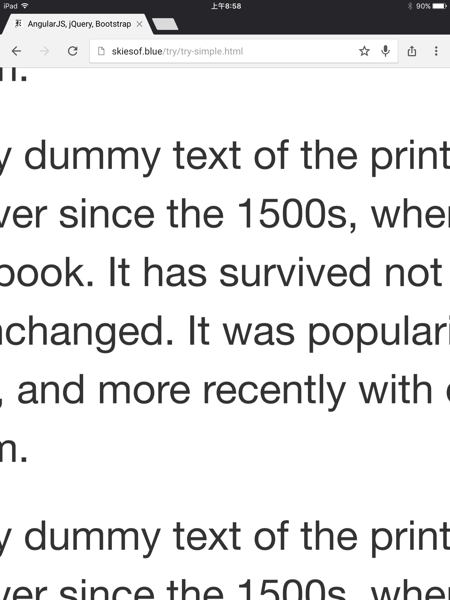
However, the page worked well in Google Chrome, and worked well in Google Chrome simulated iPhone 5, 6, or 6 Plus (note: as simulated in developer tool) -- but not work on a real iPhone 6 Plus or iPad (in the portrait mode). (the text appears really huge).

Is there a way to make it work?

The code:

<div class="modal-body">
    <div class="container col-md-12">
        <div class="row">
            <p class="col-md-4">
                1 Lorem Ipsum is simply dummy text of the printing and typesetting industry. Lorem Ipsum has been the industry's standard dummy text ever since the 1500s, when an unknown printer took a galley of type and scrambled it to make a type specimen book. It has survived not only five centuries, but also the leap into electronic typesetting, remaining essentially unchanged. It was popularised in the 1960s with the release of Letraset sheets containing Lorem Ipsum passages, and more recently with desktop publishing software like Aldus PageMaker including versions of Lorem Ipsum.
            </p>
            <p class="col-md-4">
                2 Lorem Ipsum is simply dummy text of the printing and typesetting industry. Lorem Ipsum has been the industry's standard dummy text ever since the 1500s, when an unknown printer took a galley of type and scrambled it to make a type specimen book. It has survived not only five centuries, but also the leap into electronic typesetting, remaining essentially unchanged. It was popularised in the 1960s with the release of Letraset sheets containing Lorem Ipsum passages, and more recently with desktop publishing software like Aldus PageMaker including versions of Lorem Ipsum.
            </p>
            <p class="col-md-4">
                3 Lorem Ipsum is simply dummy text of the printing and typesetting industry. Lorem Ipsum has been the industry's standard dummy text ever since the 1500s, when an unknown printer took a galley of type and scrambled it to make a type specimen book. It has survived not only five centuries, but also the leap into electronic typesetting, remaining essentially unchanged. It was popularised in the 1960s with the release of Letraset sheets containing Lorem Ipsum passages, and more recently with desktop publishing software like Aldus PageMaker including versions of Lorem Ipsum.
            </p>
        </div>
    </div>
</div>

sample page on: http://skiesof.blue/try/

P.S. I am looking into this issue further. With my iPhone 6 Plus that has iOS 9.3.1, it seems to work well, but on an iPad with iOS 9.0 or 9.1, it has this when the modal is popped up:

enter image description here

Community
  • 1
  • 1
nonopolarity
  • 146,324
  • 131
  • 460
  • 740
  • In my experience Google Chrome is VERY tolerant of code that wouldn't normally work in another browser (Safari, IE etc.). Have you tested/debugged in a different browser on your MacBook? I have to debug using IE which is more picky. – Lyall Mar 07 '16 at 15:32
  • interesting to know of using IE so that it is less tolerating. Is it IE 11 or Edge? So do they have an emulation mode or you just resize the window so that it is not wide? – nonopolarity Mar 07 '16 at 16:00
  • I use IE 11 but change the emulation to test back to IE9 (not earlier). There is emulation for iPad but not specifically iPhone - I usually just resize the screen or use a specific iPhone emulator like mobiletest.me or something. There are lots of options. Hope you get it working :) – Lyall Mar 08 '16 at 10:01
  • try-fluid is the only one working correctly in FF. – maraca Mar 20 '16 at 19:59
  • hm... the other 2 files work except in 1 resolution? (1 width at about 750 to 992px) – nonopolarity Mar 20 '16 at 20:04
  • What if you remove col-md-12? I think container should stand on its own. (Yes to the other question about the resolution). – maraca Mar 20 '16 at 20:06
  • Actually there is a pretty simple explanation why one works and the other two don't: For those who don't work your columns don't add up to 12, but to 9, if you change it to col-md-4 it would probably work for the others too. – maraca Mar 20 '16 at 20:44
  • but what about that it works on Google Chrome emulated iPhone, but not on the real iPhone? – nonopolarity Mar 21 '16 at 08:25
  • have a look bootstrap example http://getbootstrap.com/javascript/#modals-grid-system – Ismail Farooq May 02 '16 at 05:22
  • no need this (
    ) div
    – Ismail Farooq May 02 '16 at 05:24
  • have a look here http://www.bootply.com/Nn97PFniCE – Ismail Farooq May 02 '16 at 05:27

2 Answers2

2

Seems like this is an iOS9 issue and it's unrelated to the content of the modal. I haven't got an iPhone 6+ but I experienced the same issue on my iPad. Adding the following CSS made it work for me:

body {
  padding-right: 0px !important
}

.modal-open {
  overflow-y: auto;
}

https://stackoverflow.com/a/32720590/1581477

https://github.com/jschr/bootstrap-modal/issues/64#issuecomment-55794181

Community
  • 1
  • 1
Martin
  • 1,916
  • 2
  • 25
  • 37
  • The solution actually require this answer and can be improved by the other answer by @Ismail. There is some observations: (1) if the iOS is 9.3.1, then the 3 pages more or less work as they are... the issue is when it is iOS 9.0 or 9.1 (I am not sure about 9.2 and 9.3), and (2) adding `.modal-open` alone will fix the issue, it seemed (no need to use the `body` style), and make sure it is after linking to the `bootstrap.css` [cont'd...] – nonopolarity May 07 '16 at 22:20
  • and (3) with the `.modal-open`, then the `try-simple.html` and `try-container.html` will overflow in the x-direction, and removing `
    ` (and the closing `
    `) as in @Ismail's answer will make it not overflow
    – nonopolarity May 07 '16 at 22:22
2

According to bootstrap example there is no need to add container col-md-12 after modal-body just add your html after modal-body.

<div class="modal-body">
  <div class="row">
    <div class="col-md-3">
      <p>1st col 3</p>
    </div>
    <div class="col-md-3">
      <p>2nd col 3</p>
    </div>
    <div class="col-md-3">
      <p>3rd col 3</p>
    </div>
    <div class="col-md-3">
      <p>4th col 3</p>
    </div>
  </div>
</div>
Ismail Farooq
  • 6,309
  • 1
  • 27
  • 47