0

.container {
 background-color: lightgreen;
}

.column {
 width: 31.33%;
 background-color: green;
 float: left;
 margin: 0 1%;
}

.column:last-child {
 float: none;
}
<div class='container'>
    <div class='column'>Column 1</div>
    <div class='column'>Column 2</div>
    <div class='column'>Column 3Column 3Column 3Column 3Column 3Column 3Column 3</div>
</div>

Why does column three not wrap around like this: enter image description here

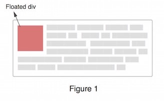
There is enough space for it on the right of the floated elements.

Robert
  • 10,126
  • 19
  • 78
  • 130

2 Answers2

3

Add width: 100% to the .column:last-child.

.column:last-child {
    float: none;
  width: 100%;
}
Dhiraj
  • 1,871
  • 1
  • 12
  • 15
  • This has the disadvantage of the content of the last column floating below column1/2, if you don't want that behavoiur check out [my answer](http://stackoverflow.com/a/35960999/4068027) – Aides Mar 12 '16 at 17:39
  • 1
    @Aides But that is exactly what the OP wants, even an image is added to show that – Asons Mar 12 '16 at 17:40
  • Thanks. Could you explain why the above happens? – Robert Mar 12 '16 at 17:43
  • Because it has width of 31.33% and cannot wrap around. That's why we made it 100%. – Dhiraj Mar 12 '16 at 17:44
0

The answer why this happens is pretty much the answer from this

Here's a fiddle demonstrating that the 3rd column is below the floated columns, and it's text content is simply wrapping around (below in this case) the floated column.

(simply made some backgrounds translucent)

.column {
    width: 31.33%;
    background-color: rgba(0, 255,0, .5);
    float: left;
    margin: 0 1%;
}

.column:last-child {
    float: none;
  background: red;
}
Community
  • 1
  • 1
Dimitris Karagiannis
  • 8,942
  • 8
  • 38
  • 63