I am sure that y'all have heard about the addition of bottom navigation to the material design guidelines. I am planning on adding it to my app. However, I am not sure what the best way to approach it is. What kind of a view would be best to show the bottom bar?
Asked
Active
Viewed 1.2k times
20
-
1Probably Google will release an official bottom view to Support Library. You can wait for it or just implement it manually with linear layouts, but the Google's implementation is always better! – Daniel Oliveira Mar 15 '16 at 20:49
-
Probably, but won't that be in a month or two, versus right now? – Nick Mowen Mar 15 '16 at 22:18
-
4BottomSheets we waited for 1 year. And finally they were here in 23.2.0 if (waitTime <= 2 months){ Toast.makeText(ctx, "Kudos Google", LENGTH_LONG).show(); }else{ Toast.makeText(ctx, "Google, you need to change the way you release support libs", LENGTH_LONG).show(); } – Ashok Varma Mar 16 '16 at 03:12
3 Answers
15
A LinearLayout with equal weights for its views, horizontal orientation. Buttons in the LinearLayout with drawableTop set to the icon of choice.
Add it to the bottom:
In a FrameLayout or CoordinatorLayout you can add it to the bottom with layout_gravity="bottom" or in a RelativeLayout use android:layout_alignParentBottom="true"
Dimensions, font size etc:
Please refer to the material design bottom navigation specs about it for the margins and font sizes etc:
Height: 56dp
Icon: 24 x 24dp
Content alignment:
Text and icon are centered horizontally within view.Padding:
- 6dp above icon (active view), 8dp above icon (inactive view)
- 10dp under text
- 12dp left and right of text
Text label:
Roboto Regular 14sp (active view)
Roboto Regular 12sp (inactive view)
Hide on scroll
Use a CoordinatorLayout from android design support library. Add this LinearLayout as a child in the xml and set a Behavior to to hide on scroll.
Update
There is now an open source library available that is built to spec: https://github.com/roughike/BottomBar
Update 2
It is now part of the support lib.
Gabor
- 7,352
- 4
- 35
- 56
Mattias Isegran Bergander
- 11,811
- 2
- 41
- 49
-
awesome! Thank you very much, I will try to get this going soon and let you know how it works out – Nick Mowen Mar 15 '16 at 22:10
-
Or maybe wait for a new version of design support library. I think it would be possible to do something like the nav drawer, using a menu resource. That way developers will never need to worry about the specs. – André Oriani Mar 16 '16 at 22:49
-
1Actually that library referenced by the edit by @ paul-burke can use a menu resource @andré-oriani – Mattias Isegran Bergander Mar 16 '16 at 22:57
-
8
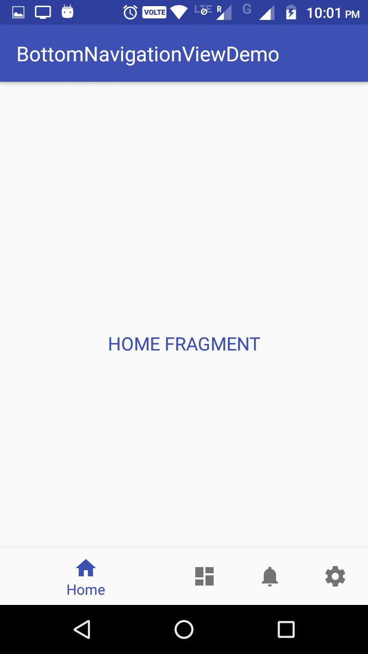
BottomNavigationView is a component added in Google Support Library 25. It provides a quick navigation between top level views within an app. It should be used when application has three to five top-level destinations. My implementation includes the switching between Fragments on Selecting the Menu Items.
Add to the build.gradle of your project module
compile'com.android.support:design:25.3.1'
Create the BottomNavigationView in xml of your layout and provide a menu resource to it:
<android.support.design.widget.BottomNavigationView
    android:id="@+id/navigation"
    android:layout_width="0dp"
    android:layout_height="wrap_content"
    android:layout_marginEnd="0dp"
    android:layout_marginStart="0dp"
    android:background="?android:attr/windowBackground"
    app:layout_constraintBottom_toBottomOf="parent"
    app:layout_constraintLeft_toLeftOf="parent"
    app:layout_constraintRight_toRightOf="parent"/>
Create a file here navigation.xml in menu resource folder. This file is used for providing the MenuItems in BottomNavigationView
<?xml version="1.0" encoding="utf-8"?>
<menu xmlns:android="http://schemas.android.com/apk/res/android">
<item
   android:id="@+id/navigation_home"
   android:icon="@drawable/ic_home_black_24dp"
   android:title="@string/title_home" />
<item
   android:id="@+id/navigation_dashboard"
   android:icon="@drawable/ic_dashboard_black_24dp"
   android:title="@string/title_dashboard" />

<item
   android:id="@+id/navigation_notifications"
   android:icon="@drawable/ic_notifications_black_24dp"
   android:title="@string/title_notifications" />

<item
   android:id="@+id/navigation_settings"
   android:icon="@drawable/ic_settings_black_24dp"
   android:title="@string/title_settings" />

</menu>
With everything in line this much code shows up the BottomBar on running the app. Now lets set the listener for the Click Events OnNavigationItemSelectedListener and OnNavigationItemReselectedListener on Menu Items -
private BottomNavigationView.OnNavigationItemSelectedListener mOnNavigationItemSelectedListener
        = new BottomNavigationView.OnNavigationItemSelectedListener() {

    @Override
    public boolean onNavigationItemSelected(@NonNull MenuItem item) {

        switch (item.getItemId()) {
            case R.id.navigation_home:
                return true;

            case R.id.navigation_dashboard:
                return true;

            case R.id.navigation_notifications:
                return true;

            case R.id.navigation_settings:
                return true;

        }
        return true;
    }

};

private BottomNavigationView.OnNavigationItemReselectedListener mOnNavigationItemReselectedListener = new BottomNavigationView.OnNavigationItemReselectedListener() {
    @Override
    public void onNavigationItemReselected(@NonNull MenuItem item) {

        switch (item.getItemId()) {

            case R.id.navigation_home:
                Log.d(TAG, "Navigation Reselected ===");
                break;

            case R.id.navigation_dashboard:
                Log.d(TAG, "Dashboard Reselected ===");
                break;

            case R.id.navigation_notifications:
                Log.d(TAG, "Notification Reselected ===");
                break;

            case R.id.navigation_settings:
                Log.d(TAG, "Settings Reselected ===");
                break;
        }

    }
};

bottomNavigationView.setOnNavigationItemSelectedListener
(mOnNavigationItemSelectedListener);

bottomNavigationView.setOnNavigationItemReselectedListener
(mOnNavigationItemReselectedListener);
If the no of Menu Items are more than 3 then the selected Item will take more space in the BottomNavView and it looks a little weird as of now, may be intentionally Google has kept it like this.
This behavior is defined by ShiftingMode property of BottomNavigationView, which can't be disabled in a straightforward way as of now, as its api is not public. But there is a way through Reflection to do it :
BottomNavigationMenuView menuView = (BottomNavigationMenuView)
btmNavigationView.getChildAt(0);

try {

        Field shiftingMode = menuView.getClass()
        .getDeclaredField("mShiftingMode");

        shiftingMode.setAccessible(true);
        shiftingMode.setBoolean(menuView, false);
        shiftingMode.setAccessible(false);

        for (int i = 0; i < menuView.getChildCount(); i++) {

        BottomNavigationItemView item =
        (BottomNavigationItemView) menuView.getChildAt(i);
        item.setShiftingMode(false);
        //To update view, set the checked value again
        item.setChecked(item.getItemData().isChecked());
        }


    } catch (NoSuchFieldException e) {
        e.printStackTrace();

    } catch (IllegalAccessException e) {
        e.printStackTrace();

    } catch (SecurityException e) {
        e.printStackTrace();
    }
After calling above code result is :
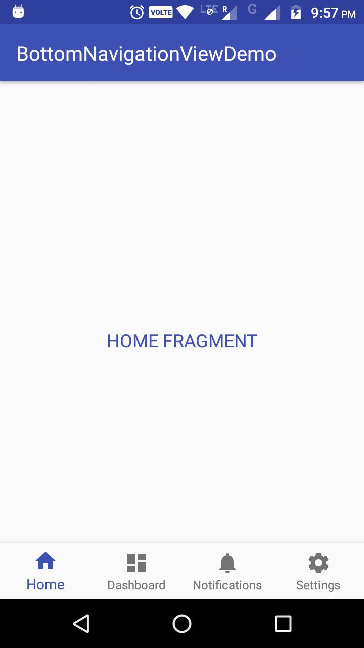
For more information checkout my Github Project: https://github.com/pmahsky/BottomNavigationViewDemo
Prashant
- 1,046
- 14
- 21
-
I don't like to use reflection, but this is once again one of these moment that Google makes me do it anyway, since they offer such little flexibility with their design library. Maybe if they implemented it better as shown in the material design guide, it would've been okay. But these items just fly from one end of the screen to the other, it looks ridiculous. – Raymond Aug 15 '17 at 10:09
3
Since android support library 25 you have a native BottomNavigationView which is the same as mentioned in material design guidelines.
To begin with we need to update our dependancy:
compile 'com.android.support:design:25.0.0'
Next we simply need to add the Bottom Navigation View widget to our desired layout file. Remember that this should be aligned with the bottom of the screen with all content displaying above it. We can add this view like so:
<?xml version="1.0" encoding="utf-8"?>
    <RelativeLayout xmlns:android="http://schemas.android.com/apk/res/android"
        xmlns:app="http://schemas.android.com/apk/res-auto"
        android:layout_width="match_parent"
        android:layout_height="match_parent">

    <android.support.design.widget.BottomNavigationView
        android:id="@+id/bottom_navigation"
        android:layout_width="match_parent"
        android:layout_height="wrap_content"
        android:layout_alignParentBottom="true"
        app:itemBackground="@color/colorPrimary"
        app:itemIconTint="@color/white"
        app:itemTextColor="@color/white"
        app:menu="@menu/bottom_navigation_main" />

</RelativeLayout>
For a more detailed article please visit this: https://medium.com/@hitherejoe/exploring-the-android-design-support-library-bottom-navigation-drawer-548de699e8e0#.bgoj4br93
Fartab
- 4,725
- 2
- 26
- 39