1

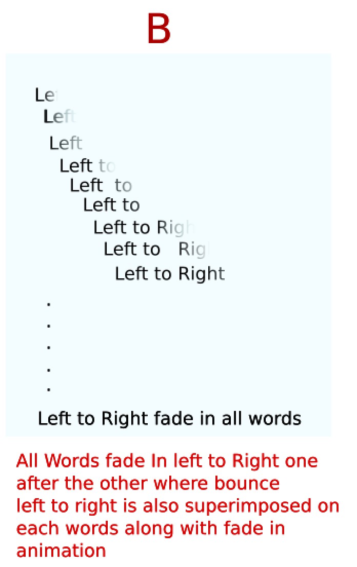
I want to achieve the final CSS only animation effect like in figure B. enter image description here

Here is my code: http://codepen.io/catch_up/pen/bpqexg?editors=1100

HTML

    <div class='programming my-anim-parent'>
      <span class='my-anim'>Hello!</span>
      <span class='my-anim'>How</span></span>
      <span class='my-anim'>Are</span></span>
      <span class='my-anim'>You </span></span>
  <span class='my-anim'>People.</span>
      <span class='my-anim'>I</span>
  <span class='my-anim'>Learn</span>
    </div>

CSS

.programming {
  font-size: 48px;
    position: absolute;
  top: 50%;
    left: 50%;
    -ms-transform: translateX(-50%) translateY(-50%);
    -webkit-transform: translate(-50%, -50%);
    transform: translate(-50%, -50%);
  white-space: nowrap;
}

.programming span:nth-of-type(1) {
    animation-delay: 0.3s;
}
.programming span:nth-of-type(2) {
    animation-delay: 0.6s;
}
.programming span:nth-of-type(3) {
    animation-delay: 0.9s;
}
.programming span:nth-of-type(4) {
    animation-delay: 1.2s;
}
.programming span:nth-of-type(5) {
    animation-delay: 1.5s;
}
.programming span:nth-of-type(6) {
    animation-delay: 1.8s;
}
.programming span:nth-of-type(7) {
    animation-delay: 2.1s;
}

.my-anim-parent {
    animation: L2RslideBounce 2.9s ease-in-out;
    visibility: visible !important;
}

.my-anim {
    animation: L2RAppear 2s, fadeIn 0.8s linear backwards;
    visibility: visible !important;
}

/*FOR BOUNCING SENTENCE */
@keyframes L2RslideBounce {
  0% {
        transform: translate(-60%,-50%);
    } 
  50%{
    transform: translate(-40%,-50%);
  }
    100% {
        transform: translate(-50%,-50%);
    }
}

/*I think this is not working properly! Words are fading in all at once not from left to right. Can also be checked by putting long word.*/
/*EACH WORD SHOULD APPEAR LEFT TO RIGHT*/
@keyframes L2RAppear {
  0% {
    width: 0%;
    }
    100% {
    width: 100%;
    }
}

/*FADING IN*/
@keyframes fadeIn {
    0% {
        opacity: 0.0;
    }
    100% {
        opacity: 1;
    }
}

Which is superimposition of 2 things:

1) fade in from left to right for each word.

2) Bounce left to right of entire sentence.

2nd is happening fine but for 1st one, fading is happening for each word all at once and not from left to right!! How to fix this. Code written for it but not working. How to fix this?

master_dodo
  • 1,203
  • 3
  • 20
  • 31
  • if you not bothered about DIY, then check this plugin -- https://jschr.github.io/textillate/ – Tasos Mar 20 '16 at 02:44
  • Hi, In the link that you gave, I would need like "fadeInLeft(sequence)" in "In Animation". But they are applying animation on individual letter which I feel can be avoided in my case. Anyway thanks :) Earlier, i tried to do it using link.. http://stackoverflow.com/questions/12686738/css-fade-left-to-right . It worked but I wanted to know why my code didn't work. – master_dodo Mar 20 '16 at 03:38
  • no probs, i didnt get to investigate you code, hence why i remembered about that plugin. – Tasos Mar 21 '16 at 04:04

1 Answers1

1

Rather than try to put together a complicated sequence for each word, you could cover the text with an element and use a gradient to fade them in.

I put together a snippet which does roughly what I think you're looking for:

#container {
  position: relative;
  left: 0;
  transition: left 1s ease-in-out;
  width: 300px;
}
#container:before {
  content: 'hover over me!';
  display: block;
  width: 100%;
  height: 100%;
  position: absolute;
  background: linear-gradient(to left,
    yellow 0%,
    yellow 50%, /* the difference between this one */
    transparent 60%, /* and this one is half fade "softness" */
    transparent 100%) no-repeat no-repeat;
  background-size: 200%;
  background-position: 100%;
  transition: background-position 1s ease-out;
}
#container:hover {
  /* This part can be replaced with the bounce animation */
  left: 100px;
}
#container:hover:before {
  content: '';
  /* 
  Move the background position such that it hides the gradient entirely
  since we scaled it up, this will bedouble the difference between the second and third gradient colours
  */
  background-position: -20%;
}
<div id="container">
  This is some text to fade in
</div>

Note that this will only work for one line of text and that I didn't include the bounce animation.

Sean LeBlanc
  • 576
  • 4
  • 13
  • Yeah, I did the same. But it doesn't achieve as quality effect as individual word. But anyways, it's tradeoff, so I used like what you also said. – master_dodo Aug 15 '16 at 16:24