I want to use css to make an image keep its aspect ratio (16:9) and be responsive at the same time.
This image will always be in the center of the screen. Check the schema to help you.
I found this post and I tried Chris's solution and Isaac's solution. But I cannot bring the image to the center. I tried using Bootstrap like so.
<div class="col-md-4">.col-md-4</div>
<div class="wrapper col-md-4">
  <div class="main">
    This is your div with the specified aspect ratio.
  </div>
</div>
<div class="col-md-4">.col-md-4</div>
or
<body>
  <div class="col-md-4" id="wrap1">.col-md-4</div>
    <div class="col-md-4" id="aspectRatio">Aspect Ratio?</div>
  <div class="col-md-4" id="wrap2">.col-md-4</div>
</body>
but all the divs appear the one underneath the other.
Any ideas on how to bring the div in the center, by using Bootstrap or not?
Thanks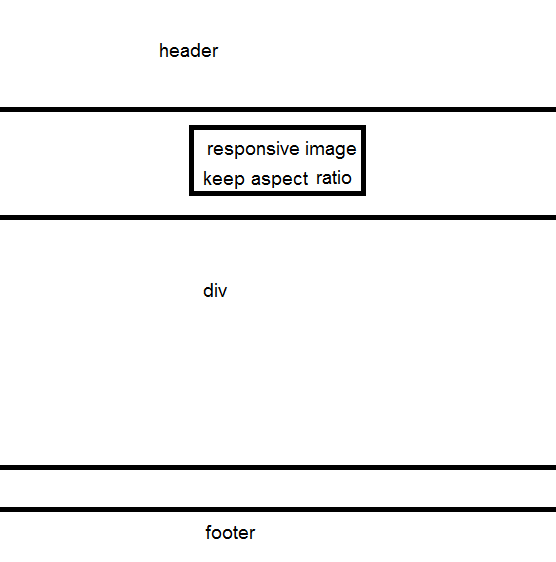