1

Im using the varImp function of the caret package and Im trying to plot the resulting dataframe that it creates. Here is the code:

RocImp2 <- varImp(svmFit, scale = FALSE)

and Im using a simple plot to plot the chart:

plot(RocImp2)

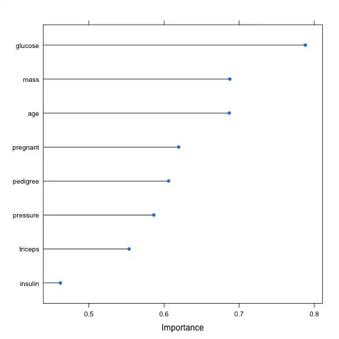
The results are supposed to look like this:

enter image description here

whereas mine looks like this:

enter image description here

Here is a copy of the dataframe:

enter image description here

disregard the names in the plot as they are from another example.
DataGuy
  • 1,695
  • 4
  • 22
  • 38
  • 3
    You should provide a [reproducible example](http://stackoverflow.com/questions/5963269/how-to-make-a-great-r-reproducible-example). Include all data and code necessary to reproducible the plot. Do not include images of data, include actual data. – MrFlick Mar 25 '16 at 22:01
  • Use dotplot or varImpPlot {randomForest}? – dww Mar 28 '16 at 16:23

3 Answers3

5

My issue was fixed by adding the following.

ggplot2::ggplot(varImp())

Adam McMahon
  • 765
  • 3
  • 24
Lucas
  • 91
  • 1
  • 5
3

here is a solution to plot the varImp in the case of a binary classification model.

model = glm(Survived~.,family="binomial", data=Titanic)

V = caret::varImp(model)

ggplot2::ggplot(V, aes(x=reorder(rownames(V),Overall), y=Overall)) +
geom_point( color="blue", size=4, alpha=0.6)+
geom_segment( aes(x=rownames(V), xend=rownames(V), y=0, yend=Overall), 
color='skyblue') +
xlab('Variable')+
ylab('Overall Importance')+
theme_light() +
coord_flip() 
-1

I found a workaround this problem. You could try:

write.csv(RocImp2, file = 'RocImp2.csv')

VIMP <- read.csv('RocImp2.csv')

plot(VIMP)
Machavity
  • 30,841
  • 27
  • 92
  • 100