2

How would you go about creating an irregular border with variable colours like the one in the screenshot?

enter image description here

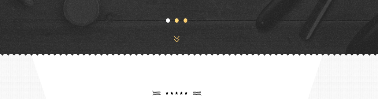
I considered creating a border image in a graphics editor and then using border-image property as described in the docs.

However, this technique would not allow me to achieve the effect of multiple background colours (grey and white in the screenshot) entering the border "waves".

Another solution would be to just produce the whole background white and grey in say Photoshop, and the just use it on the website. I really wanted to avoid this for performance reasons, and would prefer to just produce a grey, checked pattern fragment and repeat it.

Moreover, as you can see in the screenshot, the dark fragment is an image from a carousel - the images will all come in different colours so applying a border-image to the carousel container is not a solution either.

I would appreciate some advice. Thanks.

Harry
  • 87,580
  • 25
  • 202
  • 214
luqo33
  • 8,001
  • 16
  • 54
  • 107
  • Related answer - http://stackoverflow.com/questions/25895895/creating-a-droplet-like-border-effect-in-css/25903879#25903879. You can do this using `radial-gradient` like in that answer but the order of colors should be changed. – Harry Mar 26 '16 at 14:14
  • [Here](https://jsfiddle.net/k3mj2om3/) is a demo using the same approach as in the answer linked above for your reference :) The *will come in different colours* part has to be handled manually by changing the gradient's colors. I don't think there is a way for that (even if you use SVG, the colors have to be handled unless you go for a `clip-path` based approach - which wouldn't be supported in IE). – Harry Mar 26 '16 at 14:25
  • **Note to potential close-voters** - The thread that I linked is just a related item which may give the user some ideas. This question is **not a dupe** of that one as there are few extra conditions specified in this question. – Harry Mar 26 '16 at 14:58
  • 1
    Hello Harry, thanks a bunch - your contribution is very helpful. There still are some caveats left unaddressed (especially the colour overlap), but your suggestion brought me closest to the expected outcome. I guess that the most straightforward solution would be to have borders be part of background images for whole divs, or compromise and let go of the idea of alternating/overlapping colours on the border. – luqo33 Mar 26 '16 at 15:02
  • You're welcome. Yes, that thread doesn't address this question fully (I realized it only after linking but left the link there for reference). My gut feel is that a solution addressing all points is impossible but then somebody could come up with a clever idea to do it. I am not sure which part you were referring to by overlapping colors. [If it is the grey and white part then it can be done with this approach](https://jsfiddle.net/k3mj2om3/1/). – Harry Mar 26 '16 at 15:08

1 Answers1

9

Using SVG:

You can do this using SVG. I would say it is pretty complex because the approach uses patterns for the repeating circles, a mask with the pattern as its fill to produce the transparent cuts. This mask is then applied to the image to produce the full effect. This in my opinion is the closest to what you want and also has good browser support. It works fine in IE10+, Edge, Firefox, Chrome, Opera and Safari.

There are a couple of points to note though - (1) You would have to somehow get your carousel work with SVG image because otherwise mask will have no effect (2) the radius of circles change as the width of the container change and so you'd either have to use a fixed size container (or) assign width of the container to the viewBox attribute using JS (or find some setting to prevent the radius change from happening, I don't know of any) .

.masked {
  position: relative;
  height: 175px;
  width: 100%;
  background: linear-gradient(60deg, #EEE 35%, white 35.5%), linear-gradient(300deg, #EEE 35%, white 35.5%);
  background-size: 51% 100%;
  background-repeat: no-repeat;
  background-position: 0% 0%, 100% 0%;
  padding-top: 100px;
}
.masked svg {
  position: absolute;
  top: 0px;
  left: 0px;
  height: 100px;
  width: 100%;
}
path {
  fill: #fff;
}
image {
  mask: url("#mask");
}
<div class='masked'>
  <svg viewBox='0 0 1200 100' preserveAspectRatio='none'>
    <defs>
      <pattern id="circles" patternUnits="userSpaceOnUse" width="10" height="100">
        <path d="M0,0 L10,0 10,95 A5,5 0 0,0 0,95 L0,0" />
      </pattern>
      <mask id="mask">
        <rect height="100%" width="100%" fill="url(#circles)" />
      </mask>
    </defs>
    <image xlink:href='http://lorempixel.com/1200/100/nature/1' x="0" y="0" height="100%" width="100%" />
  </svg>
  Lorem Ipsum Dolor Sit Amet...
</div>

Using CSS:

This can be done using CSS masks but unfortunately the browser support for this feature is terrible. It is currently supported only in WebKit powered browsers. If other browsers need not be supported then this is a wonderful option. All that we need to do is create a radial gradient (that repeats in X axis) for the mask like in the below snippet, give it the required size and position it accordingly.

.masked {
  position: relative;
  height: 175px;
  width: 100%;
  background: linear-gradient(60deg, #EEE 35%, white 35.5%), linear-gradient(300deg, #EEE 35%, white 35.5%);
  background-size: 51% 100%;
  background-repeat: no-repeat;
  background-position: 0% 0%, 100% 0%;
  padding-top: 80px;
}
.masked:before {
  position: absolute;
  content: '';
  top: 0px;
  height: 80px;
  width: 100%;
  background: url(http://lorempixel.com/1000/100/nature/1);
  -webkit-mask-image: linear-gradient(to bottom, black, black), radial-gradient(circle at 50% 100%, transparent 50%, black 55%);
  -webkit-mask-size: 100% calc(100% - 12px), 12px 12px;
  -webkit-mask-position: 0% 0%, 0px 68px;
  -webkit-mask-repeat: repeat-x;
}
<div class="masked">Lorem Ipsum Dolor Sit Amet</div>
Harry
  • 87,580
  • 25
  • 202
  • 214
  • 1
    Hello, wow, this is some serious css wizardy going on :) Although, I've finally settled with a much more straightforward approach of using images for my backgrounds, this answer is definitely worth an upvote and would provide a solution to similar problems in many cases. Thanks Harry! – luqo33 Mar 30 '16 at 21:07
  • 1
    You're welcome @luqo33. Happy to help :) (PS: Would you mind if I add SVG tag to the question because, as you say, the approach could be helpful to others also and adding the tag would make it easier to find). – Harry Mar 31 '16 at 04:43