-1

Can anyone help tell me what is going one and why these li elements are not staying on one single line? I would expect with a width of 33% to work correctly, but when I do that, the third li element will go to the next line/start of the document.

So I decided to put 32% here, but when I do this, the result is the image attached

I honestly want to be able to use 33%, but yeah..

Here is the code:

<style>

  .navigator ul {
    display: inline;
  }
  .navigator li {
    /*display: table-cell;*/
    display: inline-block;
    list-style-type: none;
    float: left;
    border: solid 2px purple;
    background-color: yellow;
    text-align: center;
  }
  .popupDiv {

  }
</style>
<div id="example">
  <div style="font-size:20px;" class="navigator" data-reactid=".0">
    <ul style="width:100%;" data-reactid=".0.0">
      <li style="width:32%;margin-right:5px;" id="liId1" data-reactid=".0.0.$1">One</li>
      <li style="width:32%;margin-right:5px;" id="liId2" data-reactid=".0.0.1">Two</li>
      <li style="width:32%;margin-right:5px;" id="liId3" data-reactid=".0.0.2">Three</li>
    </ul>
  </div>
</div>

<script type="text/babel" src="build/helloworld.js"></script>

enter image description here

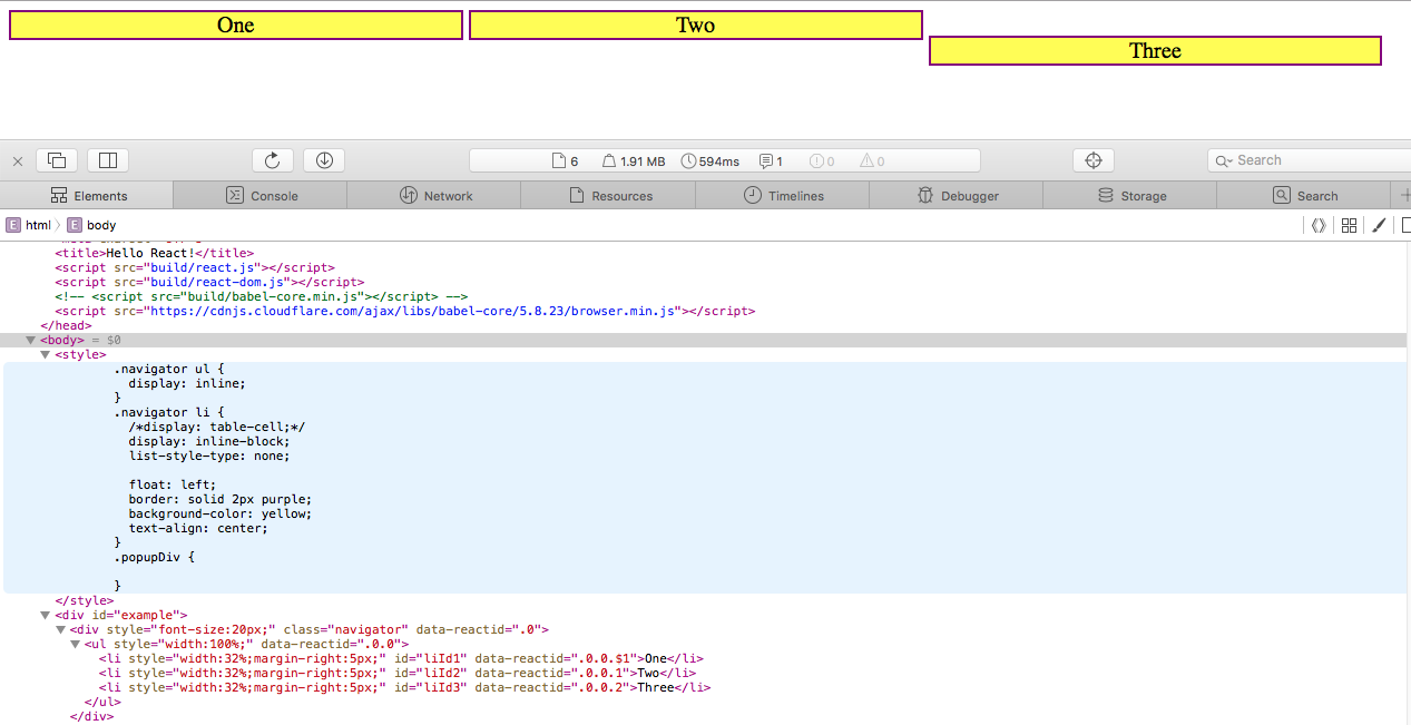
Btw, I am using Safari if you can't tell from the screenshot or didn't look at it.

Coty Embry
  • 958
  • 1
  • 11
  • 24
  • [Can't reproduce on Firefox](https://jsfiddle.net/o9suoh3u/). But it might be a `vertical-align` problem, see [CSS Inline-Block Elements Not Lining Up Properly](http://stackoverflow.com/q/19366401/1529630) – Oriol Mar 26 '16 at 20:54

4 Answers4

1

Try changing the box-sizing attribute of the li elements to be border-box (see https://css-tricks.com/box-sizing/). The border is is being added to the 32% width taking the overall width over 100%

Dave Draper
  • 1,837
  • 11
  • 25
1

Add a Box-sizing: Border-box; CSS style to li blocks.

Also try to remove the right margin you added to the li blocks or at least decrease it. That's causing the line breaking in your list.

ragingasiancoder
  • 616
  • 6
  • 17
Sasan Farrokh
  • 184
  • 2
  • 12
1

The problem is with ul element, which is inline. Thus when you set its width to 100% it's computed width is auto. The shift in space is caused by this inappropriately sized parent element. Try right-click and inspect element to see for yourself.

The li's width are seemingly ideal because they are actually taking the percentage W.R.T. the containing div.

A fix to your problem could be setting ul's display to block or inline-block. That way the width on ul takes effect.

<style>

  .navigator ul {
    display: inline-block;
    padding: 0;
  }
  .navigator li {
    /*display: table-cell;*/
    display: inline-block;
    list-style-type: none;
    float: left;
    border: solid 2px purple;
    background-color: yellow;
    text-align: center;
  }
  .popupDiv {

  }
</style>
<div id="example">
  <div style="font-size:20px;" class="navigator" data-reactid=".0">
    <ul style="width:100%;" data-reactid=".0.0">
      <li style="width:32%;" id="liId1" data-reactid=".0.0.$1">One</li>
      <li style="width:32%;" id="liId2" data-reactid=".0.0.1">Two</li>
      <li style="width:32%;" id="liId3" data-reactid=".0.0.2">Three</li>
    </ul>
  </div>
</div>

A minor issue is the border and the margin, which will mess up on smaller screens (Threshold is 4% parent width == border widths and margins). Try using padding instead of margin and box-sizing: border-box;

Yushi Sun
  • 11
  • 3
1

Evil "hack" fix:

.navigator ul {
    display: block;
    font-size: 0;
  }
  .navigator li {
    font-size: 12px;
    display: inline-block;
    list-style-type: none;       
    border: solid 2px purple;
    background-color: yellow;
    text-align: center;
    vertical-align: top;      
  }
Elvanos
  • 302
  • 2
  • 4