How to achieve this layout with CSS?
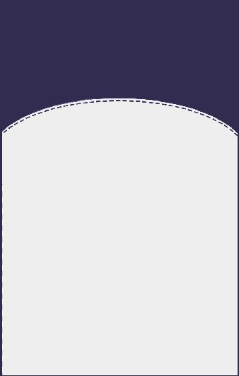
You can try this: https://jsfiddle.net/dqhx5cf5/
HTML:
<div class="rectangle"><div class="circle"></div></div>
CSS:
.rectangle{
   background-color: darkblue;
   width: 300px;
   height: 500px;
   overflow:hidden;
}

.circle{
   border-radius: 50%;
   width: 600px;
   height: 600px;
   background-color: #ddd;
   position:relative;
   left: -150px;
   top: 100px;
   border: 2px dashed darkblue;
   box-shadow: 0 0 0px 5px #ddd;
}
BUT with Firefox the curved line does not appear dashed because is not compatible with mozilla, but if you check it from IE and Chrome it works as well.
You can make shape like following way:
.shape {
    background-color: #ccc;
    border-radius: 150px 150px 0 0;
    bottom: 0;
    height: 100px;
    position: absolute;
    width: 75px;
}

.parent {
    background-color: #2e0854;
    height: 150px;
    position: relative;
    width: 75px;
}
<div class="parent">
<div class="shape"></div>
</div>Learn more about shape from here
I have solved your question. Hope it will be helpful.
Thanks
*{margin:0;}
.container{width:400px;border:2px solid #666; height:400px;}
.main{background:#666; width:100%; height:200px; position:relative;overflow:hidden;}
.oval{background:#fff;width:100%;height:200px;position:absolute;bottom:-100px;border-radius:50%;}
.oval-dashed{background:#fff;width:100%;height:200px;position:absolute;bottom:-110px;border-radius:50%; border:1px dotted #666}
<div class="container">
<div class="main">
<div class="oval"></div>
<div class="oval-dashed"></div>
</div>
</div>
To make it adopt to the container width (in this example the body):
https://jsfiddle.net/ehoo6pLt/9/
HTML
 <div class="elliptical-container">
     <h1>Content</h1>
 </div>
CSS
.elliptical-container {
    margin-top: 100px;
    box-sizing: border-box;
    height: 100%;
    background: #EEEDEE;
    border-top-left-radius: 50% 75px;
    border-top-right-radius: 50% 75px;
    box-shadow: 0 0 0 4px #EEEDEE;
    border-top: 1px dashed #3B2053;
}