1

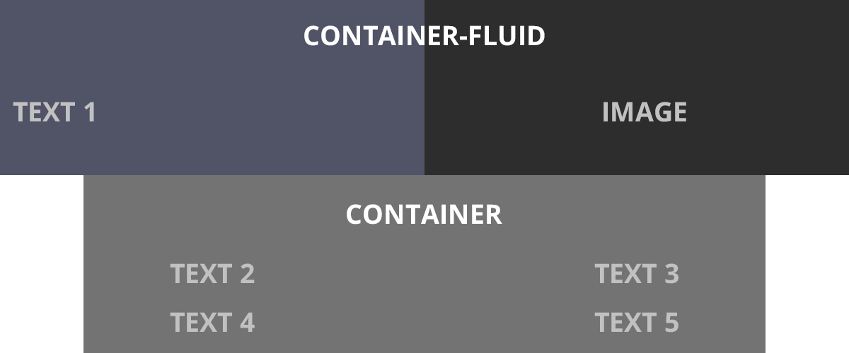
I need to align TEXT of container-fluid at same padding/margin like container. You have example in this image:


EDIT: See 2nd photo, i want that padding to be the same on container-fluid / container, and when you minimize screen to be responsive..

enter image description here enter image description here

.nopadding {
    margin: 0 !important;
    padding: 0 !important;
}

.bg {
  background-color: #f3f3f3;
}

.left {
  height: 650px;
}

.img-bg {
  margin-right: 0px !important;
  height: 650px;
  background: url(http://placehold.it/850x650) no-repeat center center;
  background-size: cover;
}
  <section id="id1">
      <div class="container-fluid">
          <div class="row">
             <div class="col-md-7 nopadding bg">
                <div class="left">
                      <h2>TEXT</h2>
               </div>
             </div>

             <div class="col-md-5 nopadding img-bg">
             </div>
          </div>
       </div>
    </section>
Razvan
  • 61
  • 2
  • 9

3 Answers3

1

Here is my solution:

HTML part:

<div class="container-fluid">
  <div class="row">
    <div class="col-xs-6 col-sm-6 col-md-6 col-lg-6 text no-padding center-flex">
      <p>Text</p>
    </div>
    <div class="col-xs-6 col-sm-6 col-md-6 col-lg-6 image no-padding">
      <div class="full-width"></div>
    </div>
  </div>
</div>

<div class="clearfix"></div>

<div class="container">
  <div class="row">
    <div class="col-xs-6 col-sm-6 col-md-6 col-lg-6 text no-padding center-flex">
      <p>Text</p>
    </div>
    <div class="col-xs-6 col-sm-6 col-md-6 col-lg-6 text no-padding center-flex">
      <p>Text</p>
    </div>
  </div>

  <div class="clearfix"></div>

  <div class="row">
    <div class="col-xs-6 col-sm-6 col-md-6 col-lg-6 text no-padding center-flex">
      <p>Text</p>
    </div>
    <div class="col-xs-6 col-sm-6 col-md-6 col-lg-6 text no-padding center-flex">
      <p>Text</p>
    </div>
  </div>
</div>

CSS part:

.center-flex {
  /* Internet Explorer 10 */
  display:-ms-flexbox;
  -ms-flex-pack:center;
  -ms-flex-align:center;
  /* Firefox */
  display:-moz-box;
  -moz-box-pack:center;
  -moz-box-align:center;
  /* Safari, Opera, and Chrome */
  display:-webkit-box;
  -webkit-box-pack:center;
  -webkit-box-align:center;
  /* W3C */
  display:box;
  box-pack:center;
  box-align:center;
}

.container-fluid .text {
  background: #515467;
  height: 650px;
}

.container .text {
  background: #737373;
  height: 300px;
}

.container-fluid .image {
  background: #2D2D2D;
  height: 650px;
}

.full-width {
  width:100%;
  height:100%;
  height:calc(100% - 1px);
  background-image:url('http://placehold.it/850x650');
  background-size:cover;
}

.full-width img {
  width:100%;
}

.no-padding {
  padding: 0 !important;
}

.no-margin {
  margin: 0 !important;
}

You can see the jsfiddle result: https://jsfiddle.net/DTcHh/18725/

Kaan Burak Sener
  • 974
  • 10
  • 19
  • Text from container-fluid needs to be aligned same like container, http://i.imgur.com/t2H5tc2.jpg – Razvan Apr 01 '16 at 06:28
  • @Razvan I am sorry but the first version of your question was directly the same with my solution and you are forcing me to solve new challenges.. In addition, '.container-fluid' continuously resizes as you change the width of your window/browser by any amount, leaving no extra empty space on the sides ever, unlike how .container does. '.container' resizes in chunks at several certain widths. In other words, it will be a specific aka "fixed" width at different screen widths. Therefore, you can only align them in same position for some specific resolutions according to '.container'. – Kaan Burak Sener Apr 01 '16 at 12:24
  • To learn more, check this link: http://stackoverflow.com/questions/22262311/container-fluid-vs-container – Kaan Burak Sener Apr 01 '16 at 12:25
0

try with this below code it may help you

.text1{
  background : #0f74bd;
  padding : 50px;
  color : white;
  font-weight : bold;
}

.image{
  background : #000;
  padding : 50px;
  color : white;
  font-weight : bold;
}
.text{
  background : #9ea3a9;
  padding : 50px;
  color : white;
  font-weight : bold;
}
<link href="https://maxcdn.bootstrapcdn.com/bootstrap/3.3.6/css/bootstrap.min.css" rel="stylesheet"/>
<section>
  <div class="container-fluid">
    <div class="row">
      <div class="col-sm-6 col-md-6 col-xs-6 text1">
        TEXT1
      </div>
      <div class="col-sm-6 col-md-6 col-xs-6 image">
        IMAGE
      </div>
    </div>
  </div>
  <div class="container text">
    <div class="row">
      <div class="col-sm-6 col-md-6 col-xs-6">
        TEXT2
      </div>
      <div class="col-sm-6 col-md-6 col-xs-6">
        TEXT3
      </div>
      <div class="col-sm-6 col-md-6 col-xs-6">
        TEXT2
      </div>
      <div class="col-sm-6 col-md-6 col-xs-6">
        TEXT3
      </div>
    </div>
  </div>


</section>
Iqbal Pasha
  • 1,318
  • 1
  • 8
  • 12
0

<!DOCTYPE html>
<html>
<head>
<script src="https://code.jquery.com/jquery.min.js"></script>
<link href="https://maxcdn.bootstrapcdn.com/bootstrap/3.3.6/css/bootstrap.min.css" rel="stylesheet" type="text/css" />
<script src="https://maxcdn.bootstrapcdn.com/bootstrap/3.3.6/js/bootstrap.min.js"></script>
  <meta charset="utf-8">
  <meta name="viewport" content="width=device-width">
  <title></title> 
</head>
<body> 
<div style="background-color: blue" class="container-fluid">
  <h1 style="text-align:center">Container-Fluid</h1>
  <div class="row">
   <div  style="text-align:center" class="col-xs-6">TEXT 1</div>
   <div  style="text-align:center" class="col-xs-6">IMAGE</div>
  </div>
  
  <div style="background-color: yellow" class="container">
  <h1 style="text-align:center">Container</h1>
    <div class="row">
      <div style="text-align:center" class="col-xs-6">Text 1</div>
      <div style="text-align:center" class="col-xs-6">Text 2</div>
      <div style="text-align:center" class="col-xs-6">Text 3</div>
      <div style="text-align:center" class="col-xs-6">Text 4</div>
    </div>
</div>
</div>
</body>
</html>

Is this what u want, using bootstrap

Manish62
  • 154
  • 1
  • 1
  • 13