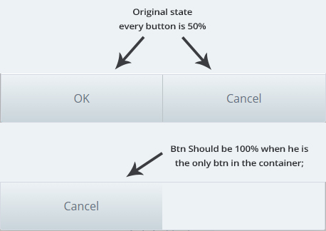
I need that when there is only one button it will be 100% width:
css based answer if it's possible
You can make use of the :only-of-type selector to override the width property like in the below snippet.
.container {
  width: 200px;
  height: 50px;
  border: 1px solid red;
}

/* if button is input tag */
input[type='button'] {
  float: left;
  width: 50%;
  border: 1px solid green;
  background: blue;
  color: white;
}
input[type='button']:only-of-type {
  width: 100%;
  background: blue;
  color: white;
}

/* if button is button tag */
button {
  float: left;
  width: 50%;
  border: 1px solid green;
  background: blue;
  color: white;
}
button:only-of-type {
  width: 100%;
  background: blue;
  color: white;
}
<h4>For Buttons using input tag</h4>
<div class='container'>
<input type='button' value='Button 1' />
<input type='button' value='Button 2' />
</div>
<div class='container'>
<input type='button' value='Button 1' />
</div>
<h4>For Buttons using buton tag</h4>
<div class='container'>
<button>Button 1</button>
<button>Button 2</button>
</div>
<div class='container'>
<button>Button 1</button>
</div>
You can use flexbox to solve this problem:
.buttons {
  display:flex;
  flex-direction: row;
  align-items:stretch;
}
.btn {
  border:1px solid #000;
  text-align:center;
  width:100%;
}
<div class="buttons">
<div class="btn">Test</div>
<div class="btn">Test</div>
</div>
<div class="buttons">
<div class="btn">Test</div>
</div>
try display: table; by using it if you have 3 link it will take 33.33% width automatically
.btn-box{
  margin: 30px 0;
  width: 100%;
  display: table;
  table-layout=fixed;
  /* Presentation purpose */
  color: white;
  text-align:center;
  line-height:30px
  }
.btn-box div{
  background: #000;
  height: 30px;
  display: table-cell;
    border: 1px solid red;
  }
<div class="btn-box">
<div>
Box1
</div>
<div>
Box2
</div>
</div>
<div class="btn-box">
<div>
Only box
</div>
</div>
You can use display:flex; in the container and flex-grow:2; in the children elements.
* {
  box-sizing: border-box;
}
.container {
  width: 300px;
  height: 50px;
  border: thin solid #dddddd;
  margin-bottom: 100px;
  display:flex;
}
.btn {
  width: 50%;
  height: 50px;
  background: #999999;
  border: thin solid #666666;
  float: left;
  color: #FFFFFF;
  text-align: center;
  line-height: 50px;
  flex-grow: 2;
}
<div class="container">
<div class="btn">
Ok
</div>
<div class="btn">
Cancel
</div>
</div>
<div class="container">
<div class="btn">
Cancel
</div>
</div>
The solution is to use :only-child The :only-child selector matches every element that is the only child of its parent.
Sample HTML:
<div class="wrapper">
  <button type="button" class="left">Button1</button>
  <button type="button" class="right">Button2</button>
</div>
Required CSS:
.left:only-child {
    width: 100%;
    background-color: #ccc;
    height: 50px;
}
.left {
    width: 50%;
    background-color: #ccc;
    height: 50px;
}
.right {
    width: 50%;
    background-color:#ddd;
    height: 50px;
    float: left;
}