I built a Google Cardboard app (or at least a Google Cardboard-compatible app with room for improvement) that works well on phones with 5-6" screens (iOS and Android) and a Google Cardboard viewer designed to work with those 5-6" screens. However, if viewing the app in a larger "phablet" screen, vision doubles and the app becomes useless for those devices.
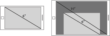
Since the app primarily runs in the phones' stock browsers Safari and Chrome, is there a way to scale down the app canvas/block element to stay within the 5-6" range on larger mobile devices? Here is a rough illustration of what I'm trying to accomplish:
So far my search brings me to answers like this one, explaining that this might not be totally possible? If that's the answer in this case, I'll work with it. I have seen other Google Cardboard VR apps that do scale down nicely on large screens, but perhaps JavaScript, HTML and CSS are not involved.
I'm using PhoneGap and Adobe PhoneGap Build to create this app, so I also have access to PhoneGap/Cordova plugins if that will help.
Maybe there's a an API that will allow lookup of device info via phone info available in the browser or a Google Cardboard API (at the moment not making use of a Cardboard SDK or two due to PhoneGap being in the middle).
I'll revisit this topic soon, but look forward to any thoughts you have on how to answer this question.