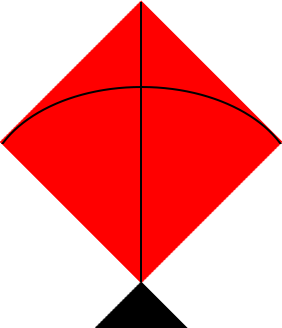
The answer given by web-tiki is wonderful and I'd recommend using SVG for complex shapes for the same reasons indicated in his answer. This shape however is reasonably simple to create with CSS and below is another variant for creating this with only one element.
The black tail part is a pseudo-element whereas the red kite is its box-shadow. The line in the middle is created using a linear-gradient on the parent and the curved string is the second pseudo.
I have used viewport units for all the parts to make the output be responsive. This is because the box shadows can't take percentage values and cannot be responsive unless viewport units are used.
.kite {
  position: relative;
  height: 25vw;
  width: 25vw;
  background: linear-gradient(to right, transparent calc(50% - 1px), black calc(50% - 1px), black calc(50% + 1px), transparent calc(50% + 1px));
  overflow: hidden;
}
.kite:before {
  position: absolute;
  content: '';
  top: calc(84.5% + 1px);  /* (15/25 * 1.414 is approximately 84.5% + 1px for correction */
  left: 50%;
  height: 15vw;
  width: 15vw;
  background: black;
  transform-origin: left top;
  transform: rotate(45deg);
  box-shadow: -15vw -15vw 0px red; /* the x and y are same as height and width */
  z-index: -1;
}
.kite:after {
  position: absolute;
  content: '';
  top: calc(0% - 2px);
  left: calc(50% + 1px);
  width: calc(15vw - 2px);
  height: calc(15vw - 1px);
  border-top-left-radius: 100%;
  border-left: 2px solid #000;
  border-top: 2px solid #000;
  transform-origin: left top;
  transform: rotate(45deg);
}
<div class="kite"></div>