I've been messing around with flex in CSS lately. My goal was to create a layout with several columns with equal height and that the contents are equally spaced in between. I found a solution that works in Firefox but not in Chrome (minimal example with erroneous behaviour):
HTML:
<div class="row">
  <div class="col-sm-6">
    <div>
      <div class="item">
        Content
      </div>
      <div class="item">
        Content
      </div>
      <div class="item">
        Content
      </div>
    </div>
  </div>
  <div class="col-sm-6">
    <div>
      <div class="item">
        Content
      </div>
      <div class="item">
        Content
      </div>
      <div class="item">
        Content
      </div>
      <div class="item">
        Content
      </div>
    </div>
  </div>
</div>
SCSS (gets autoprefixed):
.row {
  display: flex;
  flex-flow: row wrap;

  .col-sm-6 > div {
    display: flex;
    flex-flow: column nowrap;
    justify-content: space-between;
    height: 100%;

    .item {
      height: 20px;
      text-align: center;
      background-color: red;
      margin: 2px;
    }
  }
}
See this jsfiddle: https://jsfiddle.net/zn463f1j/
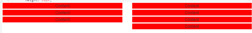
Here are images of how the two browsers render the same fiddle:
Firefox (how it should be):

Chrome:
So my question is what styles do I need to add, remov or change in order to get it working in both browsers.
I tried athe following CSS but that resulted in firefox also rendering it like Chrome. Changing height from 100% to auto made the code work in Firefox again but still not in Chrome.
.row .col-sm-6 {
  height: 100%;
}
