7

All info on the picture. My code for a second solution:

<div class="content">
  <div class="circle">
  </div>
</div>

.content {
  width: 300px;
  padding: 50px;
  background: #3f63d3;
}

.circle {
  width: 200px;
  height: 200px;
  border-radius: 50%;
  border: 10px solid #fff;
  border-top-color: transparent;
  transform: rotate(45deg);
}

Here is a JSFiddle example. Any ideas?

Image Example:

Image with expected output

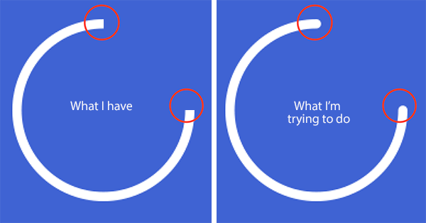
P.S.: Red circles on image - is not a part of issue, it's just a sample what I'm talking about :)

Glorfindel
  • 21,988
  • 13
  • 81
  • 109
Sergey A
  • 137
  • 3
  • 12

3 Answers3

7

As Paulie_D mentioned in his comment, the best way to achieve what you need is to use SVG. It can be done with a single path element by setting the stroke-linecap as round. We can then position it within a HTML div container (absolute positioning, if required).

You can find detailed information about SVG's path element and its various commands in this MDN tutorial.

svg {
  height: 100px;
  width: 100px;
  fill: none;
  stroke: red;
  stroke-width: 8;
  stroke-linecap: round;
}
<svg viewBox='0 0 100 100'>
  <path d='M95,50 A45,45 0 0,1 5,50 A45,45 0 0,1 50,5' />
</svg>

It might be possible to do this with CSS but it will be ultra complex compared to SVG (especially when the arc's angle can vary - it will then need adjustments to positioning etc in CSS whereas SVG needs no change at all even if the arc's angle varies).

Harry
  • 87,580
  • 25
  • 202
  • 214
4

.content {
  width: 300px;
  padding: 50px;
  background: #3f63d3;
}

.circle {
  width: 200px;
  height: 200px;
  border-radius: 50%;
  border: 10px solid #fff;
  border-top-color: transparent;
  transform: rotate(45deg);
  position: relative;
}
.circle:after, .circle:before {
  position: absolute;
  border-radius: 50%;
  width: 10px;
  height: 10px;
  background-color: white;
  content: ' ';
}
.circle:after {
  right: 21px;
  top: 21px;
}
.circle:before {
  left: 21px;
  top: 21px;
}
<div class="content">
  <div class="circle">
  </div>
</div>
tao
  • 82,996
  • 16
  • 114
  • 150
0

a very similar answer to andrei, but using shadow instead and current color to easily change circle color.

Of course, SVG as much more possibilities, here to change the lenght of the circle shape means to readjust the pseudo position and size.

/* Draw the bits of dots */

.content:before, .content:after {
  color:currentColor;
  content:'';
  position:absolute;
  z-index:1;
  border-radius:10px;
  
}
.content:before {
  box-shadow: 5px 0 ;  
  left:0;
  width:50%;
  height:9px;
}
.content:after {
  right:50px;
  bottom:-1px;
  width:9px;
  height:50%;
  box-shadow:0 -5px  ;  
}
.content + .content {color:tomato;}
/* see where bits of dots stand */
.content:hover:after, .content:hover:before {
  color:black;
  }

/* reset color ? */
.content + .content {color:tomato;}

/* original code */
.content {
  color:white;
  float:left;
  padding: 50px;
  background: #3f63d3;
  position:relative;
}

.circle {
  width: 200px;
  height: 200px;
  border-radius: 50%;
  border: 10px solid currentColor;
  border-top-color: transparent;
  transform: rotate(45deg);
}
<div class="content">
  <div class="circle">
  </div>
</div>
<div class="content">
  <div class="circle">
  </div>
</div>
G-Cyrillus
  • 101,410
  • 14
  • 105
  • 129