4

I am developing a web application using Material Design Lite.

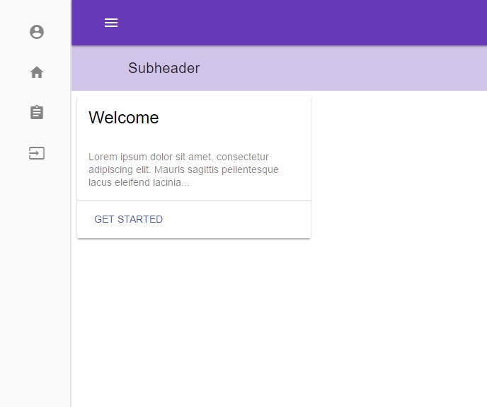
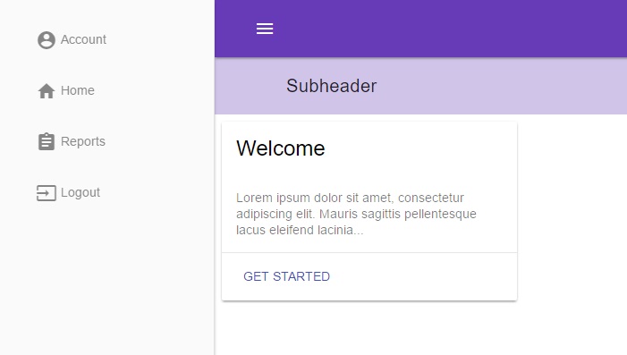
One of the requirements is this: A sidebar exists such that by default, it will display the icons of the menu items at a smaller width (say 50px). Clicking on the menu (hamburger) icon then expands the drawer to a larger size and shows not only the icons but the text beside them. Here is an example of what I want to achieve:

Default: enter image description here

Expand: enter image description here

Here is my current HTML:

<body>
    <!-- Always shows a header, even in smaller screens. -->
    <div class="mdl-layout mdl-js-layout mdl-layout--fixed-drawer mdl-layout--fixed-header">
        <header class="mdl-layout__header">
            <div class="mdl-layout__header-row">
                <button class="mdl-button mdl-js-button mdl-button--icon">
                    <i class="material-icons">menu</i>
                </button>
                <!-- Add spacer, to align navigation to the right -->
                <div class="mdl-layout-spacer"></div>
                <!-- Navigation. We hide it in small screens. -->
                <button class="mdl-button mdl-js-button mdl-button--icon">
                    <i class="material-icons">apps</i>
                </button>
            </div>
        </header>
        <div class="mdl-layout__drawer">
            <span class="mdl-layout-title"></span>
            <nav class="mdl-navigation">
                <a class="mdl-navigation__link" href="">
                    <i class="material-icons md-dark">account_circle</i>
                    <span>Account</span>
                </a>
                <a class="mdl-navigation__link" href="">
                    <i class="material-icons md-dark">home</i>
                    <span>Home</span>
                </a>
                <a class="mdl-navigation__link" href="">
                    <i class="material-icons md-dark">assignment</i>
                    <span>Reports</span>
                </a>
                <a class="mdl-navigation__link" href="">
                    <i class="material-icons md-dark">input</i>
                    <span>Logout</span>
                </a>
            </nav>
        </div>
        <main class="mdl-layout__content">
            <div class="page-content">
                <!-- Your content goes here -->
                @RenderBody()
            </div>
        </main>
    </div>
</body>

Is there a good/correct way of doing this? I was wondering how this could be done and haven't come up with a good solution.

arazzy
  • 495
  • 1
  • 8
  • 23

2 Answers2

3

Have a look at this answer. I think it's a good approach to achieving this effect.

You can then just drop the polyfill in and write in your CSS something like:

.mdl-navigation .material-icons {
    opacity: 0;
    transition: 250ms opacity ease-in-out;
}

.mdl-navigation[min-width~="200px"] .material-icons {
    opacity: 1;
}

If you think a polyfill is too much to add just this functionality I can think of one other way that doesn't use any javascript, but it wouldn't be as flexible with regards to how you animate the showing/hiding should you want to animate it. It involves overlapping the main content area over the drawer. Give me a moment and I'll mock up a demo.

EDIT

Here's what I was thinking as far as a non-js approach (still requires some for the toggling of the is-expanded class): https://jsfiddle.net/damo_s/27u4huzf/2/

.mdl-layout__drawer {
  transform: translateX(0);
  z-index: 1;
  box-shadow: none;
  border-right: 0;

  &.is-expanded {
    + .mdl-layout__header {
      margin-left: 240px!important;

      &:before {
        width: 0;
        left: 200px;
      }
    }

    ~ .mdl-layout__content {
      margin-left: 240px!important;

      &:before {
        width: 0;
        left: 200px;
      }
    }
  }
}

.mdl-layout__header,
.mdl-layout__content {
  margin-left: 55px!important;
}

.mdl-layout__header {
  z-index: 2;

  &:before {
    background: #fff;
    content: '';
    display: block;
    position: absolute;
    width: 15px;
    height: 100%;
    left: 40px;
  }
}

.mdl-layout__header-row {
    padding: 0 16px 0 22px;
}

.mdl-layout__content {
  background: #878787;
}

.mdl-layout__drawer-button {
  display: none;
}

.mdl-layout__drawer .mdl-navigation .mdl-navigation__link:hover {
    background-color: transparent;
}

On looking at it now, I don't think it's a very good approach (for a number of reasons you might notice playing around with it), but I'll leave it here just in case anyone wishes to improve upon it.

EDIT 2

I modified the previous demo to simplify it and allow for opening/closing animation. I don't know if at this point you'd exactly be doing things the "Material" way but I think it's workable and better anyway than my previous attempt. Demo: https://jsfiddle.net/damo_s/Ln6e4qLt/

.mdl-layout__drawer {
  overflow: hidden;
  width: 55px;
  transform: translateX(0);
  transition: 250ms width ease-in-out;

  .mdl-navigation__link span {
    opacity: 0;
    transition: 250ms opacity ease-in-out;
  }

  + .mdl-layout__header,
  ~ .mdl-layout__content {
    transition: 250ms margin-left ease-in-out;
  }

  &.is-expanded {
    width: 240px;

    .mdl-navigation__link span {
      opacity: 1;
    }

    + .mdl-layout__header,
    ~ .mdl-layout__content{
      margin-left: 240px!important;
    }
  }
}

.mdl-layout__header,
.mdl-layout__content {
  margin-left: 55px!important;
}

.mdl-navigation {
  width: 240px;
}

.mdl-layout__header-row {
  padding: 0 16px 0 22px;
}

.mdl-layout__content {
  background: #878787;
}

.mdl-layout__drawer-button {
  display: none;
}
Community
  • 1
  • 1
damo-s
  • 1,008
  • 7
  • 16
  • I like this approach. It would be nice if the drawer expanding/collapsing was still animated though – arazzy Apr 24 '16 at 13:36
  • Works great! Thanks a ton – arazzy Apr 29 '16 at 13:49
  • One issue I noticed with your second solution: the header width doesn't adjust when the drawer resizes. When you expand the preview window on your jsfiddle and toggle the drawer you will notice it. Its like it permanently has the 240px for the drawer removed. – arazzy May 02 '16 at 15:36
  • 1
    Ah, I see. I thought it might not be as easy as that. Here is an updated fiddle: https://jsfiddle.net/damo_s/4j9j87ke/ This one has the icon on the far right come in and out when the drawer is open and closed as well (actually an accident, didn't intend for it to do that - could be changed/removed easily.) Might be some other things you'll need to adjust for very small screens (less than 400px wide or so), but I'll leave that to you. – damo-s May 02 '16 at 22:22
0

This cannot be done by pure CSS. You have have to use jQuery. Something like this

$('#hamburger-button').on('click',function() {
   $('#menu .links').css('display','block');

});

Assuming you have hidden links by display:none.

If you can post here your css and html code I can help with specific example.

iamwtk
  • 1,031
  • 3
  • 13
  • 24
  • Thanks, added my HTML to my post and do not have any CSS yet other than the material design lite stylesheet – arazzy Apr 23 '16 at 15:17
  • I checked the material design lite and the whole drawer is managed by their js file because it is hidden on the smaller screens etc. So it would require really deep cut in the whole framework. – iamwtk Apr 23 '16 at 15:40