2

I achieved something like this using a div with the css property of transform: skew();

image

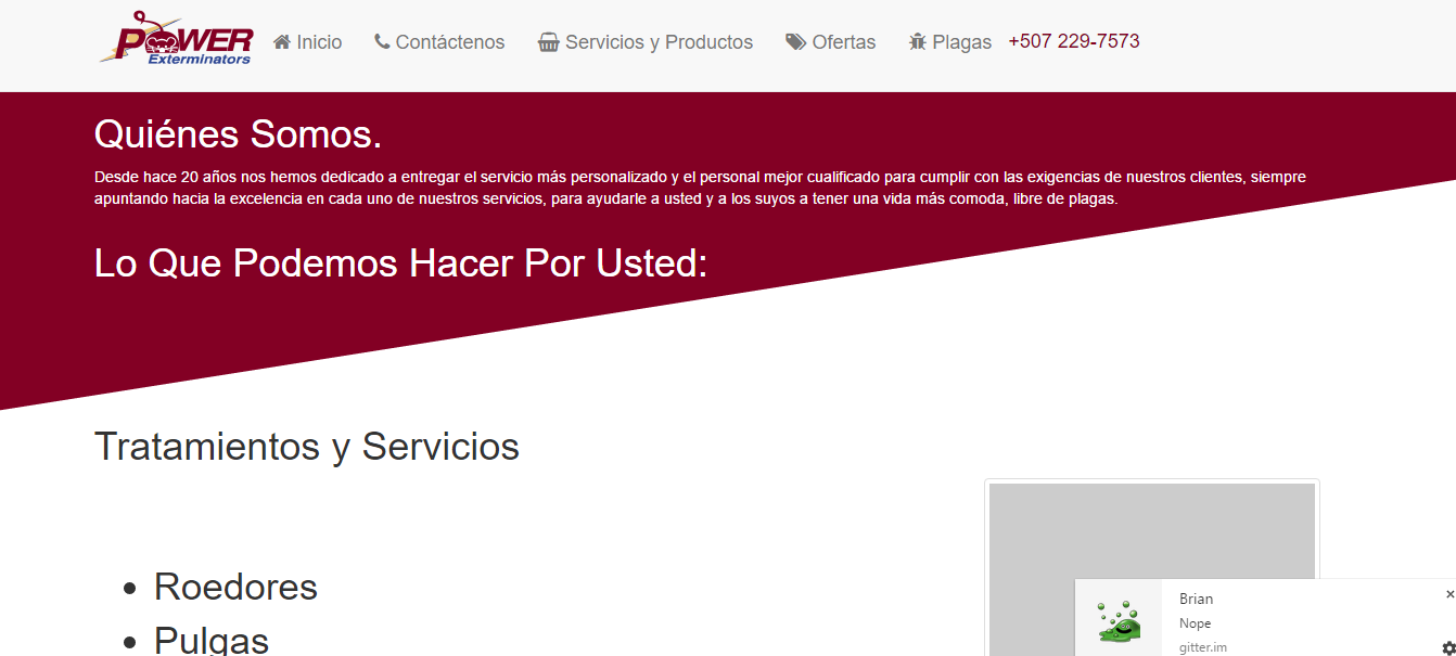
however I'd like it to have kind of a curve where the line is going up, so if you could give me a step in the right direction or tell me more about the easiest ways of inserting a responsive svg graphic art to specifically the background of the elements or the page itself it'd be much appreciated

EDIT: HERE'S THE CSS USED

.skewed-bg{
    background: #830024;
    -webkit-transform: skew(0deg, -9deg);
    transform: skew(0deg, -9deg);
    margin-top: -200px;
}
.skewed-bg .container{
    -webkit-transform: skew(0deg, 9deg);
    transform: skew(0deg, 9deg);
    padding-top: 200px;
    color: white;
}
jbutler483
  • 24,074
  • 9
  • 92
  • 145
EliT
  • 172
  • 1
  • 1
  • 8

2 Answers2

8

you can also use a linear-gradient (again), actually 2 and background-size

body {
  width: 80%;/* whatever , can be a fixed width , basicly to show behavior on resize */
  margin: auto;
}
body>div {
  background: 
    linear-gradient(to bottom right, #830024 50%, transparent 50.5%) no-repeat bottom,
    /* bottom part */
    linear-gradient(0deg, #830024, #830024) no-repeat top;
  /* top portion */
  color: white;
  padding-bottom: 3em;
  background-size: 100% 7em, 100% calc(100% - 7em)
}
<div>
  <h1>HTML Ipsum Presents</h1>

  <p><strong>Pellentesque habitant morbi tristique</strong> senectus et netus et malesuada fames ac turpis egestas. Vestibulum tortor quam, feugiat vitae, ultricies eget, tempor sit amet, ante. Donec eu libero sit amet quam egestas semper. <em>Aenean ultricies mi vitae est.</em> Mauris
    placerat eleifend leo. Quisque sit amet est et sapien ullamcorper pharetra. Vestibulum erat wisi, condimentum sed, <code>commodo vitae</code>, ornare sit amet, wisi. Aenean fermentum, elit eget tincidunt condimentum, eros ipsum rutrum orci, sagittis
    tempus lacus enim ac dui. <a href="#">Donec non enim</a> in turpis pulvinar facilisis. Ut felis.</p>

  <h2>Header Level 2</h2>
</div>
<ol>
  <li>Lorem ipsum dolor sit amet, consectetuer adipiscing elit.</li>
  <li>Aliquam tincidunt mauris eu risus.</li>
</ol>

codepen to play with

G-Cyrillus
  • 101,410
  • 14
  • 105
  • 129
4

You can apply the skew transform to a pseudo element (like ::after) without using SVG or affect the main element (also reducing the need for extra HTML element):

header {
  background: #CCC;
  padding: 2em;
}

.skewed-bg {
    background: #830024;
    color: #FFF;
    padding: 2em;
    position: relative;
    min-height:300px;
    overflow:hidden;
}
.skewed-bg::after {
  content: '';
  position: absolute;
  bottom: -75%; left: 0; right: 0;
  height:100%;
  background:#FFF;
  transform: skew(0deg, -9deg);
}
<header>Power</header>
<div class="skewed-bg">
  Quienes Somos.
</div>

jsFiddle: https://jsfiddle.net/w6690acn/1/

Aziz
  • 7,685
  • 3
  • 31
  • 54