4

I would like to

  • take a matrix of global data with lon/lat values (e.g. surface air temperature), missing values are given as NAs.
  • plot it in an equal area or compromise (e.g. Robinson) projection (both tropical and polar regions should be represented)
  • add an outline of the continents on top
  • add a grid and labels on the side

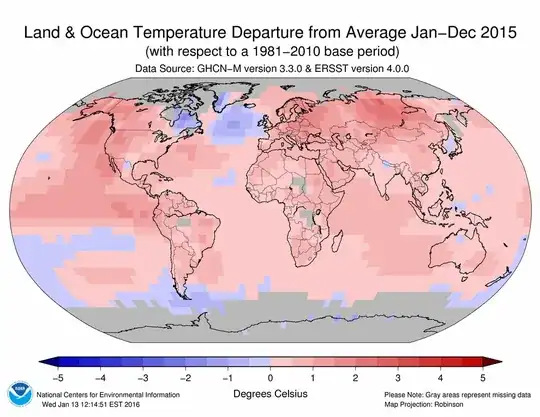
Edit: The projection I'm looking for looks something like this: image

The basic plot with lat/lon values to get a rectangular image with map on top is straightforward, but once I try to project the matrix data things appear much more complicated. It can't really be this complicated - I must be missing something. Trying to understand openproj , spTransform and SpatialPoints gave me the impression I have to convert my matrix coordinates so that I have a sort of grid object.

The example below is based on the answer to R - Plotting netcdf climate data and uses the NOAA air surface temperature data from http://www.esrl.noaa.gov/psd/data/gridded/data.ncep.html.

Edit: There seem to be (at least) three ways to approach this, one using mapproj (and converting the matrix to polygons, as pointed out in the response below), another one using openproj, CRS and spTransform', and maybe a third one usingraster`.

library(ncdf)
library(fields)
temp.nc <- open.ncdf("~/Downloads/air.1999.nc")
temp <- get.var.ncdf(temp.nc,"air")
temp[temp=="32767"] <- NA # set missing values to NA
temp.nc$dim$lon$vals -> lon
temp.nc$dim$lat$vals -> lat
temp.nc$dim$time$vals -> time
temp.nc$dim$level$vals -> lev
lat <- rev(lat)
temp <- temp[, ncol(temp):1, , ] #lat being our dimension number 2
lon <- lon -180
temp11 <- temp[ , , 1, 1] #Level is the third dimension and time the fourth.

So the data is lon x lat x temp11 and can be plotted as an image

image.plot(lon,lat,temp11-273.15,horizontal=TRUE) 
library(maptools)
map("world",add=TRUE,wrap=TRUE)

All is good up to here and works. But I want both the map and the image to be projected onto a more relevant grid. So what follows is my attempt to find a way to do this.

Trying to project the map using mapproj (fails)

library("mapproj")
eg<-expand.grid(lon,lat)
xyProj<-mapproject(eg[,1],eg[,2],projection="vandergrinten")
im<-as.image(temp11,x=xyProj$x,y=xyProj$y) # fails
image.plot(im)

Whereas this projects the continent outlines at least (but some of the lines get distorted)

map("world",proj="vandergrinten",fill=FALSE)

How can the two be combined? Thanks!

Community
  • 1
  • 1
Ira
  • 43
  • 1
  • 4
  • Please can you include an image, so we don't have to run the code to see the problem – Richard Telford Apr 27 '16 at 10:07
  • Sorry, I'm not allowed to post images (need more than 10 reputation points for that): I want to generate an image similar to this (but with axis labels and grid lines): ![Robinson projection surface temperatures from NOAA](https://www.ncdc.noaa.gov/sotc/service/global/map-blended-mntp/201501-201512.gif) – Ira Apr 27 '16 at 11:59

1 Answers1

0

I've had this issue many times. I ended up writing a function that helps to create polygons from matrix. These are then projected onto the map using the same projection settings. The only thing that is not well accomplished here is the labeling of grid lines - I have removed these as they get quite messy:

library(ncdf4)
library(fields)
temp.nc <- nc_open("air.1999.nc")
lon <- ncvar_get(temp.nc, "lon")
lat <- ncvar_get(temp.nc, "lat")
time <- ncvar_get(temp.nc, "time")
lev <- ncvar_get(temp.nc, "level")
temp <- ncvar_get(temp.nc, "air")
nc_close(temp.nc)

temp[temp=="32767"] <- NA # set missing values to NA
lat <- rev(lat)
temp <- temp[, ncol(temp):1, , ] #lat being our dimension number 2
lon <- lon -180
temp11 <- temp[ , , 1, 1] #Level is the third dimension and time the fourth.

# plot
library("mapproj")
image(lon, lat, temp11); map("world",add=TRUE,wrap=TRUE)

library(sinkr) # https://github.com/marchtaylor/sinkr
polys <- matrixPoly(lon, lat, temp11)

png("vandergrinten.png", width=6, height=6, res=400, units="in")
op <- par(mar=c(1,1,1,1))
map("world", 
  proj="vandergrinten", parameters = NULL, orient=c(90,0,0),
  xlim=c(-180,180), ylim=c(-90,90),
  fill=FALSE, wrap=TRUE
)
COLS <- val2col(temp11, col = jetPal(100))
for(i in seq(polys)){
  tmp <- mapproject(polys[[i]],
    proj="vandergrinten", parameters = NULL, orient=c(90,0,0)
  )
  polygon(tmp$x, tmp$y, col=COLS[i], border=COLS[i], lwd=0.1)
}
map("world",
  proj="vandergrinten", parameters = NULL, orient=c(90,0,0),
  add=TRUE
)
map.grid(nx = 18, ny=9, col=8, labels = FALSE)
par(op)
dev.off()

enter image description here

Update:

Defining other limits is a bit tricky, but here is one example (you'll see that I had to adjust the dimensions of the device so that all is plotted.). Important: asp=1 should be set in plot do prevent distortions:

xlim=c(-180,180)
ylim=c(-80,80)
LIM <- mapproject(x=xlim, y=ylim, proj="vandergrinten", orient=c(90,0,0))
 
png("vandergrinten2.png", width=6, height=4.5, res=400, units="in")
op <- par(mar=c(1,1,1,1))
plot(1, t="n", asp=1 ,axes=FALSE, xlab="", ylab="", xlim=range(LIM$x), ylim=LIM$y)
map("world", 
  proj="vandergrinten", orient=c(90,0,0),
  fill=FALSE, wrap=TRUE, add=TRUE
)
COLS <- val2col(temp11, col = jetPal(100))
for(i in seq(polys)){
  tmp <- mapproject(polys[[i]],
    proj="vandergrinten", parameters = NULL, orient=c(90,0,0)
  )
  polygon(tmp, col=COLS[i], border=COLS[i], lwd=0.1)
}
map("world", proj="vandergrinten", orient=c(90,0,0), add=TRUE)
map.grid(nx = 18, ny=9, col=8, labels = FALSE)
par(op)
dev.off()

enter image description here

Community
  • 1
  • 1
Marc in the box
  • 11,769
  • 4
  • 47
  • 97
  • This looks good! Is it possible to cut off the top/bottom part, so that the aspect ratio is less square? Something like the Winkel Tripel or the Robinson projection ![image](https://www.ncl.ucar.edu/Document/Graphics/Images/ncl_map_projections.robinson.png)? – Ira Apr 27 '16 at 13:28
  • I've update the example. You may want to look at other projections (e.g. [link](http://menugget.blogspot.de/2015/04/map-projection-cheat-sheet.html)) . This one seems a bit weird to me. – Marc in the box Apr 27 '16 at 14:52
  • Very useful cheat sheet. Probably the Mollweide projection gets closest to the Robinson projection. I'll test this (and try to understand the edit). Thanks. – Ira Apr 27 '16 at 15:33