3

I have the following layout using flexbox:

enter image description here

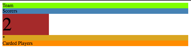
I want to have the div containing 2 on the right hand side, and the Team and Scorers should make up the space to the left of it.

Required layout: enter image description here

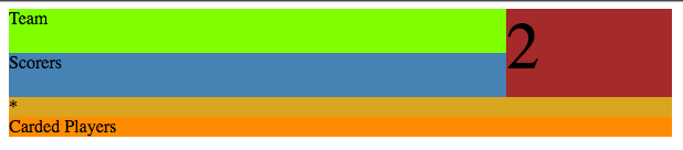
It's the same idea as the 2 div having a rowspan of 2, if using a table.

Is there a way to position Team and Scorers to the left of 2 without wrapping them in their own div? If so, is it worth the trouble?

Here is my CSS so far:

.container {
  max-width: 600px;
}

.team {
  background-color: chartreuse;
}

.score {
  background-color: brown;
}

.scorers {
  background-color: steelblue;
}

.cards-desktop {
  background-color: goldenrod;
}

.carded-players {
  background-color: darkorange;
}

.left-col {
  display: flex;
  flex-flow: row wrap;
}
.left-col > * {
  flex: 1 100%;
}

.team {
  order: 1;
}

.score {
  order: 3;
}

.scorers {
  order: 2;
}

.cards-desktop {
  order: 4;
}

.carded-players {
  order: 5;
}

.team {
  flex: 1 auto;
}

.score {
  flex: 0 150px;
  font-size: 60px;
}

The layout will be different on other breakpoints, so I want to have one HTML block that doesn't get duplicated or mimicked for other breakpoints. That's why I don't want to wrap these two divs in a container, because it's unnecessary on other breakpoints' layouts.

Codepen Link

cimmanon
  • 67,211
  • 17
  • 165
  • 171
alanbuchanan
  • 3,993
  • 7
  • 41
  • 64

1 Answers1

4

Here..

Wrap 1, 2 & 3 in their own div with display:flex / flex-direction:column / flex-wrap:wrap.

Then set widths on the various components to suit.

Unfortunately, I think Chrome this requires a fixed height on that wrapper to force the wrap (it's a bug I think)...and there you have.

* {
  box-sizing: border-box;
}
.team {
  background: chartreuse;
}
.score {
  background: brown;
}
.scorers {
  background: steelblue;
}
.cards-desktop {
  background: goldenrod;
}
.carded-players {
  background: darkorange;
}
.wrap {
  width: 80%;
  margin: auto;
  display: flex;
  flex-direction: column;
}
.top > div {
  padding: 5px;
}
.bottom > div {
  height: 25px;
}
.top {
  display: flex;
  flex-direction: column;
  flex-wrap: wrap;
  height: 150px;
}
.team,
.scorers {
  height: 50%;
  width: 75%;
}
.score {
  width: 25%;
  flex: 1 0 100%;
  display: flex;
  align-items: center;
  justify-content: center;
  font-size: 28px;
}
<div class="wrap">
  <div class="top">
    <div class="team">Team</div>
    <div class="scorers">Scorers</div>
    <div class="score">
      <h1>2</h1>
    </div>
  </div>
  <div class="bottom">
    <div class="cards-desktop">cards-desktop</div>
    <div class="carded-players">carded-players</div>
  </div>
</div>
Paulie_D
  • 107,962
  • 13
  • 142
  • 161