0

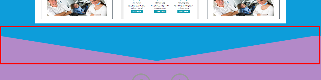
The border 500px is fixed. How to make it responsive? it is on .page1::before area.

enter image description here

.page1{
    width:100%;
    height:auto;
    clear:both;
    padding:90px 0 40px 0;
    background-color:#0D9DDA;
    position:relative;
}
.page1::before{
    content:"";
    width:0;
    height:0;
    display:block;
    border-width:80px 500px 0px;
    border-style:solid;
    border-color:#0D9DDA transparent transparent ;
    position:absolute;
    top:100%;
    left:0;
    z-index:5;
}

<div class="page1"></div>
Stephen P
  • 14,422
  • 2
  • 43
  • 67
Shahid
  • 19
  • 4
  • Basically..not with a border...a skewed pseudo-element, an SVG or perhaps something else. I'm sure this has come up before, try searching harder on SO. – Paulie_D Apr 28 '16 at 19:08
  • 1
    Here..http://stackoverflow.com/questions/25360411/responsive-css-triangle-with-percents-width – Paulie_D Apr 28 '16 at 19:10
  • actually also similar to http://stackoverflow.com/questions/36392688/header-with-curved-pointed-bottom/36410667 – G-Cyrillus Apr 28 '16 at 22:52

2 Answers2

0

Change your pixels to a flexible unit like vw (viewport width) or %. (You will need to change all of the pixel units)

So if you wanted 500px on a 1920px wide display 500/1920 ~= 26vw

0

setup a display size criteria say 30em, and add css code as follow. need further tweaking to get it right, of course.

[![/* Responsive <  30em */
@media all and (max-width:  29.9375em){

.page1{width:100%;
   height:auto;
   clear:both;
   padding:90px 0 40px 0;
   background-color:#0D9DDA;
   position:relative;
   }
.page1::before{content:"";
           width:0;
           height:0;
           display:block;
           border-width:40px 200px 0px;
           border-style:solid;
           border-color:#0D9DDA transparent transparent ;
           position:absolute;
           top:100%;
           left:0;
           z-index:5;
}
 }
/* larger display  > 30em*/
@media all and (min-width:  30em){

 .page1{width:100%;
   height:auto;
   clear:both;
   padding:90px 0 40px 0;
   background-color:#0D9DDA;
   position:relative;
   }
.page1::before{content:"";
           width:0;
           height:0;
           display:block;
           border-width:80px 500px 0px;
           border-style:solid;
           border-color:#0D9DDA transparent transparent ;
           position:absolute;
           top:100%;
           left:0;
           z-index:5;
}
}][1]][1]
Henry L
  • 48
  • 8
  • All of the common stuff should be pulled out of the `@media` rules; such as `.page1{width:100%; height:auto;` etc. rather than duplicating it all. – Stephen P Apr 28 '16 at 21:27