Hello I have been trying to make a flex box in CSS like the image below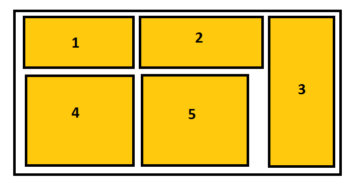
but I have a problem that's look like this image 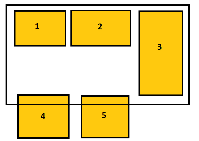
it seems like the div number 3 push every thing down here is the code
#flexcontainer
{
width: 500px;
height: 210px;
border: 3px solid black;
display: flex;
flex-wrap: wrap;
padding: 5px;

}

.flexitem
{
background: yellow;
width : 150px;
text-align: center;
height: 100px;
line-height: 100px;
margin: 2px;
}

.two
{
width : 200px;
}
.three
{
width : 120px;
height: 100%;
}
I also tried to use align-self property and set it to stretch to .three but also it doesn't work. Here is html code
<!DOCTYPE html>
<html lang="en">
    <head>
        <title>
            Project Name
        </title>

    <link rel="stylesheet" type="text/css" href="main.css">
</head>

<body>
   <div id="flexcontainer">
    <div class="flexitem one">1</div>
    <div class="flexitem two">2</div>
    <div class="flexitem three">3</div>
    <div class="flexitem four">4</div>
    <div class="flexitem four">5</div>
   </div>
</body>
</html>